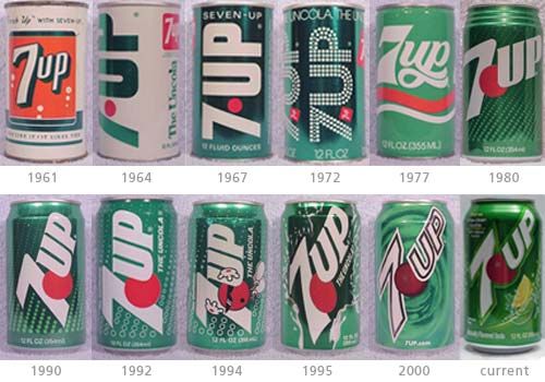
As you can see, 7-UP went through a lot of changes over the years. Only in 1977 and 1980 did they make the word “7-UP” horizontal instead of diagonal. In 1967 is where they really started making the can all green with white letters instead of 1964 where the words were in green letters. Starting in 1964 is where they tried to incorporate the color red into each of their cans and they kept that color through out. They also seemed to be using a San serif font through out every year.
Looking at this picture, you can sense that they tried their best to keep the layout the same as possible as not to confuse customers.
