Bad Design

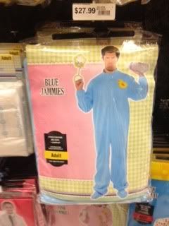
The giant baby with the package has to be the worst one in this group of images I took while strolling around the city. Its just so horrible, there’s no effort put into the design of this package. There’s so much unnecessary negative space, they used colors that don’t work well together, and also typefaces that don’t go together. Its just a mess.
Good Design
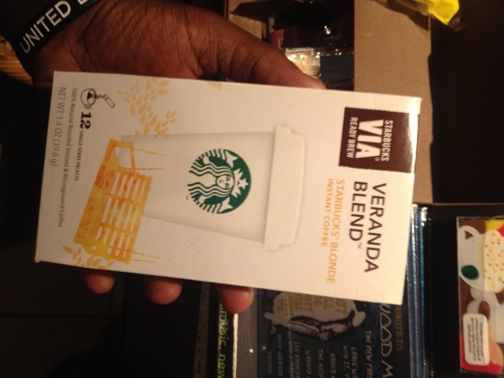
Out of these series of images I would have to say I like the Starbucks Via package the most. Its right down my alley and looks like something that I would design. I like the simplicity of the package; its very clean, and just looking at it makes me want to buy it. It has all the information you need, and the typefaces used work well together. The colors are perfectly chosen and the graphics add liveliness to the package.