
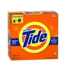
In the beginning one must consider which product has survived long enough to have experienced the journey from vintage to contemporary. Which product is known to have been around for at least twenty years? Well, let it be Tide, as we all know it.
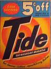
The promise of 5 cent savings must immediately give out the hint in regards to which package goes back in history. I believe this vintage package reaches back to 1950’s. Although the incandescent light to which the picture was probably taken may have distorted the true coloration of the package, one can still see that the color theme of Tide packaging has remained the same. Now more vivid and saturated – orange, yellow and dark blue have remained the trademark colors. On the other hand, we can observe that dimensions of packaging have changed; swirls have become circles and the “dot” in logotype has finally found a straight path over “i”. The newer box enjoys the advantages of computer magic where regularity and even spacing are just few clicks away. Also, when I was searching for a vintage packaging, I wanted to find one that includes the notable ad medallion which these days has a rare appearance unless designer purposefully chooses a theme of vintage elegance.