
Author Archives: VICTORIA BALDOS
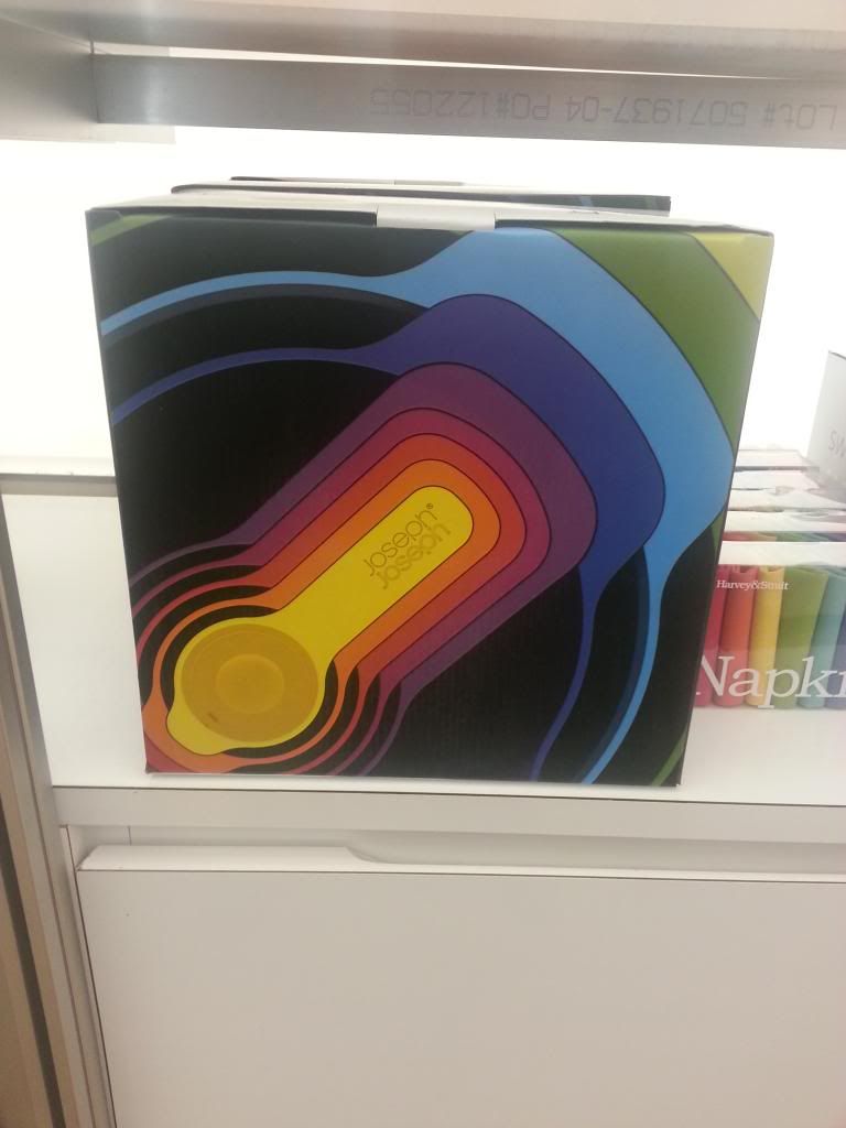
Joseph Joseph Nest Bowls
Joseph Joseph designs wonderful products in wonderfully designed packages. The product is a set of nesting bowls and measuring cups. Each of which is a different color.The packaging is a simple box with a vivid photograph. The photograph is not of the total product, but instead a small piece that explains exactly what the product is.
The reason this packaging works so well, is that it does not oversell the product. There are no special techniques, only a box with a photograph of the product. Even the logo treatment is minimal. The logo is on the product that is photographed; to add it anywhere else would be over-designing.
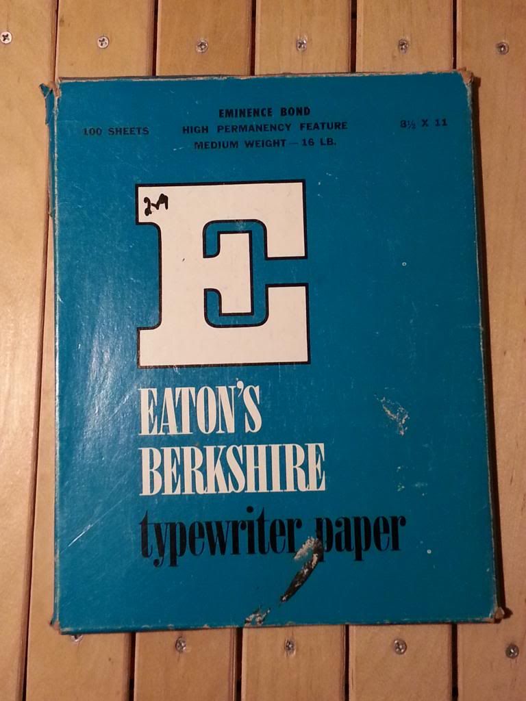
Vintage Packaging: Typewriter Paper
Eaton’s Berkshire Typewriter paper, Eminence Bond
Typography Typographical hierarchy- A large slab serif logotype, “E” for Eaton’s Berkshire; a serif with drastic thick/thin typeface for paper style; a narrow sans serif for specified product details.
Color The color palette is simple, yet busy at the same time- iconic of early design. I noticed that most vintage packaging has a bold color (i.e., red, blue) or a muted color (i.e., beige/cream, mint green, pistachio) or the occasional use of both. The use of saturated teal as a backdrop for serif typeface lends to the idea that the package is vintage.
Simplicity The design is simple because it has only 2 major factors: color and typography, however it is also very loud, busy because of the execution. “Good” design today is very simple with very little fuss. A giant logotype would be too much for today’s packaging. There are 3 typefaces used when 2 would have worked. In addition to the typefaces used, type placement is inconsistent. The text at the top is centered, while the rest is justified left.
Overall Tone The one reason why I believe this package to be vintage (other than typewriters being obsolete) is the use of serif typefaces. Older, vintage packages had script or serif typefaces, whereas now a majority of typefaces used are sans serif. Designs that use serif typefaces today are usually trying to appear vintage.
Lifestyle packaging
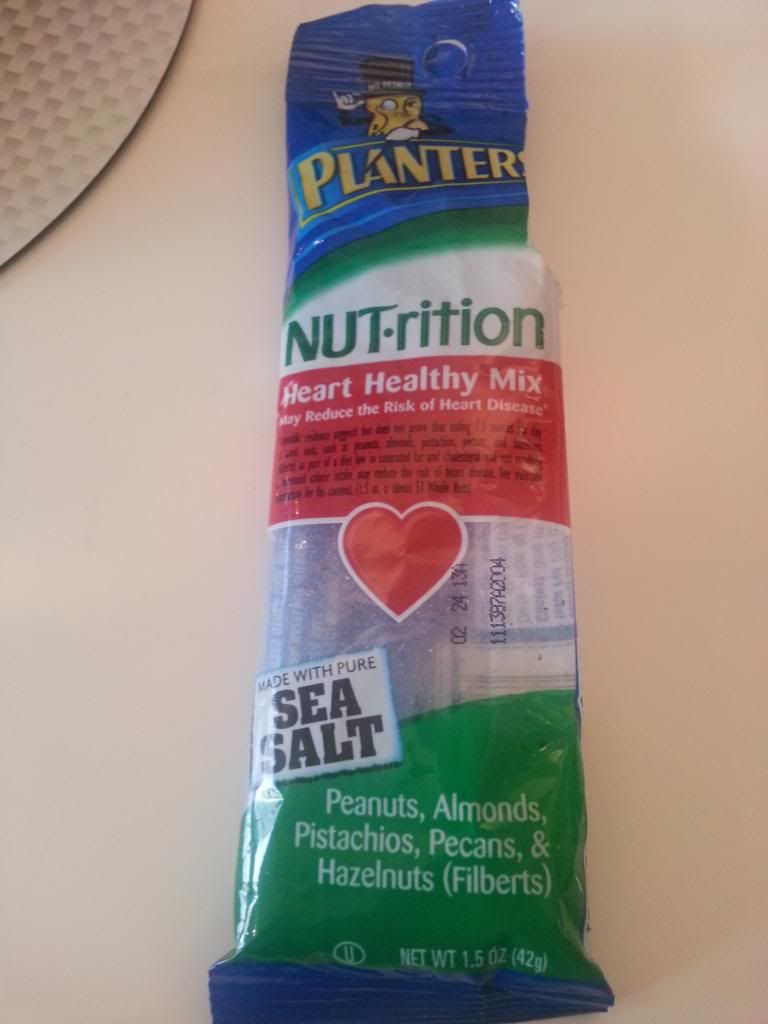
NUT-rition: nuts for the health nuts conscious.
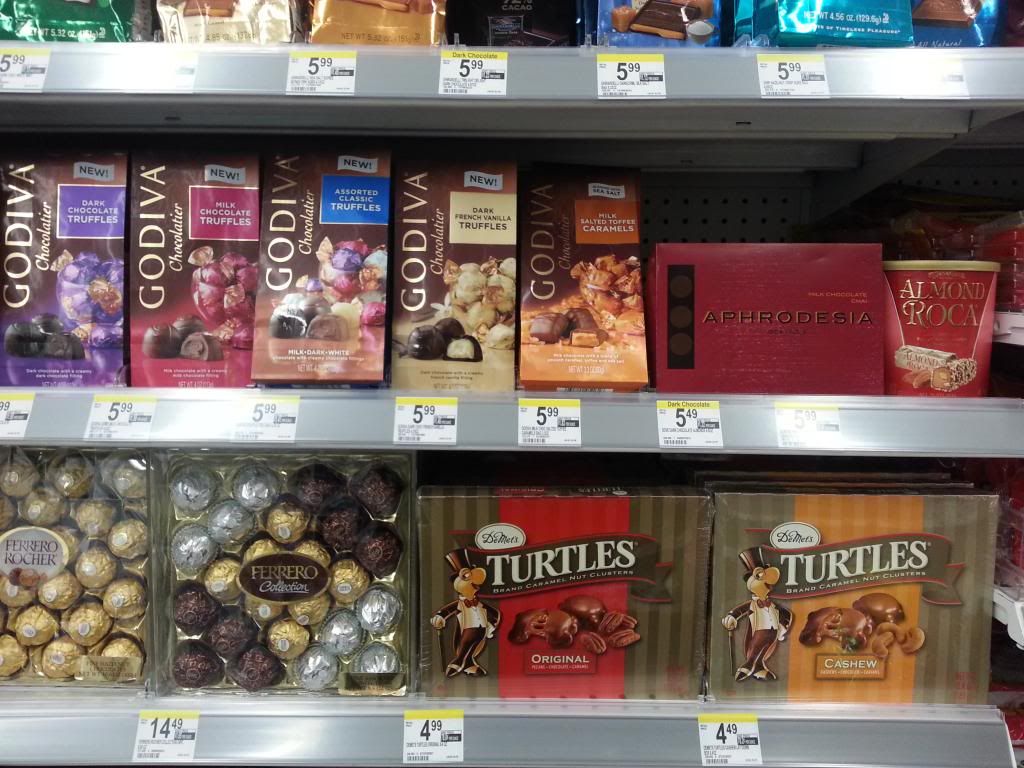
The Good, the Bad, the UGLY
Gallery
This gallery contains 12 photos.
Good packaging has the kind of aesthetics that is pleasing to the eye and sells without having to “sell”. Essentially, what that means is having the appeal where why or how much does not count, the customer just buys … Continue reading