About bs103741

5081190214361677

Moma

Link


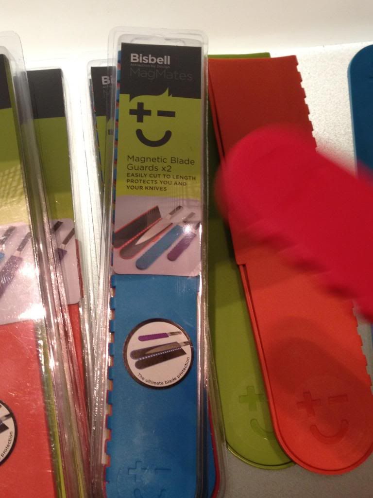
This is a magnetic case protector for knives. The outside of it is made of silicone rubber. This object can be used for all knife sizes. The magnets on the inside of the case simply attracts itself onto the knife blade, making it safe to carry knives around. I think this case is very useful for people who like to travel or need to carry a knife around to prepare their food. They dont have to worry about how to pack the knife because with this product, you can basically pack it anywhere. The material  is very soft and flexible so you can cut the product til it fits the knife size perfectly.

becky.shum Vintage vs. Contemporary

Link

http://i1277.photobucket.com/albums/y481/bs103741/6a00e39332d009883401156eda85b4970c-800wi.jpg

http://i1277.photobucket.com/albums/y481/bs103741/41GrnPg_1.jpg

Coca Cola is known worldwide to be a classic beverage. In 1950’s the drinks were sold mostly in narrow glass bottles with the brand of the drink printed on the bottle itself. No use of color was shown on it besides what is used for its brand name. As the decades go on, the coke bottle has slowly started to change and soon, the well known bottle changed into a shorter aluminum can. The can is displayed with a blast of red color and their coca cola logo is imprinted in its signature typeface onto the can in a shade of white. Although, this can be viewed as a drastic change, the consumers are still able to easily recognize the product due to the consistency of the logo and brand name.

Unsuccessful/ Successful Packages


I find this bottle to be a very successful packaging design. I like the way the bottle includes all information the consumer needs to know, yet it displays this in a clear and organized manner. The package design looks clean. I love the way the bottle displays a open zipper with fruit pouring out. This automatically makes the drink stand out amongst the rest. Each of the different bottle easily shows what flavor it is just by the look of the image as well as the corresponding color difference. The lean bottle design makes it easy to carry.

I believe this chocolate packaging is unsuccessful. The shiny packaging does not make the product attractive. There is nothing on the package that makes the product stand out or at least lets the consumers know what that product is. To me, the package looks plain and empty, despite the amount of space used for the name. Simply looking at the package design, one is not able to tell that it is a food product.

Becky Shum