About kk089980

5081190214034340

Vintage VS Contemporary– Kylesha Kea

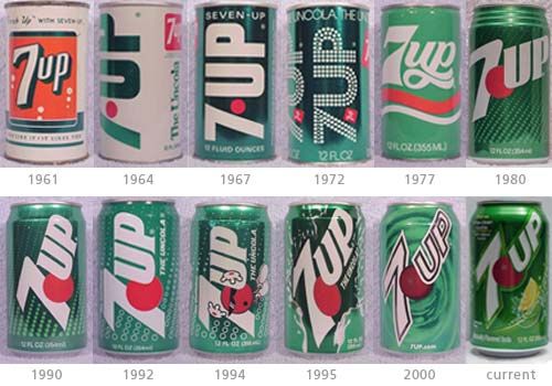
As you can see, 7-UP went through a lot of changes over the years. Only in 1977 and 1980 did they make the word “7-UP” horizontal instead of diagonal. In 1967 is where they really started making the can all green with white letters instead of 1964 where the words were in green letters. Starting in 1964 is where they tried to incorporate the color red into each of their cans and they kept that color through out. They also seemed to be using a San serif font through out every year.

Looking at this picture, you can sense that they tried their best to keep the layout the same as possible as not to confuse customers.


MoMA Packaging– Kylesha Kea

This is a cup holder that I found at the MoMA store. I like it because it is something that I can use in my daily life. The packaging is straight forward and I like the way that they made the letter “o” in the word die-cuts to show the color of the product that you will be buying.

The way that they stretched the letters put was the only thing I didn’t like abut the package.

Successful and Unsuccessful Packaging

Successful Packaging:

Unsuccessful Packaging:


Successful: I love the tea bags. If I would to see this in a store, it would grab my attention right away. The design is cute, clever and fun. I love the fact that the tea bags are in the shape of shirts on hangers and I also love how part of the packaging is a mini “closet” for the tea bag hangers. The fact that it can function well as a tea bag by hanging off the side of the cup is genius in my opinion.

Unsuccessful: This bottle would catch my attention but for the wrong reasons. The Dial packaging is a complete FAIL. putting the word “yogurt” as a part of their hierarchy wasn’t a smart idea because when I looked at this I thought “Oh cool. Dial is making yogurt now?” But that isn’t the case. It is really a body wash with yogurt with vanilla and honey. This can confuse many people looking at this bottle. I think that putting the word yogurt into a fancy font and making it big isn’t a good idea since it can lead to confusion even though if you look below it it says “refreshes thirsty skin”.

— Kylesha Kea