About mt074989

5081190214495731

Unconventional T-shirt Packaging – Maria Torres

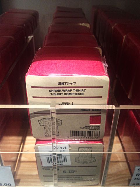
I have heard of t-shirts rolled up into a can but I never could imagine that an actual tee can take up so little space. Featured here is the packaging for crinkle style t-shirts. Apparently we don’t need to wonder why these tees would be crinkled.

I picked this product packaging not because of some fancy and complicated printing technique, but because of what this package contains. We are not used to seeing clothing packaged in such a way. If the label did not explicitly say the product’s name, it would take me few wonders to figure out what really is inside this perfectly compact cube. I imagine the purpose of sale here is not really the t-shirt itself but rather the way it was packaged. As I looked at the product itself, it was nothing particular indeed – maybe it would give out some vintage vibe if worn by specific body type. But I must admit, that packaging gave a way to my loud “wow.”

Other than that, it is just a tee compressed into a cube, wrapped with simple rough cardboard paper with clean technical print, and all of it tightly shrink wrapped. It seems so simple and easy, and in my opinion source of good design is often found in simple and mundane.

Maria’s Idylla with other chocolates

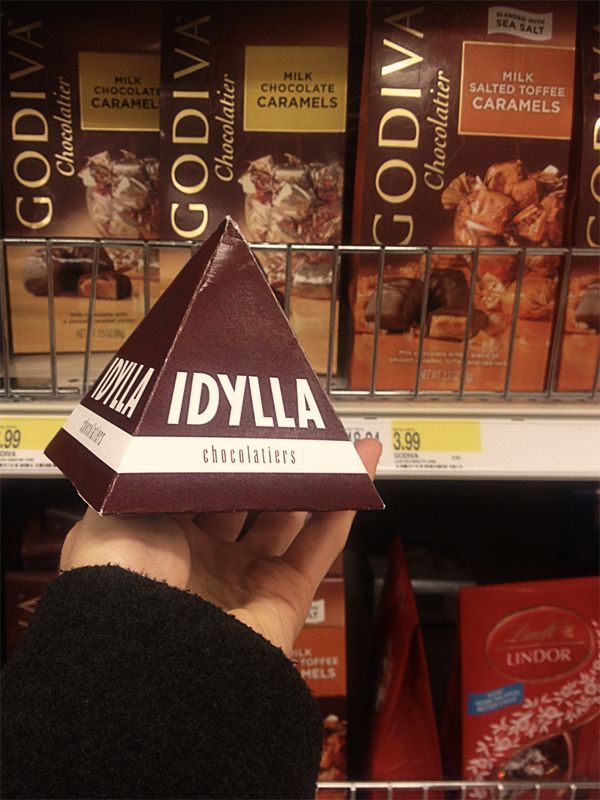
This is my Idylla Chocolatiers Package in store environment. By the time I took it on another trip in my bag, it became seriously squished.

I didn’t place it directly on the store’s shelf to avoid being entangled in a “shopkeeper’s privilege”. But, I guess, it is how Idylla would look like in Target’s section of chocolates that, nota bene, are placed all together anyway.

Vintage vs. Contemporary by Maria Torres

In the beginning one must consider which product has survived long enough to have experienced the journey from vintage to contemporary. Which product is known to have been around for at least twenty years? Well, let it be Tide, as we all know it.

The promise of 5 cent savings must immediately give out the hint in regards to which package goes back in history. I believe this vintage package reaches back to 1950’s. Although the incandescent light to which the picture was probably taken may have distorted the true coloration of the package, one can still see that the color theme of Tide packaging has remained the same. Now more vivid and saturated – orange, yellow and dark blue have remained the trademark colors. On the other hand, we can observe that dimensions of packaging have changed; swirls have become circles and the “dot” in logotype has finally found a straight path over “i”. The newer box enjoys the advantages of computer magic where regularity and even spacing are just few clicks away. Also, when I was searching for a vintage packaging, I wanted to find one that includes the notable ad medallion which these days has a rare appearance unless designer purposefully chooses a theme of vintage elegance.