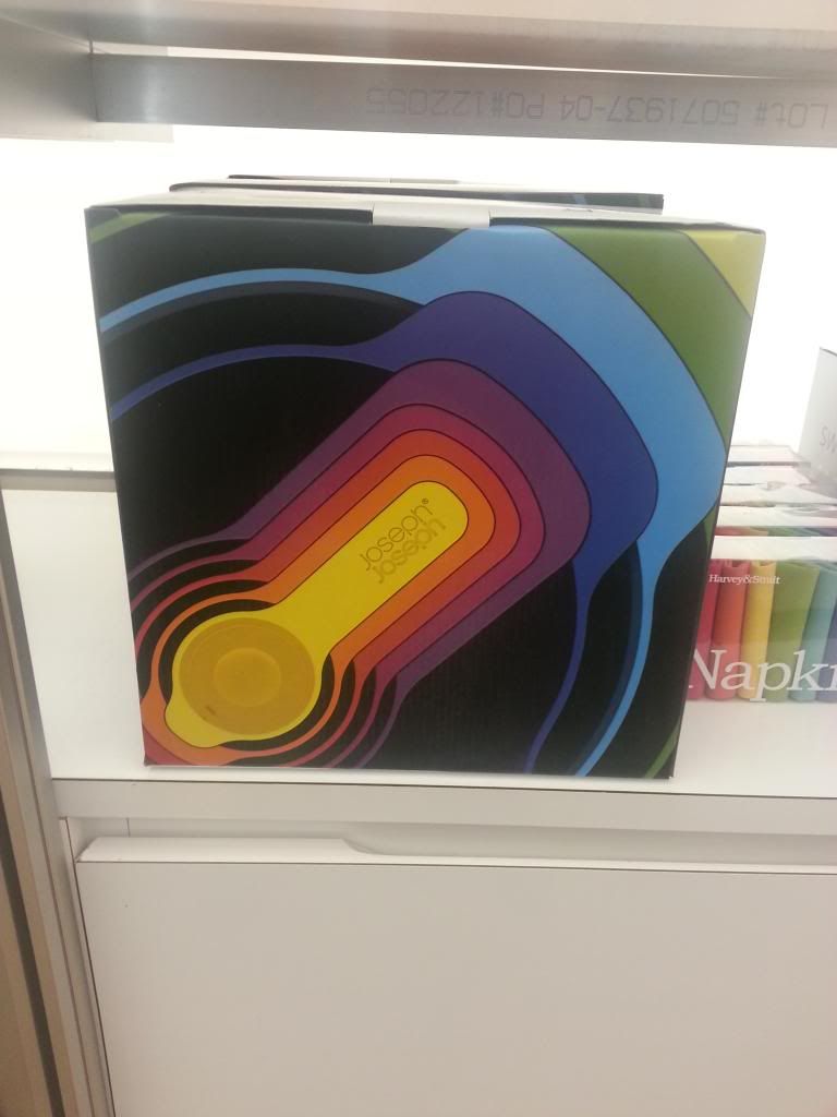
The reason this packaging works so well, is that it does not oversell the product. There are no special techniques, only a box with a photograph of the product. Even the logo treatment is minimal. The logo is on the product that is photographed; to add it anywhere else would be over-designing.
Category Archives: MoMA
MoMA, Gorillatorch Flare, xixi.feng
This product is call a Houseware tool call Gorillatorch Flare, I think its most interesting because it’s design is very unique in look and it has very efficient functions, its light, has different color of lights, flexible, magneticable and water resistant. The product has a very attention grabbing logo name that is manly and strong. The product is packed in a simple hard plastic package with logo name on the bottom and function description that says” 100 lumes” next to the product, the product is visible showing its specialty by displaying its flexible legs twisted around a tube, and magnetic feet sticking to the tube to emphasize the logo concept of the animal gorilla. A sample product is also displayed next to the box, its really cool and makes me want to buy it!
besides the one picture i took from store, I added two additional image posted for the product for a better view of this great product.
Nathalie Escobar — MoMa
(Sorry for the inconvenience. Apparently the site keeps repositioning the image)
Though this package is very minimal, I love how the vector art and text complement each other. It is very subtle to the eye and I love the design of this candle holder. The texture brings out the blackness of the candle holder and accentuates the fine lines to create the illustration. This is simple and still has the personality to stand out.
MoMA: Two packages analyzed. – Tamara Rosenfeld
http://img402.imageshack.us/slideshow/player.php?id=img402/3783/13538887127et.smil
I chose two packages to analyze which I found at MoMA. The first is a Typography Calendar for 2013. It is in a small, though not tiny, box. The colors are orangey-red, white, and black. The typography on the box itself is refined, the color of the box is eye-catching. It advertises the product inside very well. The description on the back of the box is succinct, and makes one want to know more and open the calendar.
The second package is cylinder-shaped. It is a calendar with the phases of the moon. The outside of the package is all black, with almost glowing white type on a sticker around the center of the cylinder. It would make anyone interested in astronomy eager to open it, and anyone only mildly fascinated with the moon desirous of looking at it some more, perhaps purchasing it.
Please see the link for a slideshow of the images of the MoMA packages.
MoMA
Visit the MoMA design store at 53rd between 5th and 6th or at 81 Spring Street
between Crosby and Broadway. Take a photograph of a package you find particularly interesting and write about it the package.
Talk about how the design contributes to the “selling” of the product, and how well the package design reflects the product itself.
Write about what techniques you think were used to create the package. For example, special folds, closures, unusual materials, die cuts, etc.
Post your photograph with the text on the blog under the category “MoMA”. Be sure to include your last name on the post.
MoMa Design Store
This product is sold in the Soho Moma Design store and I thought it was creatively packaged as it attracted my attention. The product sold within this package is clothespins in the shape of an sparrow. This is a twist on a classic item sold for simple household use and it transforms the act of drying clothing into a fun activity. The idea of positioning different colors of these clips on a drawn, 2D laundry clothesline is brilliant. The packaging is extremely successful because it is imaginative, creative, and descriptive, while also being simple and clean. This packaging is loosely definitive of the phrase, “a picture is worth a thousand words”.
By: HUI HUI YE