-becky

-becky


–Kylesha Kea


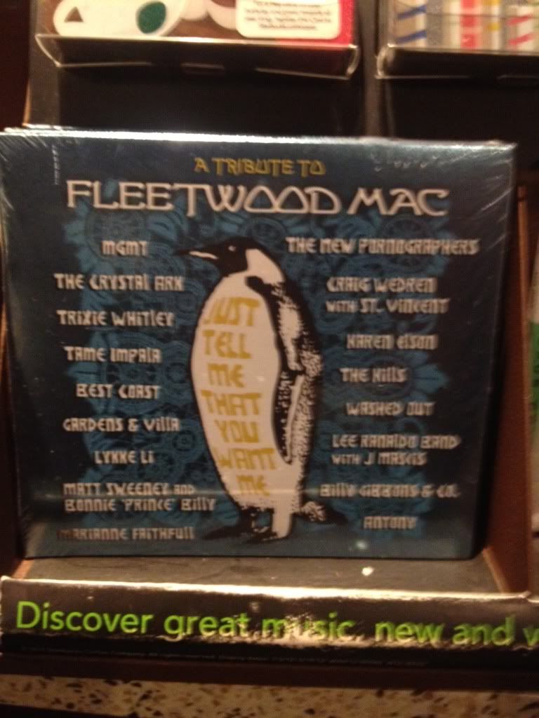
Bad Design

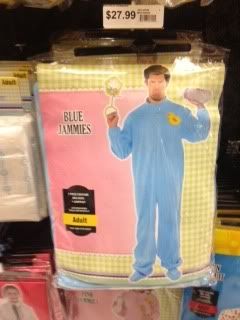
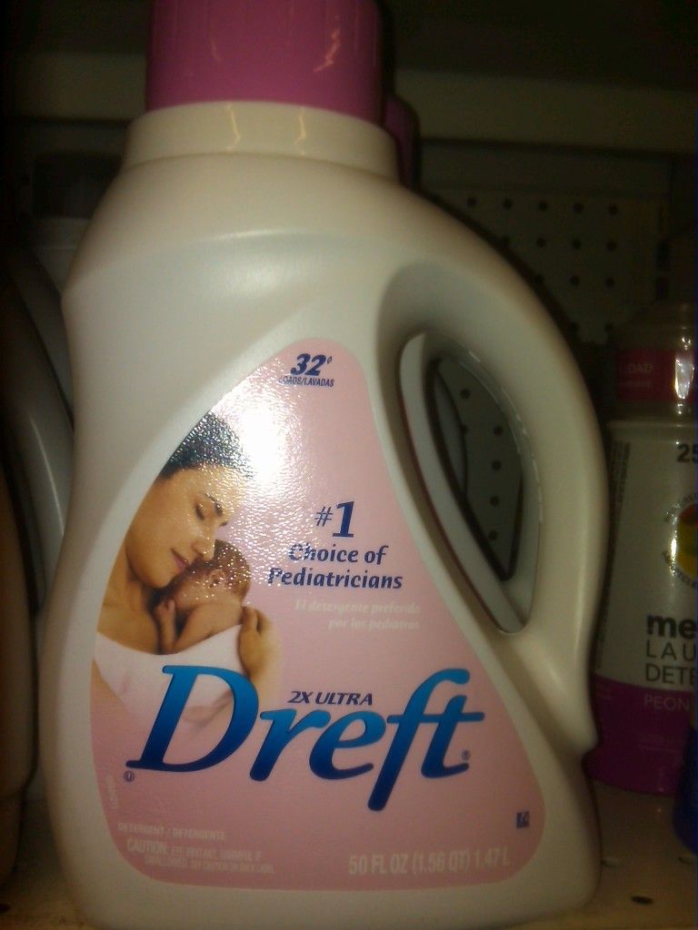
The giant baby with the package has to be the worst one in this group of images I took while strolling around the city. Its just so horrible, there’s no effort put into the design of this package. There’s so much unnecessary negative space, they used colors that don’t work well together, and also typefaces that don’t go together. Its just a mess.
Good Design
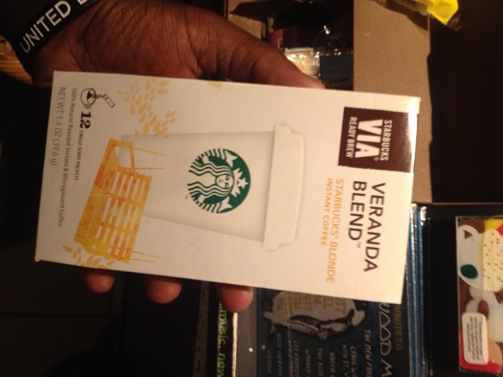
Out of these series of images I would have to say I like the Starbucks Via package the most. Its right down my alley and looks like something that I would design. I like the simplicity of the package; its very clean, and just looking at it makes me want to buy it. It has all the information you need, and the typefaces used work well together. The colors are perfectly chosen and the graphics add liveliness to the package.
1. Jelly
2. Candle Light
3. TEA BAG
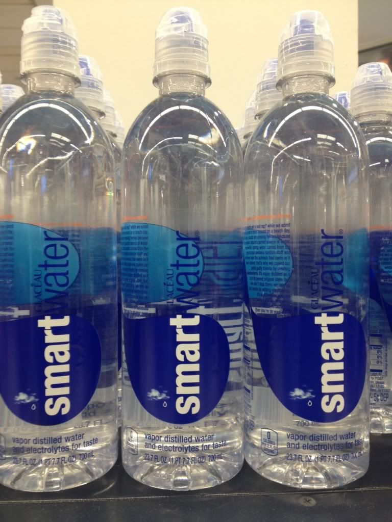
4. Vitamin Water Bottle
5. Wine
Successful Wine Package:
The Wine packages are designed by The Grain Company for A Restaurant name Wildfire in Australia. The company used the concept of tradition venetian Theatre Mask, where with each mask on the wine represented a character and mood to deliver the notion of mystery, joy,fun,playfulness of dining at the restaurant. The mysterious and unique masks on the package grabbed my attention immediately and the design really made it stand out among other wine product packages. Although the graphic does not accurately reflect the wine in the package, its concept is still entertaining and it will still persuade the consumers to buy and consume the wine. Besides from the concept, the material of the bottle helps to deliver the feel of an elegant inexpensive wine.
The Unsuccessful Packages:
1. Ketchup
2. Hershey Chocolate
3. Energy Drink
4. Emergency Candle Kit
5. Candle Stick
Unsuccessful Energy Drink Package:
The Energy Drink Package is unsuccessful because the package is very complicated , it has too much information on it. It does grab attention, but its negative attention and stands out very negatively compared to other energy drinks. First, the font of the brand name is really ugly, the graphic is weird , scary and does not reflects the product in the package. In addition there are too much color contrast which caused the product design to loses focu and became too complicated.
Everyday we are exposed to visual designs ranging from beautifully executed pieces to the not so appealing. What makes a packaging design successful is the aesthetics and if the product has the potential to ‘sell’. Pricing is not always a factor for an individual’s demand for a product. If the package looks good then people are willing to buy it regardless of the value.
Here are examples of products that I have came across which were successful. Some of the products state the obvious but are still very successful until now.


The unsuccessful packaging designs were brutal and I could not help but nitpick at these products. All of these items lacked creativity and the design could have done a better job as well. These products even if it were to be a no name brand have the potential to compete with popular brands.
Here are some examples that were unsuccessful.


In conclusion, I thought that the Imagery wine bottle was the most successful and the hair gel to be most unsuccessful. The wine bottle design was clean, simple and from the illustration, the message was easily clarified that the people have passion in making this product. The design was not text-heavy at all, none of the details were fighting with one another but instead, the elements together were complimentary. Also, this was a good use of space within the design as well. As for the hair gel, the design is dull and has no outstanding personality. On a positive note, this product is straight-forward about the contents and what its objective. Besides that, it could have been designed a little better even starting with something simple such as the readability of the text.
Good
The Absolute Brooklyn bottle to me is an example of a good package design. When I first saw it I immediately wanted to buy it. I think most of the absolute vodka bottles are well design, but this one especially. The company has started to make certain vodkas that were inspired by certain areas of the country and the designs are trying to represent that area. Through back image of a stoop is magnified through the clear vodka and gives it a more fish eye view. On each step in a different nickname for the borough of Brooklyn. The color palate chosen is a good one as well, the greens and browns go nicely together.
Bad
Raw Meal, which I’m guessing is some sort of protein powder of some sort is a package design that I do not find appealing. The package itself is too busy. There are a lot of colors and background images and seals around the package it took me a minute to even realize what it was. I also do no like the lockup they have for the word raw meal, the triangle in a different color confuses me. My biggest concern with the package is that I don’t know where my eyes are supposed to go. I see the raw meal then I jump seal to seal and finally to the bottom where the description is where I finally figured out what the product was.

Out of these 5 packages, the package for the Apple iPhone 4S is the most successful. Most of Apple’s package designs are similar – a simple white box showing the product with a few details around the package. It’s clear and to the point, and it presents the product clearly. Even if the consumer knows what the product is, it lets them know that that box is holding that product. I personally like it because it’s not cluttered and cramped. By having an uncluttered package, it makes the product look better and more desirable. As a business, that’s how I would want my product to be presented.

The most unsuccessful package out of these 5 is the Sobe Lifewater bottles. It’s just unappealing and there’s too much going on. The shape of the bottle doesn’t work, the colors are not appealing, and the design is cluttered. The idea of having their mascot wrap around the bottle is pretty clever, however, it wasn’t executed well. It just clutters up the bottle and makes it unappealing. Also, having the lizard on top of the bottle again seems a little repetitive. The colors they chose for the bottles are also unappealing, especially that green/yellow bottle. They had some pretty good ideas for the design, but it seems like they tried to include all of them. However, these ideas don’t work well together. If I was Sobe, I would not have let that bottle hit the shelves.
Successful Packaging

I chose UrbanEars as my example for successful packaging. I bought a pair of headphones a few months ago and was immediately drawn by the neat packaging and color. Among all the other headphones this product caught my eye. Immediately one notices the interesting clean and crisp packaging: With a to-scale image of the headphones in front, the color of the product is exactly the same as the color of the package, a detailed yet easy to read description on the back. You know what you’re getting immediately. I love that. When opened, the inside was even more surprising: extra earbuds were in a small triangle shaped package that fit neatly in the geometric shaped cut out inside, the earphones themselves were also packaged very neatly as well as instructions and other literature related to the product. Although I use my earphones daily, I still have yet to throw the package out and keep it to store extra headphones. I believe this packaging is a perfect example of successful packaging, it certainly grabbed my attention.
Other Successful Packaging:


Unsuccessful Packaging

My example of unsuccessful packaging is Bounce’s Dryer Sheets. I’m guilty of brand loyalty for some items such as cleaning products. I’ve always used the Bounce’s dryer sheets because it does exactly what it’s supposed to do but I only know this because my family always used them and I just continued the tradition since. But if I were to pick an item based on packaging alone, I wouldn’t choose this product. The box does come in bright eye-grabbing orange and yellow colors, however, if you are to take a good look the box is flimsy and gets easily crushed. Dryer sheets fall out and the strong scent gets on anything near it. I once placed it next to a loaf of bread and my bread tasted like the dryer sheets. I feel this package can be improved by being placed in a more durable and reusable plastic container.
Other Unsuccessful packaging examples:


-Denisse Cruz