Successful and Unsuccessful Packaging – Stefanie Seet

The Successful:


Crealto (Espresso cups)

Arta (Tea Leaf Infuser)

 Mrs. Meyers

Tea Forte

Urbanears

My favorite packaging all year is Urbanears headphones. I love the attention to design for the box itself. The box has a very smooth texture – especially, compared to a heavy cardboard-like box. Also, the texture is the same smooth texture as the phone, earpiece, texture. I like how the front and back show the actual size of the headphone and how the left follows the right side. Also, every single box color matches the color of the headphones. Even the inside packaging is so nicely designed. You open it up and you see how the headphone can be folded up. All of the design of the brochures on the inside also go with the aesthetic of the company and the packaging. Urbanears clearly thought the packaging through very thoroughly.

The Unsuccessful

Sur La Table Spices

Sagaform tea design by Camila Engdahl

Sparkling Concord Grape juice

 Jewelmint

5 Hour Energy

For a company that is on the rise, 5 Hour Energy really needs to redesign and rebrand their packaging and image. Above is two different types of items they provide. First, the font and logo is bad. Second of all, there is almost no design involved in this. It looks similar to a design that would be on a TV infomercial. The color used was not used creatively. And the box design is so simple. Even the image of the ‘berry’ looks like clip art.  It baffles me how this product even became popular.

Successful packaging


Successful Packaging

Simple, yet pretty and effective label design for this honey from France.

The packaging above are example of successful ones, the packaging clearly shows the product purpose, the shape of the package is also easy to handle and store.

Unsuccessful/ Successful Packages


I find this bottle to be a very successful packaging design. I like the way the bottle includes all information the consumer needs to know, yet it displays this in a clear and organized manner. The package design looks clean. I love the way the bottle displays a open zipper with fruit pouring out. This automatically makes the drink stand out amongst the rest. Each of the different bottle easily shows what flavor it is just by the look of the image as well as the corresponding color difference. The lean bottle design makes it easy to carry.

I believe this chocolate packaging is unsuccessful. The shiny packaging does not make the product attractive. There is nothing on the package that makes the product stand out or at least lets the consumers know what that product is. To me, the package looks plain and empty, despite the amount of space used for the name. Simply looking at the package design, one is not able to tell that it is a food product.

Becky Shum

Successful and Unsuccessful Packaging

Successful Packaging:

Unsuccessful Packaging:


Successful: I love the tea bags. If I would to see this in a store, it would grab my attention right away. The design is cute, clever and fun. I love the fact that the tea bags are in the shape of shirts on hangers and I also love how part of the packaging is a mini “closet” for the tea bag hangers. The fact that it can function well as a tea bag by hanging off the side of the cup is genius in my opinion.

Unsuccessful: This bottle would catch my attention but for the wrong reasons. The Dial packaging is a complete FAIL. putting the word “yogurt” as a part of their hierarchy wasn’t a smart idea because when I looked at this I thought “Oh cool. Dial is making yogurt now?” But that isn’t the case. It is really a body wash with yogurt with vanilla and honey. This can confuse many people looking at this bottle. I think that putting the word yogurt into a fancy font and making it big isn’t a good idea since it can lead to confusion even though if you look below it it says “refreshes thirsty skin”.

— Kylesha Kea

Unsuccessful & Successful Packaging by Lisa Kurner

#1-5: Unsuccessful Packaging

#6-10: Successful Packaging

#1 This is a packaging for a peanut butter jar made by the Saratoga Peanut Butter Company. I think this is an example of an unsuccessful packaging because of its imbalanced use of typefaces and layout. First, the three different typefaces used on the front are clashing and do not seem to have a well-balanced hierarchy. Some words even have drop shadows which makes the design look too complicated. Also, the colored circle behind the writing is not an effective background, but rather a distraction. The gradation in the center of the circle and the combination with the striped background make it even worse. Overall, this packaging seems not to have a clear concept and provides the customer with an overload of design elements.

#6 This packaging from AmericanApparel is an example of a successful one. It is simple, clean, and straightforward. The graphic on the outside helps consumers see exactly what the product looks like and therefore allows them to know what to expect from the purchase. The typeface suits the product image and follows the brand identity. This packaging concept is used throughout the store and is successfully capturing the customers’ attention.


Unsuccessful and Successful Packages

Unsuccessful Packages

  1.  Juice Box
  2.  Chocolate
  3. Cigarette Box
  4. Wine & Glasses
  5. Sneaker Box

All the above are well thought-out designs; however, somewhat they are not attractive.
Especially, the last one “5. Sneaker Box.” It is understandable that the designer is trying to show an eco-friendly, but it is not a good idea for this kind of high-tech running sneaker. This cheap looking package leads customers to think that this sneaker also uses cheap materials. This package may work for shoes like Toms Sneakers.

Successful Packages

  1. Tea Bags
  2. Stomach Medicine
  3. Pasta
  4. Juice Box
  5. Headset

These are quite successful package designs. They are unique and each has a strong concept, yet each product gets favor of it because all the designs are eye-chatchy and attractive. I really like the Headset one. This is very simple and getting straight to the point! It uses the headset as the part of the design to portray the musical note.

Unsuccessful & Successful Packages

Unsuccessful Packaging

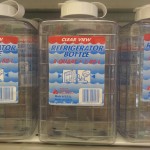
The packaging on the item above is considered as unsuccessful because it sends a confusing message to the consumer.  The typeface used on the package is a boring serif type that does not grab the attention of the viewer at all.  Even though the label is colorful, it still is not fun enough to attract the designated audience, young children.  The clear container that it is placed in does not help sell the product for it downgrades the product, making it look cheap.  So, the ultimate question to ask is, who is the packaging trying to attract with the colorful serif typeface and its “organic” labeling, adults or children?

Successful Packaging

The above package design is a very successful one because it attracts!  This product is called Black Spring Water, water that is infused with a certain mineral, turning the water black.  A glance at this water, being placed on the racks with other water bottles, the consumer will definitely stop and pick up this water.  The other amazing idea included in this bottle design is that after you finish drinking this water, the brand’s creative articulation appears, giving its consumers a surprise ending.

By: Hui Hui Ye (Eleanore)

Unsuccessful and Successful Packages – Tamara Rosenfeld

Unsuccessful Package: Volum’Express Mascara

Though the package grabs attention, I’m not sure it’s positive attention. I think there are other ways to make mascara stand out besides adding bold red to the design. The red makes me think of a red eye, which is not attractive at all. I also do not think the graphics really reflect the product, because of the overdone red coloring. I think that the mascara package looked dusty, a sign that it was a product that did not sell well.
The product itself needs a lot of help with selling, I believe, because it is extremely oversized for mascara. Perhaps the design on it should have been a little more dainty, to balance it out. The design looks rushed; it should look planned out better, even if it is ‘Express’ mascara.

Successful Package: Something Natural Sparkling Water – Blueberry Lemon

This packaging caught my eye in a good way. It does not vary colors much on the bottle; simple, natural, tasteful are adjectives I’d use to describe the packaging. The product looks very appetizing to me. It stands out among bottled water; and it even looks different from sparkling waters. It looks classy. The colors, blue and white, reflect the product very well. It is very creatively done and I would think it sells well.

Volum’Express Mascara (example of unsuccessful packaging design)

Sparkling Water (example of successful packaging design)

Other Photos of Successful Packaging Designs:

Persimmon

Origins

l’occitane

l’occitane 2

Garlic Flatbread

Other Photos of Unsuccessful Packaging Designs:

snackbars

Nivea

Coppertone

wafflemaker

Ajax


Collect Packages

Collect 5 samples of what you consider successful package design and 5 samples of what you consider unsuccessful package design.

You may take pictures at the store with your camera or phone, or find samples on the internet. If you wish to purchase the product, photograph it and bring the package to class.

Do  not limit yourself to one source. Visit many stores, including gift shops, museum stores, food shops, specialty shops, supermarkets. Be creative with your choices. Be sure to choose your packages from different sources.

Write one paragraph about one of the successful packages and one paragraph about one of the unsuccessful packages, indicating why the package is successful or why the package is unsuccessful. You will be writing about only two packages.

Consider the following criteria:

Does the package grab your attention?
Does the package stand out among similar products?
Do the graphics accurately reflect the product in the package?
Do the materials used help “sell” the package?

Schedule
Due Sept 10, posted on blog.

Categorize you post as Blog Homework 1