Vintage vs Contemporary – Kiichiro Ishikawa

Vintage

Contemporary


Package I picked up is “Dr. Pepper Diet.” I believe that most of people’s image of this product is in white color; however, actually, it used be in blue color. I would say the concept of the design has not been changed too much from the old days. It uses almost the same logo that laying out from left to upper-right corner, but the background is in the blue color; I just think it does not work and it was a correct decision that they changed it to be in while color.

Vintage vs. Contemporary – Kevin Chan

I have a slight fascination with vintage soda bottles. I like the way they were designed. Most were clean designs that used shapes that made the design work. My favorite soda package design is the “throwback” Pepsi designs. I like how simple and clean they were. Even the bottles with the cursive writing look simple and elegantly designed.

Vintage

Contemporary

Vintage VS Contemporary – Colin McKeveny

To compare vintage and contemporary packages I decided to go with Kodak.  In this case I believe that the vintage Kodachrome package is a lot stronger than the contemporary film package.  The Kodachrome package is simple and very eye catching.  The Kodachrome package was from the 1960’s and shows a great design.  The brand is built right into the name of the product, which makes the product and brand synonymous.  I really like the arrowhead pointing toward the “Daylight Type” which shows it’s importance.  The slab-serif of the product name shows a hierarchy in the package.  The rest of the type is a light extended sans serif, which works nicely with the package.  The colors are simple and have a very professional look.  I think this package is so beautifully done.

When looking at the modern film package, I am just disappointed, it seems over designed.  The drop shadows and gradations make the product seem more mass market, lesser quality.  They have kept the colors the same, but with the gradations, it doesn’t have the same professional look.  The one aspect that I really don’t like is the P3200 TMAX and there twice.  The top looks well designed with a contrast of weight, however your eye goes right to the second one.  The change in type from a sans serif to a slab serif for the numbers doesn’t make sense to me, along with the white drop shadow.  Maybe this is why Kodak has declined so much in the last 2 decades.

Vintage VS Contemporary– Kylesha Kea

As you can see, 7-UP went through a lot of changes over the years. Only in 1977 and 1980 did they make the word “7-UP” horizontal instead of diagonal. In 1967 is where they really started making the can all green with white letters instead of 1964 where the words were in green letters. Starting in 1964 is where they tried to incorporate the color red into each of their cans and they kept that color through out. They also seemed to be using a San serif font through out every year.

Looking at this picture, you can sense that they tried their best to keep the layout the same as possible as not to confuse customers.


Vintage vs Contemporary packaging: Cadbury Creme

The vintage packaging is simple in design. The design on the box depicts one sans serif typeface. The colors used are limited to just two: a red and gold. No images, just words and a few small lines and circles to embellish the package a bit. All in a closed box.

The contemporary package is a bit more complex in design than the vintage package. There are more colors, font sizes, die cuts, several images of the chocolate and bunny, the logo has also changed. The chocolate eggs are also packaged in colorful foil. I’m not sure if the vintage package went as far packaging the separate chocolates as well.

Both packages use a san serif font. I personally prefer the simplicity of the vintage package. The contemporary package looks cheesy and cheap. The vintage packaging has a more classier feel. A little goes a long way.


-Denisse Cruz

Donnell Culver – Vintage Vs. Contemporary


Tropicana was founded in the late 1940’s. They went through a few different logo changes, including a failed one recently. The beginning package features a character called Tropic-ana with a fruit basket on top of her head. This was during a time when characters were widely used in the advertisement of products. For typography of the vintage package they went simple choosing all san serif typefaces to convey their message, the contemporary package for the most part kept this idea, but also has serif typefaces in my guess for hierarchy and differentiating the important information from the less important.

The colors in both packages have different feels to the. The vintage package features only one color, which keeps the package simple, but the contemporary package features a range of different colors making the product more desirable, and interesting. The contemporary package also has more of a tropical feel to it which link well to the name.

Nathalie Escobar — Vintage vs Contemporary

IBM, otherwise known as International Business Machines, is highly recognizable all over the world. The company was founded in New York on June 15, 1911 as a Computing-Tabulating-Recording Company (CTR) that consisted of three merger companies: The Tabulating Machine Company, the International Time Recording Company, and the Computing Scale Company. Since the expansion of CTR’s activities was rapidly changing, it forced to change the company’s old name. Around February of 1924, CTR’s name was formally changed to Interntional Business Machines Corporation, IBM for short, and adapting to a rebranding of the company’s logo. Over the span of years, the company has used the IBM logo on numerous products such as stationery, vehicles, service packs, flags, etc. in order to promote recognition. Hence the first IBM logo was created. However, after 32 years, the globe shape logo of IBM failed to accomplish its recognition for the company. The globe design was then altered to simple typographic form “IBM” and the typeface that was used for this execution was Beton Bold. However, the logo was more refined in 1972 by the famous graphic designer, Paul Rand. He kept the same typographic treatment on the IBM logo but replaced the typeface with City Medium. In addition, instead of the simple solid color, Paul Rand added some dimension to logo by using horizontal stripes, suggesting a futuristic and dynamic aesthetic.

IBM’s logo is an image of innovation and expertise, especially how they have reinforced their strength within the industry. Their logo finally gained the recognition they have always wanted simply from the logo itself and how much they have built within their customer loyalty. Furthermore, IBM was also known as “Big Blue” based on the fact that their logo was swapped from the black and white features to a subtle blue. However, “Big Blue” refers to the company’s size in the market and of their established trademark that consisted of the blue eight bar design. In all honesty, IBM has came a long way in branding and marketing in order to get where they are now in business history.

I love both vintage and contemporary IBM package designs. There are simple simple tweeks to the packaging but Paul Rand kept the designs as original as possible. The only changes were made to the logo which was mentioned before, it was rebranded with horizontal lines and the kerning was much tighter than before. I love how the white space interacts with the solid colors. It doesn’t scream the brand compared to other newly branded companies.

Hair Net from the 1920s

Vintage versus Contemporary Package – Rosenfeld


From a design point of view there are a few differences between this 1920s graphic and today’s types of graphics.

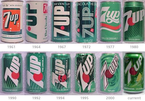
First the typography. There is no real cohesive flow to the images’ fonts. They are all over the place: Handwritten script, sans serif bold, serif, italic. The typefaces are thrown on. Today, products are meant to advertise themselves on a shelf. Therefore, fonts are chosen carefully, and are not thrown on; and they try to impart what the brand has to offer.

Second, colors. The colors are bright red, yellow, white, black, navy blue. The colors to choose from for packages were not many in the 1920s. Today we would see a selective color scheme. It would be chosen with purpose; perhaps a bright color paired with one that is muted, so that the colored part would be more evident or stressed. Or, nowadays, maybe a number of colors, but ones that would work well together and not fight with each other for attention.

Third, simplicity. The font choices in the image are simple, as are the color choices, because the 1920s offered less availability of what to use. Now we have a whole lot more fonts to choose from; many different colors and shades; and even different materials that can be printed on.

Fourth, abstractly, the tone of the design. The 1920s image speaks to a different era, during a simpler time. There were no computers, no cell phones, and TV was not in the home as yet. Now, we are a more complex society, and maybe that is why we try to simplify or pare down the design sometimes, to make life less hectic, to make us focus on what the brand wants us to.

Vintage Packaging: Typewriter Paper

Eaton’s Berkshire Typewriter paper, Eminence Bond

Typography Typographical hierarchy- A large slab serif logotype, “E” for Eaton’s Berkshire; a serif with drastic thick/thin typeface for paper style; a narrow sans serif for specified product details.

Color The color palette is simple, yet busy at the same time- iconic of early design.  I noticed that most vintage packaging has a bold color (i.e., red, blue) or a muted color (i.e., beige/cream, mint green, pistachio) or the occasional use of both.  The use of saturated teal as a backdrop for serif typeface lends to the idea that the package is vintage.

Simplicity The design is simple because it has only 2 major factors: color and typography, however it is also very loud, busy because of the execution. “Good” design today is very simple with very little fuss.  A giant logotype would be too much for today’s packaging.  There are 3 typefaces used when 2 would have worked.  In addition to the typefaces used, type placement is inconsistent.  The text at the top is centered, while the rest is justified left.

Overall Tone The one reason why I believe this package to be vintage (other than typewriters being obsolete) is the use of serif typefaces.  Older, vintage packages had script or serif typefaces, whereas now a majority of typefaces used are sans serif.  Designs that use serif typefaces today are usually trying to appear vintage.

Typewriter paper