Vintage vs. Contemporary (Stefanie Seet)

To the left, is Nestle’s hot chocolate package from around the 1930’s. This package was definitely limited by the printing at the time. There is only three printed colors. Everything is in a simple layout. The main font is rounded and the “instant” and “just add water” is in a script – very popular design method during this time. A script font made things look interesting. Also everything is in simple icon images. The kearning in “whole milk” is also very bad.

Compared to today’s design. Instead of an icon, we are not limited by printing. We can now print the actual image of the product. We can print in many colors and provide dimension in our package design. There is also noticeably less type. Because we provide that large image, text is not necessary.

becky.shum Vintage vs. Contemporary

Link

http://i1277.photobucket.com/albums/y481/bs103741/6a00e39332d009883401156eda85b4970c-800wi.jpg

http://i1277.photobucket.com/albums/y481/bs103741/41GrnPg_1.jpg

Coca Cola is known worldwide to be a classic beverage. In 1950’s the drinks were sold mostly in narrow glass bottles with the brand of the drink printed on the bottle itself. No use of color was shown on it besides what is used for its brand name. As the decades go on, the coke bottle has slowly started to change and soon, the well known bottle changed into a shorter aluminum can. The can is displayed with a blast of red color and their coca cola logo is imprinted in its signature typeface onto the can in a shade of white. Although, this can be viewed as a drastic change, the consumers are still able to easily recognize the product due to the consistency of the logo and brand name.

xixi.feng Vintage vs Contemporary Package


1948

  2012

2012


typography,colors,simplicity,abstractly,overall tone

The  early Pepsi cans from 1948 had a distinctive feature of bottle cap and can choices, the company market the product by designing an odd triangle top portion of the bottle and the picture display of the brand’s cap on the can. Simplicity is reflected by only using repeating color choices of white, blue and red. The 3 colors are displayed in the cap picture, in the bottles boarder and background choices and in the typefaces. Besides the designed logo name, the design also applied Helvetica typeface in regular and italic form.

Contemporary Pepsi designs are shifting toward a more simple design, the logo names are shorten from Pepsi-Cola to simply Pepsi to different itself from its competitor coca cola. The logo are now separated from its logo name, although remaining its 3 symbolic colors, the colors changes its dimension throughout the decades. In addition , the contrast of color in typefaces are eliminated while contrast of direction is applied. The product is as well designed to a more lifestyle concept, by marketing its brand relating to soccer sport and music singers. It’s also targeting consumer populations that concern about health by stating information such as 375 mL and 0 calorie carb sugars.


Vintage vs. Contemporary by Maria Torres

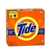
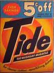
In the beginning one must consider which product has survived long enough to have experienced the journey from vintage to contemporary. Which product is known to have been around for at least twenty years? Well, let it be Tide, as we all know it.

The promise of 5 cent savings must immediately give out the hint in regards to which package goes back in history. I believe this vintage package reaches back to 1950’s. Although the incandescent light to which the picture was probably taken may have distorted the true coloration of the package, one can still see that the color theme of Tide packaging has remained the same. Now more vivid and saturated – orange, yellow and dark blue have remained the trademark colors. On the other hand, we can observe that dimensions of packaging have changed; swirls have become circles and the “dot” in logotype has finally found a straight path over “i”. The newer box enjoys the advantages of computer magic where regularity and even spacing are just few clicks away. Also, when I was searching for a vintage packaging, I wanted to find one that includes the notable ad medallion which these days has a rare appearance unless designer purposefully chooses a theme of vintage elegance.

Vintage Vs. Contemporary

The first package is a vintage package of Rawleigh’s healing powder and the second package is a similar product in today’s market, Neosporin.  The Rawleigh package has many features that indicate it as a vintage package such as, its typeface, color, and composition.  The key indicators of this package being vintage is its script typeface for the company name, the medallion circle that takes up half the package, and of course, the rivers in between the text at the bottom.  The colors are also an indicator, for it uses a faded turquoise and yellow/ivory combination.  As compared to the new package, the blue and yellow are much more vivid and instead of using an all around fade, Neosporin’s package uses the gradient feature, emanating a modern feel .  The contemporary package is much more cleaner and simpler than the vintage one because it uses mostly san-serif typefaces for the descriptions and it contains less text.  The vintage package looks very busy while the contemporary one is straight to the point, stating only the important features of the product.  The vintage also has more elaborate designs in its labeling with a picture of the president, composition of intricate curls, etc.  Raleigh’s package is geared toward attracting customers using emotional benefits and self-expressive benefits, gaining their trust using the president’s picture and stating on the package, “useful for man or beast”.  On the other hand, Neosporin sells their product using a functional benefit approach, clearly stating the functional uses of the product.

By Hui Hui Ye

Vintage vs Contemporary Package

Compare contemporary packaging with vintage packaging. Choose a package from another decade: 1920s, 1930s, 1940s, 1950s, 1960s.

Discuss what you perceive to be the differences from a design point of view: typography, colors, simplicity, and more abstractly, the overall tone of the design.

Post your image with your written analysis on the blog. Be sure to include your last name with the post.