

MoMA packaging – Stefanie Seet

Although this may seem like a normal everyday packaging, I assure you it’s not. From this picture I showed you all 4 sides of the box. The front and back show the product opened and closed. It’s a clean design using the font and name with different languages. It keeps the packaging very simple especially contrasted to the green color. The color is also very nicely indicated on the side corner. It’s simple yet subtle. I also like the choice that the front and back design were kept on a white background. Even though the product contains some white on it, it provides a clean feeling.
The two sides show how the product is used in two different ways. One side shows all the different graters the product comes with. It also shows what kinds of food, 3 different types, you can use with each grater. After showing which food you can grate, it shows you the 3 easy steps to clean it. It keeps it very symmetrical. The other side shows the food after its grated. This is a great way to show off what the product can do, before and after.
Aphrodesia
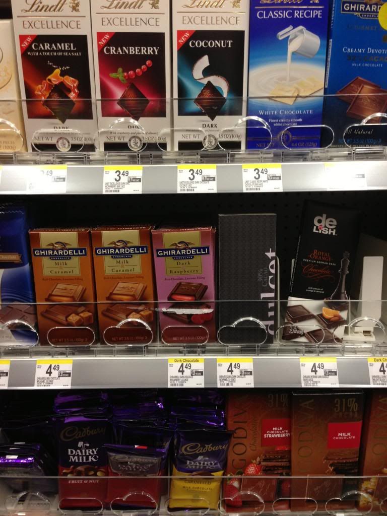
Chocolate Package – Colin McKeveny


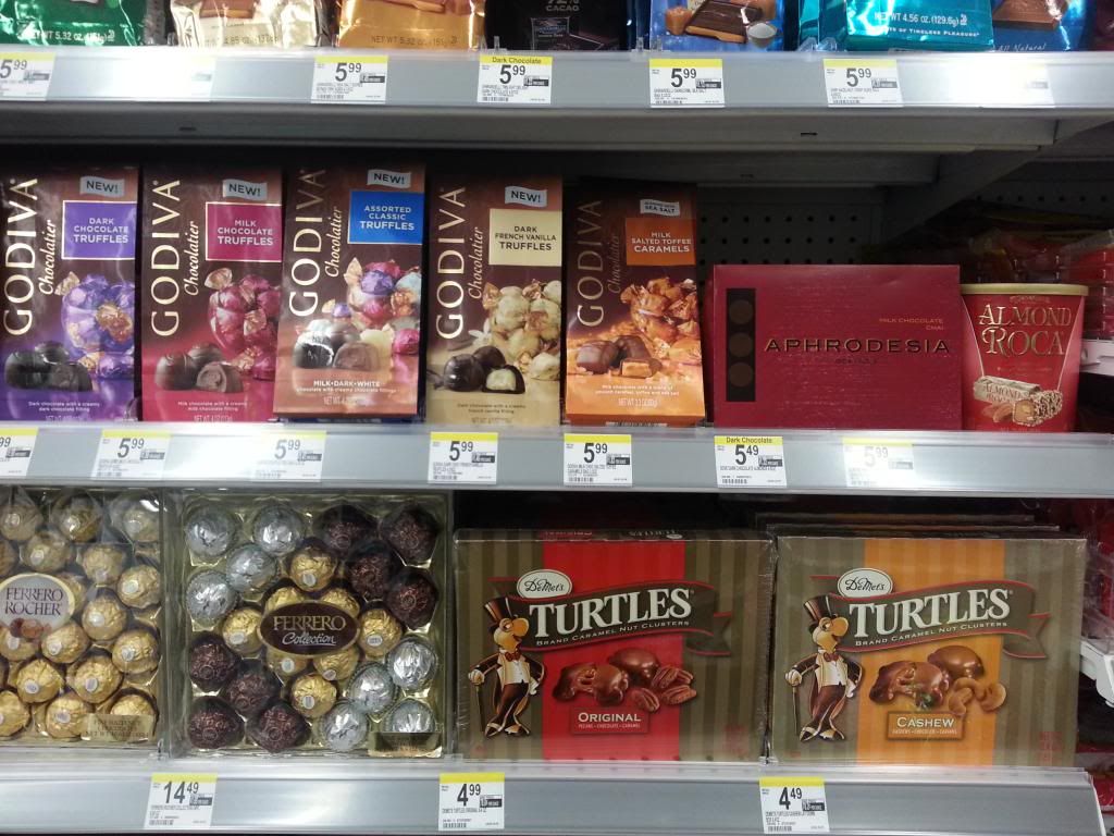
Chocolate Packaging on Shelf– Kylesha Kea
Donnell Culver – Moma
 The packaging I chose was for a set of Eva Solo knives. The design itself was nothing too fancy, but I felt that it was a powerful message for the knife set with a minimalist touch design wise. There isn’t much that went into the designing of the package, but it has a modern feel to it, which I believe is what drew me to it. The knife stand it stainless steal and there is a beautiful image of it on the box. I think it reflects the product really well by not having a bunch of distracting images around the actual product itself.
MoMA Packaging– Kylesha Kea
 This is a cup holder that I found at the MoMA store. I like it because it is something that I can use in my daily life. The packaging is straight forward and I like the way that they made the letter “o” in the word die-cuts to show the color of the product that you will be buying.
The way that they stretched the letters put was the only thing I didn’t like abut the package.
Donnell Culver

Unconventional T-shirt Packaging – Maria Torres
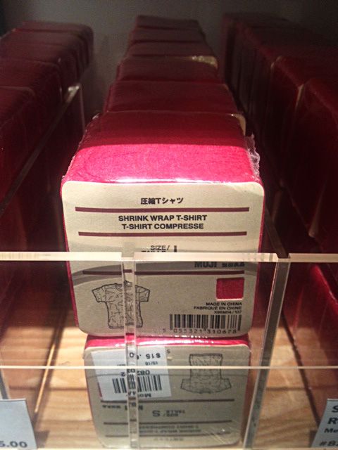

I have heard of t-shirts rolled up into a can but I never could imagine that an actual tee can take up so little space. Featured here is the packaging for crinkle style t-shirts. Apparently we don’t need to wonder why these tees would be crinkled.
I picked this product packaging not because of some fancy and complicated printing technique, but because of what this package contains. We are not used to seeing clothing packaged in such a way. If the label did not explicitly say the product’s name, it would take me few wonders to figure out what really is inside this perfectly compact cube. I imagine the purpose of sale here is not really the t-shirt itself but rather the way it was packaged. As I looked at the product itself, it was nothing particular indeed – maybe it would give out some vintage vibe if worn by specific body type. But I must admit, that packaging gave a way to my loud “wow.”
Other than that, it is just a tee compressed into a cube, wrapped with simple rough cardboard paper with clean technical print, and all of it tightly shrink wrapped. It seems so simple and easy, and in my opinion source of good design is often found in simple and mundane.
Moma
Link
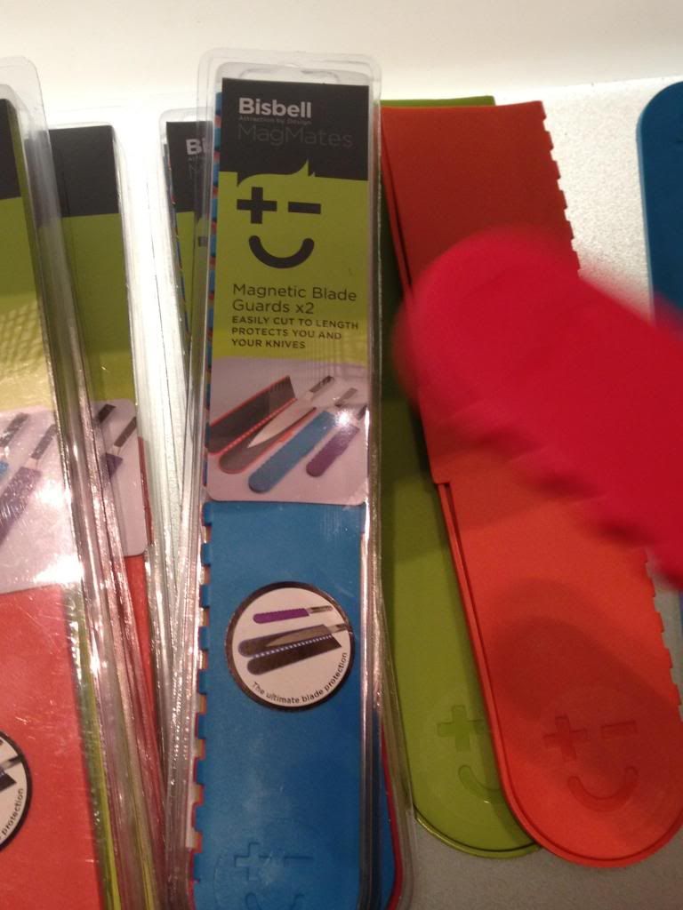
This is a magnetic case protector for knives. The outside of it is made of silicone rubber. This object can be used for all knife sizes. The magnets on the inside of the case simply attracts itself onto the knife blade, making it safe to carry knives around. I think this case is very useful for people who like to travel or need to carry a knife around to prepare their food. They dont have to worry about how to pack the knife because with this product, you can basically pack it anywhere. The material is very soft and flexible so you can cut the product til it fits the knife size perfectly.