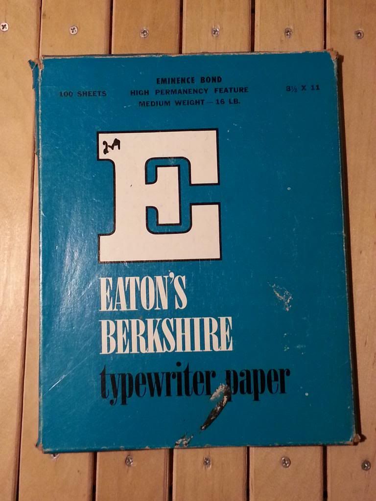
Eaton’s Berkshire Typewriter paper, Eminence Bond
Typography Typographical hierarchy- A large slab serif logotype, “E” for Eaton’s Berkshire; a serif with drastic thick/thin typeface for paper style; a narrow sans serif for specified product details.
Color The color palette is simple, yet busy at the same time- iconic of early design. I noticed that most vintage packaging has a bold color (i.e., red, blue) or a muted color (i.e., beige/cream, mint green, pistachio) or the occasional use of both. The use of saturated teal as a backdrop for serif typeface lends to the idea that the package is vintage.
Simplicity The design is simple because it has only 2 major factors: color and typography, however it is also very loud, busy because of the execution. “Good” design today is very simple with very little fuss. A giant logotype would be too much for today’s packaging. There are 3 typefaces used when 2 would have worked. In addition to the typefaces used, type placement is inconsistent. The text at the top is centered, while the rest is justified left.
Overall Tone The one reason why I believe this package to be vintage (other than typewriters being obsolete) is the use of serif typefaces. Older, vintage packages had script or serif typefaces, whereas now a majority of typefaces used are sans serif. Designs that use serif typefaces today are usually trying to appear vintage.


 2012
2012 2012
2012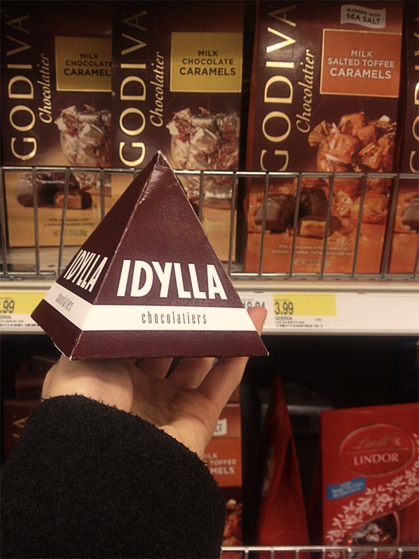 This is my Idylla Chocolatiers Package in store environment. By the time I took it on another trip in my bag, it became seriously squished.