
The introduction of the “new alphabet” during the late 19th century is definitely one of a kind. As opposed to the generic appearance of the alphabet as we have seen for the past centuries, Wim Crouwel’s “new alphabet” practically eliminated the need for rounded edges and diagonal lines in forming the shape of the 26 letters. By using only dashes, dots, vertical, and horizontal lines, Crowel manages to create an abstract, but barely legible typeface. The characters’ unique composition are purposefully constructed to accommodate for the developing technologies that were only capable of displaying vertical and horizontal texts on a digital video screen.
Crowel’s “new alphabet” typeface accomplishes more aesthetically than it does functionally in terms of design. Nowadays, these modern letters are mostly seen on graphic design publications, especially in Crowel’s own works. This typeface cannot really translate universally well with other graphical elements. Some of the letters to this typeface are pretty ridiculous-looking. It would be crazy if they were to be used as an overall font on modern day documents.
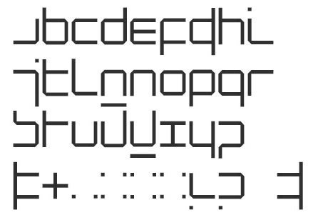
“New Alphabet”

“An introduction for a programmed typography”