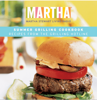
Martha Stewart’s design style is very American classic–from that cozy, inviting warmth, to the playful nature of her use of colors. Many of her food cookbooks use strong type, from bold, thick sans serifs to intentional serif strokes:
(sans serifs)

(serifs)


On the majority of her publications, she includes her name in the title. I believe this is not only to sound personable and relatable to the average woman cook (e.g. Here’s a recipe from your good friend, Martha!), but also because her name has become her brand. Also, an image of Martha Stewart is on many publications, and this definitely helps her image because she is an attractive, slender woman. More people are more likely to reach for her cookbook (and feel good about what they’re cooking) over a cookbook with a larger figure– regardless of how healthy Stewart’s recipes may or may not be.
Stewart also makes sure that her food images look good–from lighting control to decorations, she always makes sure to have people craving her food. Even if her foods may be heavy, she always counter-balances this with light-colored clothing (if she’s in the image) or table setting.
On the inside of her cookbooks and/or publications, her recipes are always clear and simply organized:


These recipes are always organized cleanly to make the recipe easy-to-do. Even if the instructions are actually complicated, there is nothing fussy about the layout that makes cookers and bakers want to cringe. The focus is one one beautiful photo of the food that the cooker/baker may be motivated by, and the directions are written in light type.