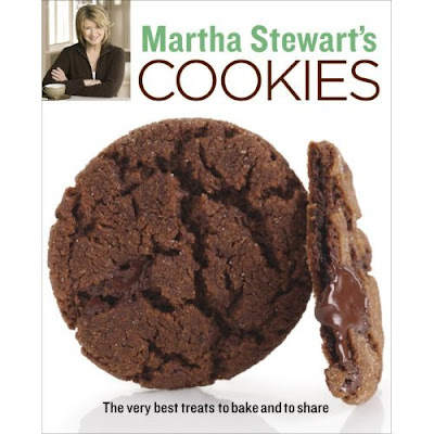
Martha Stewart’s designs are simple and not majorly extravagant. These cookbooks use basic typefaces and is not too wordy. She uses simple typefaces but sometimes mixes serifs with non-serifs or just one of each. Her name is always a different color then the rest of the text. On most of her publications I noticed that there is a picture of her. There is also usually a focused picture on a certain type of food. Right away, without even reading the title you know what the book will be about and you have the idea that it will be a simple recipe that anyone can do.


