
 This image is designed by Manraj Singh, a graphic student in Unitec’s Graphic Design and Animation Graduate school. I think this designer did a good job in using sizing and scaling within the design. The larger words going to smaller words works because it created an illusion where t looks like waste is entering into the ocean because of the picture the designer added at the bottom.
Author Archives: JOEY NG
Blog HW 4


Martha Stewart’s design style is clean and minimalistic. Her designs for her magazine and cookbooks are very distinctive. It highlights the photography of the food. For example the design for her magazine, it’s clean and simple and not busy at all. This defines all of Martha Stewart’s other design style for her magazine and cookbooks. I personally think her design highlights the photography and I really like her design style.
Blog Homework 3
1) Example of Typeface Mixing

2) Example of Bad Kerning
![]()
3) good/Bad Line Spacing Example

4) Marking Paragraphs

Blog Homework #2
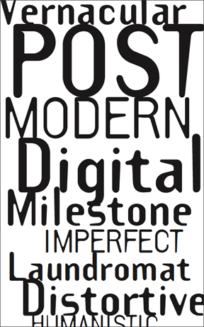
Template Gothic is a typeface inspired bu letters drawn with a plastic stencil. Designed by Barry Deck in the 1990s during the time when digital design tools increased in popularity. Template Gothic describes the process that was once mechanical and manual. Barry Deck designed this typeface because of his desire to abandon the perfection of modernists letter-forms. The features of this typeface includes an irregular, tapering strokes, thickened junctions, inconsistent weight and lopsided rhythm combined in making this typeface unique.
This typeface shows Deck’s interest in type that is not perfect. It is a type that reflects the imperfection of the world and the imperfect beings inhabiting in this world. Deck said he “… was inspired to design a face that looked as if it had suffered the distorted ravages of photo-mechanical reproductions.” Also, this typeface embodies a post- modern narrative on the methods of character-generation it supersedes, and can withstand the most casual of designs. Template Gothic released by Emigre Fonts in the 1990s have since became an important milestone in the history of digital fonts.
Blog HW 1
This documentary documented how books and bookstores are slowly being replaced by digital readers like Kindle, Ipad etc. and eventually disappear altogether. I disagree with what is being documented because there are still people that prefers reading a physical book rather than a digital reader. Therefore making an assumption that books and bookstores will eventually disappear seems too extreme to me. Its just a matter of preference. There are people that prefer E-readers and people that prefer holding a physical book. I, myself prefer reading a physical book rather than an E-reader. It is true that an E-reader is more convenient however nothing beats holding a book and the satisfaction when you finish the book or excitement when your about to reach the end of the book. E-reader can’t give that satisfaction or excitement because you can’t really tell whether or not your nearing the end of the book or not.