About QIAN CHEN

5081190214676546

Hw 6

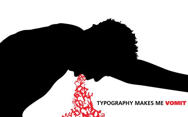
This piece was designed by damagedinnocence. This is an extreme visual of the artist’s love-hate relationship with type.”Typography makes me vomit” is written in a sans-serif typeface  while the “vomit” is all over the place, the type is skewed, scaled, rotated, and generally messed up .

The image is filled with contradiction. On one hand, it is well-designed and type is used to make the “vomit” and convey the message at the same time. On the other hand, typography still makes them vomit.

HW 4

img343 Martha-Stewart-Living-Radio-Summer-Grilling-Cookbook-2011


The first thing I noticed about Martha Stewart’s publications was the rich use of color. Many of them are well saturated and enhanced to create an inviting appeal, whether it would be for recipes or home. It is also very family oriented. The typefaces she uses inclue a combination of serif and san serif; Helvetica also makes a frequent appearance. The layouts are centered around images, while the type is more complimentary/secondary.

Hw 3

1. Good type mixing: The thick serif type stands well with its thinner relatives.
mynitelife-logo

2. Good Kerning: The different kerning used lines up in an aesthetic way.
fishinspiredlogo1

3. Good line spacing: The different leading of the text has a unique effect on the overall image.
feature-72-dr-bronners-label-pan_15165

4. The NYTimes web articles are always broken up in short chunks of paragraphs, making it less-overwintering to read.

nytimes

Hw 2

GromainThe romain du roi was a typeface that emerged in France during the Age of Enlightenment in the 17th-18th century.  It was commissioned by King Louis XIV who wanted a unique typeface exclusive to the royal printers.

The Age of Enlightenment was a significant period in the Western World due to it’s deviation from tradition and faith; promoting reason and science. In the spirit of the age, the romain du roi was created by three members of the Bignon Committee from the Academy of Science, with an emphasis on the math and sciences for the design. The designs were produced on a 48×48 grid (2,304 squares) with careful measurements, with distinctive thick and thins.

The emergence of the romain du roi marked the beginning of the Traditional period in type history.

HW 1

No matter how hard these people in the documentary want to resist it, bookstores and printed books will soon go in the way of videocassettes and floppy disks.

Growing up as a bookworm, I spent many of my days wandering through the shelves of my local library. Many books from my personal collection came from library book sales and elementary school book orders.Although I did enjoy the occasional trip to Barnes and Noble, the prices were never fit for my student budget. On the rare occasions I did enter a local bookstore, the prices looked even more out of my league. Furthermore  many of these stores would be gone within a year after my initial visit.

Even bookstores at a corporate level are treading on thin ice. Borders tanked many years ago, and Barnes and Noble continues to stumble along. A great reason why B&N are still around is because they embraced the move towards ebooks with their NOOK readers. Even so, they still don’t own a significant share of the market.

I resonate with feeling of holding a book in my hands, and breathing in the scent of the old and the new, they hare figments for nostalgia. Many of those books are lost somewhere in my garage today, ready for a rare trip down memory lane.