B6

Alignment pg. 112

How do you pick the right alignment style for the texts within any given design?

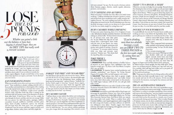
Well Henry, despite having a limited number of alignment formats in typography design, they work universally well with almost every style of bodies of texts. It all depends on the other elements that accompany the text. For example, the magazine spread above with the justified columns of texts work surprisingly well with square, or rectangular shaped objects. It contributes to the page’s overall sharp and tidy appearance. A word of warning however, as rivers are common for justified columns, make sure to use appropriate text size and line spacing of the columns of text to evenly distribute the words.


HW5

The book title “Get Used To The Seats” by the students of Cardozo and Woodrow Wilson High Schools clearly show the use of scaling when compared to its accompanying texts.  With regards to its overall design, the various sizing of the texts not only emphasize the title, but also give the impression of depth on the surface of a skull that is wearing glasses.  Although there are major differences in sizing between the title the author, and minor differences between the title and subtexts, the alignment of texts combined with the varying sizes designed by Oliver Munday successfully brings out the overall theme of the book.


HW4

Martha Stewart’s Everyday Living April 2012 edition portrays an effective layout of pictures and type throughout the cover.  The warm and cool colors of the eggs bring the sense of Easter during the springtime.  The arrangements of the eggs are strategically placed so that they evenly fill the background without having a messy appearance.  The positioning of the various sanserif and serif characters doesn’t clutter the cover, and are clean and legible.


Caviar, presented elegantly.  What better way to showcase the use of caviar than to fill an entire page of a magazine with a high quality photograph?  On the other side of the photo, the leading of the bodies of text are spaced apart accordingly to promote legibility.  In addition, the paragraphs are all fully justified to contribute to the overall layout’s simplicity.  Finally, a multi-color large display size “Caviar” can be seen blended onto the first line of text for aesthetics.

HW3


1. A circus of 8 different typefaces.


2. What Obama means is for us to maintain appropriate kerning.


3. Legible line spacing, essential for human survival.


4. Lose the last 5 pounds for good, but keep the paragraph markings.

HW2

The introduction of the “new alphabet” during the late 19th century is definitely one of a kind. As opposed to the generic appearance of the alphabet as we have seen for the past centuries, Wim Crouwel’s “new alphabet” practically eliminated the need for rounded edges and diagonal lines in forming the shape of the 26 letters. By using only dashes, dots, vertical, and horizontal lines, Crowel manages to create an abstract, but barely legible typeface. The characters’ unique composition are purposefully constructed to accommodate for the developing technologies that were only capable of displaying vertical and horizontal texts on a digital video screen.

Crowel’s “new alphabet” typeface accomplishes more aesthetically than it does functionally in terms of design. Nowadays, these modern letters are mostly seen on graphic design publications, especially in Crowel’s own works. This typeface cannot really translate universally well with other graphical elements. Some of the letters to this typeface are pretty ridiculous-looking. It would be crazy if they were to be used as an overall font on modern day documents.

“New Alphabet”

“An introduction for a programmed typography”

HW1

Book reading is culture. E-book reading is culture. Either one will not fully surpass the other anytime soon. There will always be people who prefer the actual book-in-hand experience. Nevertheless, more and more individuals are already gradually shifting towards the world of electronic texts. With regards to convenience, E-books and E-book readers such as Kindles and Nooks definitely have the upper hand. However, in terms of the general reading experience, there is nothing like flipping through real pages, and inhaling the aroma of new and vintage books. There can only be certain feelings and advantages gained from either one type of reading source, not both. Although the number of book businesses are diminishing due to the advent of such digital devices and formats, the support for physical books will not be neglected, nor forgotten.