About ch126562

5081190214502932

HW #5

This is an example I saw and liked in regards to scale and size. The words all refer to different kinds of beer. I like beer and definitely think it works. The words and type changes with the contrast of the glass. The design is Serigraph , Beer Typography designed by Kyle & Courtney Harmon

HW #4

tumblr_mhzossvWkb1qanrqso3_400


I particularly like that everything is very colorful, vibrant, insinuating happiness and good mood. The typography is pretty simple which is easy on the eyes and inviting. The images of all the foods look delicious and make me hungry. I might even experiment with a few of her recipes after seeing a cover like this one for example.

ht_martha_stewart_book_cover_cc_110408_wg


This one seems very simple with a lot of white in the background and a small photo of herself in the corner allowing us to focus in on this very strong image of a tasty looking dessert. Typefaces used are nice, again simple, and the image is very inviting with a little thing at the bottom stating the amount of recipes which is smart. The designer did a good job with this.


HW #3

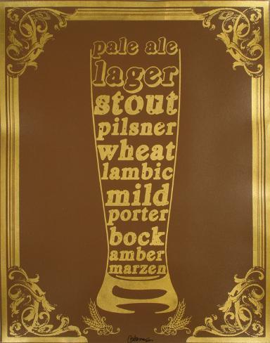
Good example of Mixing Typefaces.Horrible example of Kerning/Tracking.

Good example of Leading/ Linespacing.

Marking paragraphs.

HW #2 GOTHAM TYPEFACE

The Gotham typeface is a digital typeface classified as a family of geometrically structured sans-serif’s and also consists of other variations (Gotham Rounded, Gotham Narrow, Gotham Condensed, and Gotham X-Narrow). They were designed in 2000 by an American designer named Tobias Frere-Jones. His motivation to create this typeface came from walking through Manhattan “block-by-block” searching for different source material. Gotham was inspired and came about as a form of architectural visual graphics that were designed to attract a particular type of audience during the mid-twentieth century and became very favored and used this way throughout New York City. It was enfranchised by the editors of GQ magazine to give the magazine a “masculine, new, and fresh look”.It has been seen in very distinguished places such as Barack Obama’s 2008 presidential campaign, at the Port Authority Bus Terminal, and The Freedom Tower at the World Trade Center location in 2004. I find this typeface to not only be not boring but beautiful besides the fact that it is used a lot in many different places.

images-4 images-3

HW #1

This documentary “The Printed Word” was quite interesting. Although it spoke about the difference or change in culture between actual books and new age products such as kindles and other ways to read them. I really don’t think that I will completely change the everything because there are still so many people that like to pick up and actual book regardless of it’s weight or the space it may take up in a book bag or purse. Sure these are all factors to consider when traveling and saving space but yea there are way too many people out there that prefer to keep it “old school”. In the video there were many older people in bookstores discussing this and pointing out the fact that it’s not the same. My favorite part is where the girl keeps smelling the books as if she was really appreciating the smell of the book (made me chuckle) at first the I realized she may be right. The other gentleman took a whiff of his kindle and when he was asked what he smelled he replied “plastic” haha that was funny. Anyhow yea I really think that there will always be actual books around.