HW#6

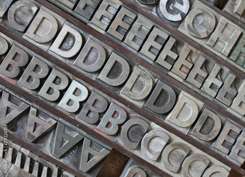
Why do people mix typefaces? (pg54)

The mixing of typefaces is a practice where a person most likely a disigner uses more than one typeface together. The reason for this is to creat something different and becomes sort of a challege. It give contrast to the design. The combining of the typefaces most be handle with care, the values of the different strokes of the typeface most be taking into account as well as the tone of the typefaces. For example Helvetica is neutral typeface while Bodoni has an elegant element, so mixing these two typefaces might not be the best idea. What needs to be taken into consideration also is the text hieght, and the length of its ascendor or descendor.

http://designshack.net/articles/typography/mixing-typefaces-tips-and-techniques/

http://www.noupe.com/design/mixing-multiple-fonts.html

http://www.typography.com/ask/recentTopic.php?path=head

HW#5

t

The designer goes bythe name Anjani Miranti. I find this design successful because the way he handle the small type to create the image while still having the actual type be legible. While looking at this design all i could think about was eating McDonalds.

HW # 4

Martha Stewart style if i had do put it in words would be, simplistic and classic. Where the products that she sells, the item she promotes, the recipes that she mades are old American classics made simple for anyone to reach out and purchase it.

HW#3

This is an example of typemixing, the different in type is input in a way that is apparent but not disruptive with the message that its trying to illustrate.

A good example of good Tracking. The Name of the product (maybelline) is Tracked all across the image in thin type so that ppl could still see the image in the background.

I like the line spacing in this picture and i think that is good, it is easy to notice the spacing because the type in inside different black boxes. I feel like the amount of spacing between the lines makes it easy too read by spreading out the spaces between the lines without making it seem like too much text which can sometimes happen when there is too much line spacing.

A good example of Marking paragraphs


Hw #2

Romain Du Roi is a type created in the late 17th century commision by the king LouisXIV, the name literaly means Roman of the king. Unlike the previous roman type faces, this was the first typeface created from rational thinking, where the measurements and proportions where well thought out. As you can see from the image, a grid was use to created the typeface.

Fette Futura is another typedface created using geometry. Unlike the previous typeface this one was made in Germany in the early 1900s. Futura is one of the most used san serif typefaces in the world. There are used for many important materials,he Boston Celtics championship banners has futura letters, the game Elder scrolls also uses Futura. This goes to show how popular this typeface is.


HW #1

The documentary focus on the technological advancement of printing books and how the way we view and read books has change through out the years. I find it interesting the way people have come enjoy e-books and read things aon a kindle instead of real books.In my opinion i rather read a real book instead of an eletronic copy because for me its hard to focus on reading material that is on a screen rathr than paper. Im sure that there are alot of people like me that will always prefer the feeling of real book instead of electronic one, so im sure the need for actual printed copies of books will never sease to exist.