About Kristina Yao

5081190214465007

HW #6

When and where should we use certain alignments? (pg. 112)

When deciding your alignment for your design you should consider your theme, readability and legibility. Center alignment should be used selectively as it is the hardest to read.  While it can create the most aesthetically pleasing design, sometimes setting a whole body of text can be hard to read.  However, small amount of texts such as headlines or smaller paragraphs can be centered.  It can make it look sophisticated and elegant.  Flush left is generally most common as it is the easiest to read.  Flush left is one of the “biggest factors in improved readability.”  It is mostly used in body copies whereas flush right should be used “sparingly,” and only when necessary, such as setting a small body of text that is meant to sit close to the edge.  It is important to keep in mind readability instead of focusing on the aesthetics.  Justified text has a formal feel to it.  It is easy to read yet sometimes the spacings of words can become uneven and uncomfortable.  Sometimes this can be adjusted but other times it is not always a possibility in our designs.

http://blog.anthonyjones.biz/2009/01/typography-101-alignment/

http://designinstruct.com/tools-basics/the-basics-of-typography/

HW #5

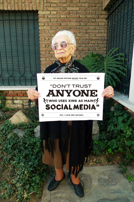
This was a quote designed by Chacho Pueblo who wanted to use different fonts.  This design works because it puts emphasis on the what the main quote is about.  The main focus of the quote here is “anyone,” which has unique serifs while the rest are non-serif fonts.  Your next focus is then “social media.”  Xing is also essential or else you wouldn’t know which form of social media he is talking about.  While “don’t trust” is bigger in scale than “xing” is, they have different importance where one is bigger and one is bolded.  The top and bottom lines are smaller than the quote itself because it tones down the words itself, giving the audience a loving feeling when he speaks of his grandmother.


HW #4


tumblr_mhzossvWkb1qanrqso1_1280


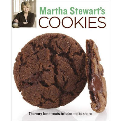
Martha Stewart’s designs are simple and not majorly extravagant.  These cookbooks use basic typefaces and is not too wordy.  She uses simple typefaces but sometimes mixes serifs with non-serifs or just one of each.  Her name is always a different color then the rest of the text.  On most of her publications I noticed that there is a picture of her.  There is also usually a focused picture on a certain type of food.  Right away, without even reading the title you know what the book will be about and you have the idea that it will be a simple recipe that anyone can do.

HW #2

Monster fonts came during a time when new ideas were being explored.  Around the 19th century industrialization took on a major role.  Mass advertising became a new form of communication, which called for new designs and new typefaces.  Instead of the classical typefaces, designers began to change the shapes and sizes to form more noticeable fonts.

salinger

Some ways that they did this were to expand, heighten, enlarge, shadow and flatten these typefaces.  In order to print these enlarged typefaces the people had to resort to wood, which helped to create the decorations and textures to typography.  Monster fonts created a way to form fonts in any way you wanted by just adjusting a serif to your liking or combining it with abstract art.

Type1

HW #1: The Printed Word

This documentary is a portrayal of the way books are being transformed by the digital world.  There are devices out there like the iPad, kindle, nook, etc. that make reading easier and more accessible.  With the click of a button you can have a book or document onto your tablet.  While I admit, I do own one myself that doesn’t mean I don’t enjoy a good book in my hands either.  I don’t believe that this means the end for books.  I believe that books are necessary because you can’t compare it to a tablet or any technological device.  The idea of convenience and being able to carry several books at once in the palm of your hand is a break through, yes, but there are certain aspects about books that you just can’t get with technology.  Like the creators showed, you can’t get the smell of the book or the physicality of flipping the corners of a page or writing in it to make your own notes.  I can understand the creators worry for books and bookstores but I think there as just as many people out there who prefer e-readers over books as there are people who enjoy books over e-readers.  Perhaps, it may just be my hopefulness that books won’t go away anytime soon but only time will tell.