Hw 2: Dead History

1e5958a7467c123a0d53385ce4a64217

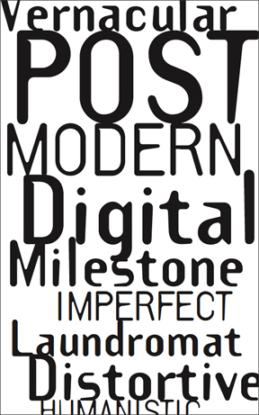
Who knew that a mixture of the traditional serif font Centennial and the Pop classic VAG Rounded would be combined together creating a whole new creature called Dead History. P. Scott Makela’s new typeface designed in 1990, was designed by manipulating the vectors of readymade fonts showing a strategy in contemporary art and music. By embracing the burden of history and precedent, this typeface has played a role in every typographic innovation.

DeadHistoryBold

This typeface has a mixture of serif and non serif which is appealing because one area of the font is thick while the other area of the font is thick. It is similar to Bodoni, however it is more bold and gives a twist in the shape and size of the typeface.

HW #2

Monster fonts came during a time when new ideas were being explored.  Around the 19th century industrialization took on a major role.  Mass advertising became a new form of communication, which called for new designs and new typefaces.  Instead of the classical typefaces, designers began to change the shapes and sizes to form more noticeable fonts.

salinger

Some ways that they did this were to expand, heighten, enlarge, shadow and flatten these typefaces.  In order to print these enlarged typefaces the people had to resort to wood, which helped to create the decorations and textures to typography.  Monster fonts created a way to form fonts in any way you wanted by just adjusting a serif to your liking or combining it with abstract art.

Type1

HW #2

The movement of monster fonts grew with the rise of advertising in the 19th century. These large-scaled and bolded letters demanded immediate attention from potential consumers. They are sometimes known as  “font on steroids” because they are very in-your-face. During this time of advertising, multiple different typefaces would be used to maximize the use of letters in the negative space. Many of these were bolded and enlarged, with strong strokes and/or serifs.

Screen Shot 2013-02-14 at 2.55.52 PM

The avant garde typeface movement is more modern and abstract compared to monster fonts. This movement explores negative space and geometric lines of characters (e.g. ligatures), and is often labeled as an advanced, innovative, and creative type compared to others. They can seem very modern and sometimes even futuristic. Herb Lubalin designed the Avant Garde typeface in the 1970s, originally for a magazine logo (Avant Garde Magazine) and not as a commercial typeface. Especially for its time, this typeface was considered very different compared to what the public was used to–almost alien-like because there was nothing else quite like it.


HW #2 GOTHAM TYPEFACE

The Gotham typeface is a digital typeface classified as a family of geometrically structured sans-serif’s and also consists of other variations (Gotham Rounded, Gotham Narrow, Gotham Condensed, and Gotham X-Narrow). They were designed in 2000 by an American designer named Tobias Frere-Jones. His motivation to create this typeface came from walking through Manhattan “block-by-block” searching for different source material. Gotham was inspired and came about as a form of architectural visual graphics that were designed to attract a particular type of audience during the mid-twentieth century and became very favored and used this way throughout New York City. It was enfranchised by the editors of GQ magazine to give the magazine a “masculine, new, and fresh look”.It has been seen in very distinguished places such as Barack Obama’s 2008 presidential campaign, at the Port Authority Bus Terminal, and The Freedom Tower at the World Trade Center location in 2004. I find this typeface to not only be not boring but beautiful besides the fact that it is used a lot in many different places.

images-4 images-3

Blog Homework #2

Template Gothic is a typeface inspired bu letters drawn with a plastic stencil. Designed by Barry Deck in the 1990s during the time when digital design tools increased in popularity. Template Gothic describes the process that was once mechanical and manual. Barry Deck designed this typeface because of his desire to abandon the perfection of modernists letter-forms. The features of this typeface includes an irregular, tapering strokes, thickened junctions, inconsistent weight and lopsided rhythm combined in making this typeface unique.

This typeface shows Deck’s interest in type that is not perfect. It is a type that reflects the imperfection of the world and the imperfect beings inhabiting in this world. Deck said he “… was inspired to design a face that looked as if it had suffered the distorted ravages of photo-mechanical reproductions.” Also, this typeface embodies a post- modern narrative on the methods of character-generation it supersedes, and can withstand the most casual of designs. Template Gothic released by Emigre Fonts in the 1990s have since became an important milestone in the history of digital fonts.


hw#2

What really stuck out to me while doing this weeks reading was Wim Crouwel’s “new alphabet”. Crouwel was inspired by the increase in the use of electronic communication devices. The main idea behind his “new alphabet” is that there are no diagonal lines or curves. The reason for this is because on video screens curves and angles are rendered with horizontal scan lines. Horizontal scan lines are alternating colored and black lines that were seen on older televisions etc. but now are seen when used for styling computer graphics.

800px-Poryzoid_scan_line_effect_example

Crouwel’s “new alphabet” is especially interesting because he created it in 1967. His insight into the future use of electronics, interest in making communication better and intuition for a programmed typography for these new electronics was truly impressive. Although the concept is unique and forward thinking the “new alphabet” itself is not very practical as several of the letters look nothing like they traditionally do.

Thinking_with_Type

Hw #2

Romain Du Roi is a type created in the late 17th century commision by the king LouisXIV, the name literaly means Roman of the king. Unlike the previous roman type faces, this was the first typeface created from rational thinking, where the measurements and proportions where well thought out. As you can see from the image, a grid was use to created the typeface.

Fette Futura is another typedface created using geometry. Unlike the previous typeface this one was made in Germany in the early 1900s. Futura is one of the most used san serif typefaces in the world. There are used for many important materials,he Boston Celtics championship banners has futura letters, the game Elder scrolls also uses Futura. This goes to show how popular this typeface is.


Hw #2

Francesco Griffo

Did you know that Italic letters were introduced in the fifteenth-century? Venetian printer Aldus Manutius and his type designer, Francesco Griffo are credited with creating the first italic typeface. Italic is simply a more casual style of handwriting.

This typeface was used in the cheaper writing shops. Using this style produced faster results because it did not need the carefully formed lettering like its rival lettera antica. The huge pro for Italic type during this time was its cost. It was inexpensive to print, saved time and space. The con was its connotation of a cheaper quality.

Hw#2

Romain Du Roi

Well the typeface was made in 1692 by King Louis XIV to be used as a Royal Typeface. I think this image pretty much sums what I just said.
It is used by Impremiere Royale and was first used in 1702. It was created by Philippe Grandjean. I think for the most part the typeface was supposed to be different than non-royal beings. It was used during the Age of Enlightenment and for the most part the designer had creative liberty to create what he wanted. The letters really reflect the time and elegance of his reign.

HW # 2

Bauhaus_93_by_benedictbatumbakalIn 1919, the Bauhaus manifest was not in geometric sans serifs but it was in an art nouveau form. Later Herbert Bayer and Joost Schmidt re constructed the type to a geometric type feel.

itcbauhaus_01_d13369i46

Herbert Bayer created the design for Bauhaus typeface in 1925. Bauhaus took place during the reform revolution in the 1920’s. The typeface is based on geometric shapes and sizes. Bauhaus is a san serif font meaning it does not have any lines tailing from the edges of the letters.  Bauhaus is designed round by the edges not like Helvetica, which is straight giving it a modern abstract feel to the typeface.