Homework 2 Romain du Roi

RomanDuRoi

Romain du Roi is literally a style of type that means “King’s Roman”. While this style of type may look like any old stuffy font at first glance the typestyle created upon Louis XIV request in 1692 actually differs from the type before it. The request can be seen as part of the transition from older styles of type, usually known as “Old style”, to a newer more “transitional” style. The difference between oldstyle and transitional type fonts is often unnoticed by many because of the fact that both type styles are serif type-styles(serifs being the little decorative bits attached to letters as seen on the M above). One of the major differences between transitional type styles and the oldstyle fonts is that they have less natural “stress”. Stress being the angle that a font naturally rests at un-italicized( that funky little I you may see in Microsoft word).

stress

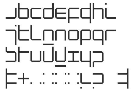
One of the most unique features of this type-style as opposed to the ones before it is how it is created. The artists used a very mathematical systematic approach to creating this type-style. Each letter was carefully crafted on a grid piece by piece, as opposed to the older styles not being not nearly as specific. Something to note when considering that this type style wasn’t as inspired by older hand written type and more by science is that King Louis XIV had a scientific committee design the style and the style was developed during the ‘Age of Enlightenment’, which had a pretty strong aversion to tradition. So of course instead of creating a new handwritten type it was much edgier to use 48 by 48 grids on each letter of the alphabet.

romainduroy

Type as program

“Programmed Typography” it is the beginning of “electronic type”. In 1967 more and more tech has been introduce to the society. A Dutch designer Wim Crouwel published a new type of fonts which looks like a program type. Which he idea he gets from are rule-based and systematic by using CRT. Basically, it is zooming the letter big enough as the picture shown.

4a_raster_12-2048

After 1980 personal computers and low-resolution printers become popular, more people can using those type fonts.  Zuzana Licko and her husband cofound the emigre fonts and emigre magazine. Which are using lower resolution digital media. And till 1990 when high resolution laser, people start to using more high-res laser then the lower one, letters are become more and more clear .it is a revolution of typeface.

postscript_text


HW2

The introduction of the “new alphabet” during the late 19th century is definitely one of a kind. As opposed to the generic appearance of the alphabet as we have seen for the past centuries, Wim Crouwel’s “new alphabet” practically eliminated the need for rounded edges and diagonal lines in forming the shape of the 26 letters. By using only dashes, dots, vertical, and horizontal lines, Crowel manages to create an abstract, but barely legible typeface. The characters’ unique composition are purposefully constructed to accommodate for the developing technologies that were only capable of displaying vertical and horizontal texts on a digital video screen.

Crowel’s “new alphabet” typeface accomplishes more aesthetically than it does functionally in terms of design. Nowadays, these modern letters are mostly seen on graphic design publications, especially in Crowel’s own works. This typeface cannot really translate universally well with other graphical elements. Some of the letters to this typeface are pretty ridiculous-looking. It would be crazy if they were to be used as an overall font on modern day documents.

“New Alphabet”

“An introduction for a programmed typography”

Blog HW #2

Monster Fonts emerged from the rise of industrialization in the nineteenth century.  Advertising became extraordinarily popular and was in need of new forms of type to communicate their messages.  Classical letters now became embellished and over the top, stretched in height, width and dimension. Even the serifs were now used not as finishing details but as their own ornate structures to stand out to the public.

There were new techniques in making these fonts come to life. In 1834, the emergence of the combined pantograph and router revolutionized wood-type manufacturing.  Lead, the go to source for casting metal type was too soft to hold such large sized shapes under the printing press.  The pantograph was now able to make the type accessible in maybe shapes and sizes, with different weights and proportions.  The alphabet was now open to interpretation, being able to be flexible letterforms.  The identity of the individual characters became less important, the actual relationships between letters in a typeface was the focus.

Monster FontMonster Font

Blog HW #2

During the era of “reform and revolution”, awakened a new group of artist that went against historical forms to adopt new typeface designs that used alphabets with shapes and sizes. These avant-garde artists wanted to develop a new design that represented a vision seen by the world as one. Artists like Herbert Bayer , designer of Bauhaus type, focused on constructing letters from basic geometric shapes. This approach created the alphabet in an abstract way that became part of the revolution of modern type.

In 1925 Bayer undertook a task given by Gropius  to design a “universal  typeface”. This typeface was, in his eyes, idealistic, and captured the essences of geometric shapes and curves. This sans-serif font can also be called the Victory Type. Bayer then incorporated this type into Bauhaus printing and further on to their product catalogue. HerbertBayer--Universalalphabet-1926NoahRothschild--BayerModern-2009

Blog HW#2

In the reading, Ellen Lupton talks about a lot of different typefaces, type designers, type designs, and type movements you may not have heard of before (for example: lettera antica, the romain du roi, monster fonts, avant-garde and abstract type, early digital type, the Bauhaus, and De Stijl). Find out more about one of these (or choose something else from the reading) and write 2 paragraphs about it—pretend you are telling someone who has no idea about graphic design. Post 2 images that you think best illustrate what you are researching. Categorize your post as Blog HW#2.