HW #3

  1. One great example of typeface mixing.
  2. One great or horrible (your choice) or either kerning or tracking.
  3. One great or horrible example (your choice) of line spacing (leading).
  4. And one great example of marking paragraphs.

Example of Typeface Mixing

This example of typeface mixing is remarkable because it uses a modern abstract font with a thin, sans serif font.

Great Tracking/Kerning

Simple, 45 degree font rotation with the arrow in the top right. Light brush overlay on the font gives it a rough look.

The Leading is represented by each plank of wood.

Marking Paragraphs

 The Skis are used as if they are line breaks between the title and the text


HW #3

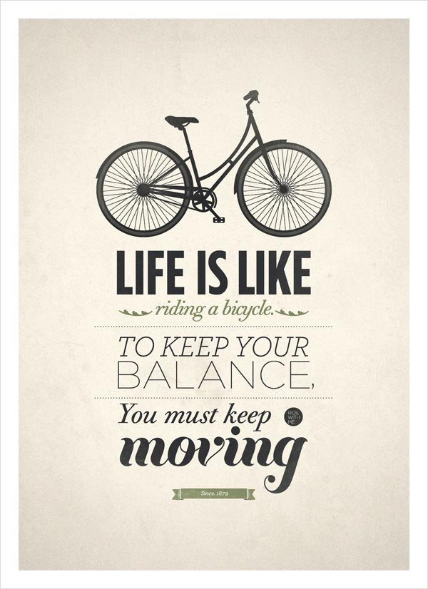
Good example of Mixing Typefaces.Horrible example of Kerning/Tracking.

Good example of Leading/ Linespacing.

Marking paragraphs.

HW #3

1. One Great example of TypeFace Mixing

gonzo-10

2. One Creative use of Tracking


tm-08

3. One Great use of Leading

tm-13

4. One example of marking paragraphs (in this case they happen to be the dummy text for an article for a magazine layout)

tumblr_miwx06977S1s6vwgio1_1280

HW #3

09_brilliant_typographic_poster_designs_joplin_relief_poster


1. 6 different typefaces

Kerning_640


2. Bad kerning- “Kerning can make all the difference”

dear_typography_poster_final


3. The linespacing in this poster looks confusing. Once you look at it closely and read the poster the linespacing makes sense and get a point across.

87d4250dac4b6b847ad639e5b2cf76c8


4. Marking paragraph

HW3


1. A circus of 8 different typefaces.


2. What Obama means is for us to maintain appropriate kerning.


3. Legible line spacing, essential for human survival.


4. Lose the last 5 pounds for good, but keep the paragraph markings.