HW #4

Martha Stewart Living Cover


Martha Green


What I noticed with Martha’s design style is that she uses various shades of green. San Serif text with minimal use of serif text. You will always notice white space or sprinkles of white in her design to give a fresh clean appeal.

HW #4


tumblr_mhzossvWkb1qanrqso1_1280


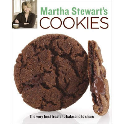
Martha Stewart’s designs are simple and not majorly extravagant.  These cookbooks use basic typefaces and is not too wordy.  She uses simple typefaces but sometimes mixes serifs with non-serifs or just one of each.  Her name is always a different color then the rest of the text.  On most of her publications I noticed that there is a picture of her.  There is also usually a focused picture on a certain type of food.  Right away, without even reading the title you know what the book will be about and you have the idea that it will be a simple recipe that anyone can do.

Blog HW 4


Martha Stewart’s design style is clean and minimalistic. Her designs for her magazine and cookbooks are very distinctive. It highlights the photography of the food. For example the design for her magazine, it’s clean and simple and not busy at all. This defines all of Martha Stewart’s other design style for her magazine and cookbooks. I personally think her design highlights the photography and I really like her design style.

hw#4

I took one from her Living Cook Book and the other from her website. They both have the same thing going on. Her style is very defined. You can tell this is “Martha Stewart” from a mile away. Light very defined colors are used. Her styles are simple and elegant. She uses sans-serif typeface to push the idea of simplicity. She’s doing a lot by not doing much. The images are pretty large and her text is pretty small. There’s always a bunch of space even though she can have larger type! It works for her.

HW4

Martha Stewart’s Everyday Living April 2012 edition portrays an effective layout of pictures and type throughout the cover.  The warm and cool colors of the eggs bring the sense of Easter during the springtime.  The arrangements of the eggs are strategically placed so that they evenly fill the background without having a messy appearance.  The positioning of the various sanserif and serif characters doesn’t clutter the cover, and are clean and legible.


Caviar, presented elegantly.  What better way to showcase the use of caviar than to fill an entire page of a magazine with a high quality photograph?  On the other side of the photo, the leading of the bodies of text are spaced apart accordingly to promote legibility.  In addition, the paragraphs are all fully justified to contribute to the overall layout’s simplicity.  Finally, a multi-color large display size “Caviar” can be seen blended onto the first line of text for aesthetics.

HW #4

This book cover is very has a minimalistic feel. Her background is white and her dishes are white giving it a clean authentic feel. You can tell she is going for a more vegan/ vegetarian approach to this cover.  The text she uses is a san serif. She uses a bright yellow for her title which catches your eyes.  The yellow text compliments the dishes she displays on the cover which make the dishes and the title pop. All of the type is in lowercase letter but her name which is in all caps. The layout of her cover is the book title in the middle with her dish in front of it. This cover is very simple but still get her point across to her audience.

Cook books are about high resolution images that sell the book. This cover screams out summer BBQ. The text on this cover is a sans serif which gives it a clean feel. She uses bright colors in the title that gives it the playful summer feel.

The layout of this book is huge high resolution image that takes up the whole cover. She put all of the text at the top header with great bright colors.

hw4

Screen Shot 2013-03-05 at 2.57.47 PM

All of Martha’s type is sans serif as expected, this version of her website (June 2011) is busier than I expected, I personally don’t like the way the page layout was done.

I really love this magazine cover the use of color is awesome, the type style is great. They use a funky serif and use contrast italicizing “for” and “is” and I love it.


HW 4

img343 Martha-Stewart-Living-Radio-Summer-Grilling-Cookbook-2011


The first thing I noticed about Martha Stewart’s publications was the rich use of color. Many of them are well saturated and enhanced to create an inviting appeal, whether it would be for recipes or home. It is also very family oriented. The typefaces she uses inclue a combination of serif and san serif; Helvetica also makes a frequent appearance. The layouts are centered around images, while the type is more complimentary/secondary.

HW # 4

Martha Stewart style if i had do put it in words would be, simplistic and classic. Where the products that she sells, the item she promotes, the recipes that she mades are old American classics made simple for anyone to reach out and purchase it.

Martha Stewart’s Designs – Hw 4

marthadecorating

Martha Stewart’s designs style gives off a warm feeling in her books. They are not too distracting and everything falls into place. The color schemes of the fonts matches the whole book cover. They layout of these books are in sync with the image of her and the objects.

martha-stewart

In this image, the typeface “cupcake heaven” are in lower case, which gives off a small cute feeling. The cupcake looks delicious and it makes me want to eat it. The image of the cupcake draws people in and the fonts are easy to read. It is very simple and clear.