HW4

ht_martha_stewart_book_cover_cc_110408_wg

mzl_ugtqdnlt_480x480-75

mzl_rluyizkd_480x480-75

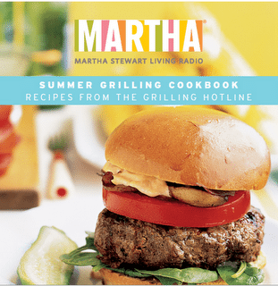
Most of her cover desgin is simply. one or few dishes, with few blurb. Title with her name, doesnot need much to be popular, it already enought for people who love cook. Most of cooking fans knows her name and her face well.By look at the cover.the first idea to most audiences is delicious then is simply.  By using simply step to cook most delicious food in the world. there will be not reason to not get one of her book.

1cookie

cookie2

cookie3

Thoes are the pdf from her book”Cookies“.it well organize and with simply tips.  intro with ingredients, directions, and with few pictures. give audiences a clear view of how to cook the cookies , and in the back of the book have few pages about how to perpare cookie dough. it gives audiences a simply and organize way to complete their meal.

About her text font on the cover are conservative, clean, and classic,it shows the idea of her cook book and the title are same important as the picture.


HW #4

Martha Stewart’s design style is very American classic–from that cozy, inviting warmth, to the playful nature of her use of colors. Many of her food cookbooks use strong type, from bold, thick sans serifs to intentional serif strokes:

(sans serifs)

(serifs)

On the majority of her publications, she includes her name in the title. I believe this is not only to sound personable and relatable to the average woman cook (e.g. Here’s a recipe from your good friend, Martha!), but also because her name has become her brand. Also, an image of Martha Stewart is on many publications, and this definitely helps her image because she is an attractive, slender woman. More people are more likely to reach for her cookbook (and feel good about what they’re cooking) over a cookbook with a larger figure– regardless of how healthy Stewart’s recipes may or may not be.

Stewart also makes sure that her food images look good–from lighting control to decorations, she always makes sure to have people craving her food. Even if her foods may be heavy, she always counter-balances this with light-colored clothing (if she’s in the image) or table setting.

On the inside of her cookbooks and/or publications, her recipes are always clear and simply organized:

These recipes are always organized cleanly to make the recipe easy-to-do. Even if the instructions are actually complicated, there is nothing fussy about the layout that makes cookers and bakers want to cringe. The focus is one one beautiful photo of the food that the cooker/baker may be motivated by, and the directions are written in light type.

HW #4

tumblr_mhzossvWkb1qanrqso3_400

Martha Stewart’s distinct design is that all the designs on her work are clear concise to the point and use colors. The feeling constantly given is one of warmth and simplicity, as her target audience is one that appreciates the natures of those qualities in the things she does. Clear concise easy to follow and hopefully you’ll feel fabulous when its all done.

tumblr_mhzossvWkb1qanrqso1_1280

One important thing to mention is that white is a color that almost needs to be present in all of the deigns, white or something extremely near it like cream or a pale shade of vanilla. Pastels and a pop color are also a staple. While the colors featured may not always be warm the feeling they attempt to express is clear.

tumblr_mhzossvWkb1qanrqso2_1280Aside from the above example, the type faces are typically easily readable simple and to the point however for a more special occasion this particular book uses a typeface with heavy contrasts in thickness and thin-ness as well as a secondary typeface that features letters at an angle. While this may be more on the wild-side of a Martha Stewart aesthetic it shows that even the deviations from her aesthetic still have the trademark warmness the white and the simplicity. Her website stays true to these themes as well.

Martha Stewarts’s creations

Screen Shot 2013-03-03 at 12.49.27 PM


The most common way this was approached was displaying a high def image and using big type to get the idea across. However I do not like how the “e” in meatless (specifically after the “m”, was cut off. I believe the designer could’ve done more with the type so it wouldn’t look “squished” together. I like the way the cover is simple but I feel that the cover designer could’ve gone further with this. The color choice is perfect because it compliments the picture as a whole.


Screen Shot 2013-03-03 at 12.50.21 PM


I am more of a fan of this cover, only because the pictures were placed nicely on the edges; portraying a border around the type and Martha Stewart’s picture. Once again I think the color choice for the type works very well and the choice of plates worked well with the color schemes of this cover.

The main idea to take from this is using soft colors; there is this constant pattern that her cookbooks are always in mellow toned colors and nothing more. Simple, mellow toned covers

Blog HW #4 Martha Stewart

Research Martha Stewart’s design style, and post 2 images of distinctive designs done for any of her publications—books, magazines, websites. (Until October 2012, her creative director was Gael Towey, so you may want to research her as well.) Discuss Martha Stewart’s design style: the images, the typefaces, the layouts.
Use the “add media” button in the menu right above you when you’re writing your blog post to add images.
Categorize your homework as Blog HW#4.