HW #5

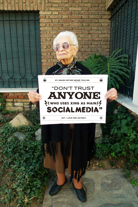
This was a quote designed by Chacho Pueblo who wanted to use different fonts.  This design works because it puts emphasis on the what the main quote is about.  The main focus of the quote here is “anyone,” which has unique serifs while the rest are non-serif fonts.  Your next focus is then “social media.”  Xing is also essential or else you wouldn’t know which form of social media he is talking about.  While “don’t trust” is bigger in scale than “xing” is, they have different importance where one is bigger and one is bolded.  The top and bottom lines are smaller than the quote itself because it tones down the words itself, giving the audience a loving feeling when he speaks of his grandmother.


Blog #5

The design works because all the fonts seem to be from text families that are all have serifs and the text remind me of older times in the past. This was designed by the company Zazzle. It is used to draw the attention of customers by using different scales and designs to sell tea.

blog5

This two is desgin by admin.it is a idea of he creates that shows the messages that are  kids receiving as a result of marketing, and the difference between gender. the first one is for boys and second one is for girls.it using different size and scale, the biggest word is always the main or most famous for boys and girls. for example, the one for boy are battle and power,most of boys love those words.the second one for girls are love and magic.