HW#5

http://payload148.cargocollective.com/1/0/128/5273228/GAX_2004_0007e_Ray2.jpg

This design is pretty awesome. It’d sone by a guy named Man Ray just to be cool. I love the composition of this piece is wonderful. There are two major shapes that overlap and I’m very interested in the relationship of scale between the shapes, lines, and that one black circle. It’s just awesome.

HW #6

KERNING pg. 102

When do you when to use optical kerning or metric kerning?

According to the book, when you select metric kerning you are using the spacing that was intended by the type designer. Designers apply metric kerning to text and this looks good at small sizes. On the other hand optical kerning assesses the shapes of all characters and adjusts the spacing wherever needed. This is good when applied to headlines and when a font has few or no built-in kern pairs, or when the overall spacing seems uneven. Designers suggest using optical kerning when you are combining different fonts or type sizes. So how do you know which kerning to use when formatting text? This depends on your typeface, and it should determine which of the two to use, “it’s a visual thing.”


http://www.creativepro.com/blog/typetalk-metrics-versus-optical-kerning

Blog HW# 6

Enlarged capitals pg 125

Enlarged capitals are commonly used to be indications to an entrance to a book or chapter. However my question is when should you use it or is it necessary? And how do you create a drop cap?


Enlarged capitals aren’t necessary but “the dropped capital is a separate illustration placed in the layout”. Meaning if your text looks boring after all the indents and kerning you have done, it doesn’t hurt to put a fun touch to the layout. However it must be consistent if building a book for example.

How do i create a drop cap? You can do this on word typophile.com has provided a PDF that explains how to create a drop cap and a blog question where professionals give their input whether or not to use a drop cap and how to use them properly.


PDF File of Drop Cap

http://www2.binghamton.edu/uctd/office/mmdropcap.pdf

Blog Posts about Drop Caps

http://typophile.com/node/75049

http://typophile.com/node/19874

Blog HW 5

This image is designed by Manraj Singh, a graphic student in Unitec’s Graphic Design and Animation Graduate school. I think this designer did a good job in using sizing and scaling within the design. The larger words going to smaller words works because it created an illusion where t looks like waste is entering into the ocean because of the picture the designer added at the bottom.
Hw 6

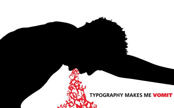
This piece was designed by damagedinnocence. This is an extreme visual of the artist’s love-hate relationship with type.”Typography makes me vomit” is written in a sans-serif typeface  while the “vomit” is all over the place, the type is skewed, scaled, rotated, and generally messed up .

The image is filled with contradiction. On one hand, it is well-designed and type is used to make the “vomit” and convey the message at the same time. On the other hand, typography still makes them vomit.

HW#5

typography_by_nominuss-d36vppo[2]

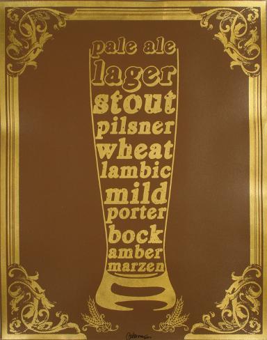
This cool bottle looking typography was designed by a Nominuss (user name) from “Deviantart.com” This designer clearly used variety of scale and size of types. If you only read the bold and biggest words, you can get a sense that the whole thing is about drinks. However, if you see the script from top to bottom the story gets more interesting. This design is indeed beautiful. The type is scaled both vertically and horizontally. Although the tracking between letters seem tight, because of the use of different sizes, it is still easy to read.  No wonder this design was also featured in “Typography in Design: 100 Brilliant Examples” at myinkblog.com.

HW #5

This is an example I saw and liked in regards to scale and size. The words all refer to different kinds of beer. I like beer and definitely think it works. The words and type changes with the contrast of the glass. The design is Serigraph , Beer Typography designed by Kyle & Courtney Harmon

HW#5

t

The designer goes bythe name Anjani Miranti. I find this design successful because the way he handle the small type to create the image while still having the actual type be legible. While looking at this design all i could think about was eating McDonalds.

HW #4

tumblr_mhzossvWkb1qanrqso3_400


I particularly like that everything is very colorful, vibrant, insinuating happiness and good mood. The typography is pretty simple which is easy on the eyes and inviting. The images of all the foods look delicious and make me hungry. I might even experiment with a few of her recipes after seeing a cover like this one for example.

ht_martha_stewart_book_cover_cc_110408_wg


This one seems very simple with a lot of white in the background and a small photo of herself in the corner allowing us to focus in on this very strong image of a tasty looking dessert. Typefaces used are nice, again simple, and the image is very inviting with a little thing at the bottom stating the amount of recipes which is smart. The designer did a good job with this.


Blog HW 4

http://www.aiga.org/uploadedImages/AIGA/Content/Inspiration/Corporate_Awards/CLA_MStewart_011_FOOD_Recipe_640.jpg

http://www.artfire.com/uploads/product/9/359/71359/3071359/3071359/large/martha_steward_holidays_-_1993_craft_cookbook_4a9aff15.jpg

Martha Stewards design style is simple, and classic. Neither of these designs are really edgy, but they use very classic layouts. All the photos are overhead shots, for consistency and usability. The first design is wonderful. I really like how the text interacts with tomato’s around it.