Blog HW# 6

Enlarged capitals pg 125

Enlarged capitals are commonly used to be indications to an entrance to a book or chapter. However my question is when should you use it or is it necessary? And how do you create a drop cap?


Enlarged capitals aren’t necessary but “the dropped capital is a separate illustration placed in the layout”. Meaning if your text looks boring after all the indents and kerning you have done, it doesn’t hurt to put a fun touch to the layout. However it must be consistent if building a book for example.

How do i create a drop cap? You can do this on word typophile.com has provided a PDF that explains how to create a drop cap and a blog question where professionals give their input whether or not to use a drop cap and how to use them properly.


PDF File of Drop Cap

http://www2.binghamton.edu/uctd/office/mmdropcap.pdf

Blog Posts about Drop Caps

http://typophile.com/node/75049

http://typophile.com/node/19874

Blog HW 5

This image is designed by Manraj Singh, a graphic student in Unitec’s Graphic Design and Animation Graduate school. I think this designer did a good job in using sizing and scaling within the design. The larger words going to smaller words works because it created an illusion where t looks like waste is entering into the ocean because of the picture the designer added at the bottom.
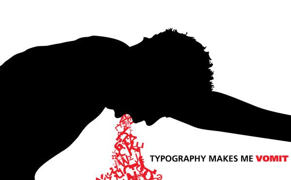
blog hw6

what is the ten popular type face desgin tool?(pg80)”you can also learn to make your own fonts as well as find fonts that are distributed for free online.”then it dosenot says anything about the software and how to desgin my own typeface.

the best font software are Fontlab Studio,Type Tool,Fontgrapher,FontCreator,Type,Font Type Master,BitFonter, SigMaker,Alphabix,Scanahand.

http://font-editor-software-review.toptenreviews.com/

what is the few free tools for create my own Fonts?(p80)

FontStruct,FontForge,BitfontMaker,Type Light,Gbdfed Bitmap Font Editor,Font Constructor,Raster Font Editor.and i check few of them such as the FontStruct, after you register their website you can use it, it’s right there. you dont have to pay anything for register or for use it.

http://mashable.com/2011/11/17/free-font-creation-tools/


Hw 6

This piece was designed by damagedinnocence. This is an extreme visual of the artist’s love-hate relationship with type.”Typography makes me vomit” is written in a sans-serif typeface  while the “vomit” is all over the place, the type is skewed, scaled, rotated, and generally messed up .

The image is filled with contradiction. On one hand, it is well-designed and type is used to make the “vomit” and convey the message at the same time. On the other hand, typography still makes them vomit.

HW#5

typography_by_nominuss-d36vppo[2]

This cool bottle looking typography was designed by a Nominuss (user name) from “Deviantart.com” This designer clearly used variety of scale and size of types. If you only read the bold and biggest words, you can get a sense that the whole thing is about drinks. However, if you see the script from top to bottom the story gets more interesting. This design is indeed beautiful. The type is scaled both vertically and horizontally. Although the tracking between letters seem tight, because of the use of different sizes, it is still easy to read.  No wonder this design was also featured in “Typography in Design: 100 Brilliant Examples” at myinkblog.com.

Blog HW #6, Letter and Text

Find more things you don’t know or would like to know more about in the reading (LUPTON TEXT “LETTER” (Section 1) and “TEXT” (Section 2).
Ask a question about the reading (please cite the page #), and then answer the question in 1-2 paragraphs. Please use outside research to answer your question and cite the source(s). Title your post Blog #6.

HW5

The book title “Get Used To The Seats” by the students of Cardozo and Woodrow Wilson High Schools clearly show the use of scaling when compared to its accompanying texts.  With regards to its overall design, the various sizing of the texts not only emphasize the title, but also give the impression of depth on the surface of a skull that is wearing glasses.  Although there are major differences in sizing between the title the author, and minor differences between the title and subtexts, the alignment of texts combined with the varying sizes designed by Oliver Munday successfully brings out the overall theme of the book.


HW #5

This design uses san serif typefaces. They use a combination of uppercase letters and lowercase letters. All the words are related to apple. The most important words are bolder and bigger.It gives off an elegant yet homey feeling to it. The sizes of the words are all in different sizes and scales. This design says a lot even though you can recognize the company by the logo.

http://neoformix.com/2011/WarAndPeace.html

HW #5

This is an example I saw and liked in regards to scale and size. The words all refer to different kinds of beer. I like beer and definitely think it works. The words and type changes with the contrast of the glass. The design is Serigraph , Beer Typography designed by Kyle & Courtney Harmon

Hw 5 – Size n’ Scale

Family Typography

http://imgc.artprintimages.com/images/art-print/jo-moulton-family-typography_i-G-65-6514-4QP6100Z.jpg (copy and paste)

With a combination of serifs and sans serifs, Jo Moulton’s Family Typography is vivid and sharp. It gives off an elegant yet homey feeling to it. The sizes of the words are all in different sizes and scales. Personally I enjoy looking at this design because the words have meaning and the words are well arranged.