This is a design from 3oneseven agency and was used on their home page. It is very successful because it is clear, interesting and relatable. Lots of white space to focus on the word Life as well as the other text.
HW #4

Martha Stewart Living Cover

Martha Green
What I noticed with Martha’s design style is that she uses various shades of green. San Serif text with minimal use of serif text. You will always notice white space or sprinkles of white in her design to give a fresh clean appeal.
HW#5
t
The designer goes bythe name Anjani Miranti. I find this design successful because the way he handle the small type to create the image while still having the actual type be legible. While looking at this design all i could think about was eating McDonalds.

This design uses scale in order to alert the reader to the progression of the words in the lyric used for the design. The largest word is used to catch attention while the words get progressively smaller. The work is designed by the art designer who goes by the name Ajnin on the artistic community Behance. The tension created with the size of the letters helps the reader also get a sense of the tone and meaning behind the words even though the song may not have been heard by the person listening. I’m personally very fond of the treatments on the type.
Blog HW #5
http://www.empirella.com/wp-content/uploads/2012/10/not-all-who-wander-are-lost.jpg
I feel this design has a strong message both in the meaning in the saying and also the way it is presented. By using serif and san serif typefaces the words pop out more to you, making you feel more than you would think through the typefaces. The sizes of the words also causes tension within the design.
hw#5
http://mrpatching.files.wordpress.com/2011/04/typography_by_bengisu666.jpghttp://
This design is showing the quote in a special way using size and scales and even its direction. “Art is breaking the rules” is the quote. You can tell by the scale of the r,u,l,e, and s and the brokenness of the letters that its puts this quote on a deeper level. It isn’t just oh that’s a nice quote but more like this makes sense. It’s almost there’s power in transforming a set of text saying something into it actually showing it. Not really sure who designed this it doesn’t say. I got this off someone’s blog. They were explaining a random system. Though the reason it works is because it has a method of chaos. Like in Hamlet, there was a method to his madness. Likewise, in this design the chaos in the word “rules” is working for the design instead of against it.
Blog HW #5
http://pinterest.com/pin/157555686933834317/
This designs works perfectly because the butterfly outline is nicely scaled in the middle using negative space to show the image inside the butterfly outline. I also like like how the type falls nicely in the bottom of the poster, still complimenting the image inside. This design was created by a French paper company.
HW #5
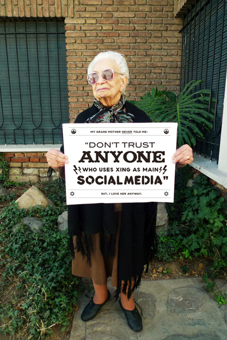
This was a quote designed by Chacho Pueblo who wanted to use different fonts. This design works because it puts emphasis on the what the main quote is about. The main focus of the quote here is “anyone,” which has unique serifs while the rest are non-serif fonts. Your next focus is then “social media.” Xing is also essential or else you wouldn’t know which form of social media he is talking about. While “don’t trust” is bigger in scale than “xing” is, they have different importance where one is bigger and one is bolded. The top and bottom lines are smaller than the quote itself because it tones down the words itself, giving the audience a loving feeling when he speaks of his grandmother.
HW #4

Martha Stewart’s designs are simple and not majorly extravagant. These cookbooks use basic typefaces and is not too wordy. She uses simple typefaces but sometimes mixes serifs with non-serifs or just one of each. Her name is always a different color then the rest of the text. On most of her publications I noticed that there is a picture of her. There is also usually a focused picture on a certain type of food. Right away, without even reading the title you know what the book will be about and you have the idea that it will be a simple recipe that anyone can do.
Blog #5
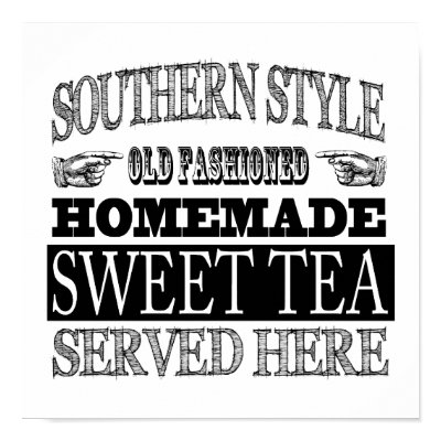
The design works because all the fonts seem to be from text families that are all have serifs and the text remind me of older times in the past. This was designed by the company Zazzle. It is used to draw the attention of customers by using different scales and designs to sell tea.