1. One Great example of TypeFace Mixing

2. One Creative use of Tracking

3. One Great use of Leading

4. One example of marking paragraphs (in this case they happen to be the dummy text for an article for a magazine layout)


1. One Great example of TypeFace Mixing
2. One Creative use of Tracking
3. One Great use of Leading
4. One example of marking paragraphs (in this case they happen to be the dummy text for an article for a magazine layout)

1. 6 different typefaces

2. Bad kerning- “Kerning can make all the difference”

3. The linespacing in this poster looks confusing. Once you look at it closely and read the poster the linespacing makes sense and get a point across.

4. Marking paragraph

1. A circus of 8 different typefaces.

2. What Obama means is for us to maintain appropriate kerning.

3. Legible line spacing, essential for human survival.
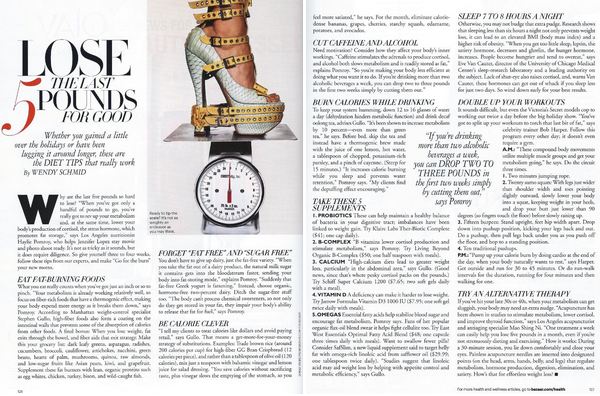
4. Lose the last 5 pounds for good, but keep the paragraph markings.

Here is a Mixing Typeface. The “Cream” and “Productions” are two different typefaces that works perfectly with each other.

This is an example of a good kerning and tracking.

The line spacing in this is neat. 🙂

Here is an example of marking paragraph. It is simple yet elegant.
1. typeface mixing

2. good tracking/kerning

3. good leading/linespacing

4. marking paragraphs

Research Martha Stewart’s design style, and post 2 images of distinctive designs done for any of her publications—books, magazines, websites. (Until October 2012, her creative director was Gael Towey, so you may want to research her as well.) Discuss Martha Stewart’s design style: the images, the typefaces, the layouts.
Use the “add media” button in the menu right above you when you’re writing your blog post to add images.
Categorize your homework as Blog HW#4.
1. One good example of mixing typefaces

2. One good example of tracking

3. One okay example of line spacing

4.One great example of marking paragraphs


This is an example of typemixing, the different in type is input in a way that is apparent but not disruptive with the message that its trying to illustrate.

A good example of good Tracking. The Name of the product (maybelline) is Tracked all across the image in thin type so that ppl could still see the image in the background.

I like the line spacing in this picture and i think that is good, it is easy to notice the spacing because the type in inside different black boxes. I feel like the amount of spacing between the lines makes it easy too read by spreading out the spaces between the lines without making it seem like too much text which can sometimes happen when there is too much line spacing.

A good example of Marking paragraphs
1. Good type mixing: The thick serif type stands well with its thinner relatives.
![]()
2. Good Kerning: The different kerning used lines up in an aesthetic way.

3. Good line spacing: The different leading of the text has a unique effect on the overall image.

4. The NYTimes web articles are always broken up in short chunks of paragraphs, making it less-overwintering to read.


Typeface Mixing:for somereason i love this flier it is mixing with differnt typeface& color.

Kerning.this one using a optical kerning which automatically desgin by the page layout program. the word “Matt” the two “T” are connect. but base on the idea of this flier, feels it is better with connect.

line space: this flier is mixing with differnt size of line space normally if so may different line space on one page going to be a little be werid. but this one. by adjust the size of typeface makes looks good.

Marking Paragraphs: this desginer makes the paragraphs into an graphic that have so many different ideas when look at the paragraphs. is that a person’s head. or is that a big city….