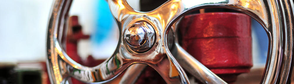
I’ve been on and off this site for a long time. The opening page, the introduction to this site, is simple. When I first came across this site, it took me a while to finish roaming the entire site. However, it wasn’t the complexity that made me stay on that long. It was the simple, but attractive features used in the site. The flash used is amazing. From that, I can tell that it’s definitely a professional website, with professional designers behind working on it here and there. Another thing is the perfect timing in every flash content. Whether it’s the blinking or the transitions, the flash content is well organized. Also, the color used is also eye-catching as well, which is the whole purpose of having this site on the internet in the first place. Great marketing strategy. The colors, the tints used, the color transformation used on every category, are all interesting. I play tennis, so this site is interesting to me to begin with, but even if you don’t play tennis, you’ll be amazed. There’s more, take a look.
One thought on “Tennis or not”
Leave a Reply
You must be logged in to post a comment.
I really like the color scheme used for this website. The red, black, and silver colors are used very effectively. The slight glow on the Wilson logo is attractive as well. I also enjoy watching the advertisement for the [K]FactorFX because of the way the blinking matches with the music. When I watch it, I feel as if there’s a heart beating, even though that is clearly not the case. The colors and the music just work very well together. Everything runs smoothly on this website. As Tiff mentioned, the site is simple, but it’s eye-catching.