Jonathan Choi Final Project Continue reading
Jungle
Reply
Jonathan Choi Final Project Continue reading
For my slideshow, I chose images of animals because i was randomly looking through pictures and liked the quality of the images. From there I made the interface simple and allowed users to click both thumbnails and back and forward arrows, I would have liked to animate how the images showed up on my slideshow project but didnt get the actionscript to work.
I like Jennifer Moy’s clean interface that intergrated a map that can be used to scroll through the pictures and that she used the actionscript to allow the pics to drop down when the next or when she clicked on a button on her map. It just gave the slideshow a nice effect with simple functionality and clean design.
Anime has its own aesthetic details that Japanese artist have created to express a unique visual style. Japanese artist use anime’s distinct aesthetic details to develop their story telling abilities by using exaggerated stylizations of eyes, body language, emotions, and overall characteristics of each individual character. I believe that anime is considered an art form and has gained a large audience for its manga and anime animations. Continue reading
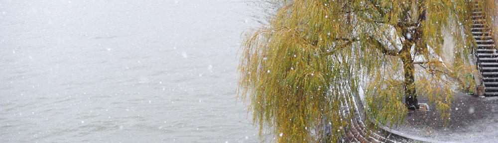
For my final project I would like to use three different still images and animate them. I want to animate my project to allow the still image to come to life. I want to use a waterscape, a cityscape, and a junglescape. I want to create subtle details through tweens and actionscripts to animate each individual surrounding. In the cityscape there might be a train moving in the background, I want something of this nature to occur in each of the scenes. I’m not exactly sure of what I want to animate but along these lines I want to be able to create realistic animations by using images that I have imported into flash.
Jonathan Choi Slideshow Continue reading
This website ducduc has a very clean interface and is very simple, and it doesnt take away from its images. When you hover over the links they change to a light blue color which I dont really like, but I guess its just a preference. The transition between photos has a nice clean feel to it, it slowly fades into each picture. The tabs to change through the pictures has a sleek and user friendly feel to it as well. I like the use of white and orange, the orange isnt too flashy and the white background just compliments it very well.
For my Good Banner, I picked UPS‘s banner because it coveyed its meaning well. The text wasnt scrolled across the banner too quickly but at the same time it coveyed speed. The banner also has 3 links on the bottom, the pictures in the background could be better but overall I believe that this banner has done its job with a decent image and use of text but lacks music or sound clips in the background.
For my Bad Banner, I chose a banner from active ride shops it has a link to buy a transworld magazine. I thought this banner had bad use of colors in the text, and didnt convey the meaning of the magazine. The basics of the link are understood but I believe that this banner could have been greatly improved upon. This is a banner that I would pass right over normally because it is very small and doesnt have anything to pull my attention towards it. It is hidden at the bottom of the page but I guess they dont expect transworld’s magazine link to sell many copies.


This website is flash based and teaches you how to do cartoons with adobe programs but mainly flash. This site caught my eye and has very nice animations. It was very easy to navigate through and if you didnt have to pay for the tutorials they would be a good way to learn more about flash. Even though the site lacked sounds, the links to different tutorials have a slight movement when you hover over the links. Some parts of the website have little animations that loop. I believe that this website has a simple look to it but has more than meets the eye.
This website is so advanced the flash on this website is amazing. It has animations for amost every click and has different backgrounds forming on different sections with them digitally forming. This website looks like a video game. Everything opens as if each page is a different world. Images and text boxes appear as you hoover from different links within the website.