Valeria’s final project
Reply
What is considered a serious art form? Perhaps it is artwork that has a general standard of what the subject matter should be and the style in which it should be presented. An example of a serious art form may be mandalas because they are supposed to reflect spirituality, as well as have patterns and geometric shapes. However, anime, which is Japanese animation, and manga, which are Japanese comics, do not appear to have “rules” about what they should look like. The exhibit Krazy!: The Delirious World of Anime + Manga + Video Games at the Japan Society showcases a wide variety of anime and manga genres and styles. The Japan Society’s collection of manga is more diverse than that of anime though. The manga displayed there feature human characters and even machines as the main characters, whereas the anime there only has people in it. Both manga and anime use many art styles, but manga appears to combine more styles than anime. Therefore, manga can be practically based on any subject and style. There is no clear set of “rules” to adhere to in creating manga. Hence, manga is not a serious art form. Continue reading
My slide show presents various optical illusions. I used classic tweens and different alphas in my project. In the second scene, the pictures that I used had people, animals, and a bicycle. I tried grouping the similar subjects together. I like the moving eyes because it makes my slides how a little mysterious. I also like how I arranged the buttons into eyebrow shapes. However, my project could have used some more interaction. As Zoe suggested, I could have made some of my images into buttons that would show the answer to the optical illusion. I could have excluded the bicycle image from my slide show too, but I thought that it had a very cool illusion. Overall, I accomplished my goal of making my slide show look unconventional with the animated eyes and button eyebrows.
I really enjoy looking at Liat’s slide show. The music goes very well with her images. I like how each image blurs and then becomes clear, as well as the raindrop effects on it. I also like how the raindrops in her intro changed into letters. I believe she used shape tweens for that. The clickable images on a roll of film is a clever and creative idea too. However, I think the cursor should be changed into another symbol when it’s rolled over an image so that the user knows that the image is clickable. Sometimes it’s a little difficult to click on the image I want to see because all the other images on the film start moving too. It might be better to make the images on the film not move so fast. Overall, this slide slow is very pleasant to look at, especially with all the different effects and music! For my next project, I want to have good music for it and some cool effects.
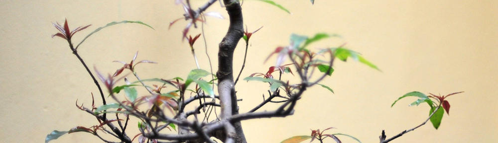
For my final project, I would like to create a short animation (approximately 45 seconds to one minute) about a cute cat that encounters some gangster cats in a dark alley. At first, the cat will look scared, but then it will gain courage as the scene progresses. I found a song called “March of Ghosts” from a Rurouni Kenshin soundtrack that would go well with this animation. I will attempt to match the motions with the music. The animation will consist mainly of dark colors. I will have either few or no interactive buttons on it.
My intended audience is for children older than 8 but I think adults would enjoy it too. I promise that there will be no blood or very graphic violence. My purpose is to make my animation humorous, not violent. Like Nastahia, I grew up watching cartoons and some anime so I would like to create an animation. My project will not be anime style. It will be simple and 2 dimensional.
The Joe Wong Photography website has a beautiful slideshow of weddings from different cultures. I like how the slideshow switches from black and white to color photographs. The black and white photographs are sophisticated, while the colorful photographs make the photographs come alive. I especially like the children in the slideshow.
The design of the slideshow is simple. When the slideshow first loads, the photographs change without any user interaction. However, as the slideshow plays, one can press the numbers or the arrows at the bottom of the show at any time to jump to another photgraph. Once the user clicks on the buttons though, the slideshow seems to stop playing on its own. There is also an option on the bottom right side to make the slideshow fullscreen. The typography that is used on the website looks professional. Overall, I like the simple, yet elegant slideshow.
Valeria’s Slideshow Continue reading
Princess Cruises’ website has a beautiful banner that can be found here: http://www.princess.com/. It slowly plays elegant and breathtaking pictures of the cruise line. There are images of the dining area, the pool, the exterior view of a ship, and many more. I like it that the banner plays the images at a slow pace so that its viewers can admire the scenes before them. It gives a feeling of relaxation. The images are also very sharp and crisp, which make them aesthetically pleasing. Lastly, I like the interactiveness of the banner. It allows me to visit other webpages. It’s also a plus that it replays itself.
On the other hand, Sleepy’s banner is not well made. It can be found here: http://www.sleepys.com/. It is very plain and it plays only once. It sends the message that the price of the mattress is half off, but it does not use flash effectively. The designer could have conveyed the same message without using flash. Even though a red color is used, the banner still looks a little dull. The blue color might look better if it were darker. Towards the end of the flash animation, the “Twin 2PC Set” and “Full 2PC Set” shrink, but I don’t think it really adds to the advertisement. The regular prices are also too small at the end of the animation. It might be better if the designer had made the prices bigger and then crossed them out with a flash application.
The exhibit, “Second Lives: Remixing the Ordinary” at the Museum of Art and Design presents extraordinary works of art constructed from ordinary objects. Buttons, clothing labels, forks, q-tips, glasses and a variety of other typical everyday items are used as building blocks to create amazing structures. Though each piece of artwork is unique, one similarity among all of them is that the shape of the individual parts in the artwork does not resemble the final shape of the whole. The simple shapes of the parts can be arranged into a complex whole. Continue reading


Baruch’s Chemistry Lab Tutorial website is effective in teaching people about lab safety. It is divided into 6 sections: an introduction, exploring the lab, what to wear, safe lab practices, emergency scenarios, and a practice quiz. I like this website because I can jump around to different sections instead of watching all of the tutorials. I also have the option of skipping slides or replaying them. Another feature of this website is that I can read the text or listen to the audio. It’s a good idea to have the text because it’s easy to miss some of the things in the audio. The slides also have pop ups of important points. In addition, in the emergency scenarios section, I can click on objects in the virtual lab and in the what to wear section, I can pick out a person’s clothes. These interactions help make this educational site a little fun.
The design of the website is much simpler than a website that is trying to sell a product. It has simple shapes and is not cluttered. The color scheme mainly consists of yellow and orange, but it’s not too bright. I think these colors were used so that the tutorial is not as boring. Overall, there is nothing “wow” about this website, but it’s clear and easy to understand.
An interesting example of Flash content is Snapple’s website, which is located here. The website’s opening instantly amazes me. It has an elaborate 3-dimensional map of all the locations that inspired Snapple’s products. The map has Africa, China, England, India, and New York City on it. If you click on each place, you will be able to zoom into it and see some of the famous landmarks in that area. Then you will be given the opportunity to click on specific Snapple drinks that originated from those places. Another pro of this website are the warm colors and the upbeat music.
Although the content is overall very impressive, I do not like the zooming in of the places too much. It makes me dizzy because the zooming is so fast that it makes some parts blurry. I also get bored of clicking on the Snapple products because there are so many of them that look similar to each other.
The website conveys the message that Snapple is “made from the best stuff on earth.” The scenery is astounding, as well as the music. It gives the sense that Snapple is not an ordinary drink because of its exotic origins. Though I do not agree that Snapple is the best drink, the Flash animation does a splendid job of promoting Snapple.