Hello and welcome to my first blog post! My name is Lucy I am an economics major, and I will be writing about the linguistic landscape of New York City.
For this assignment, I chose to do my analysis on Astoria, Queens.
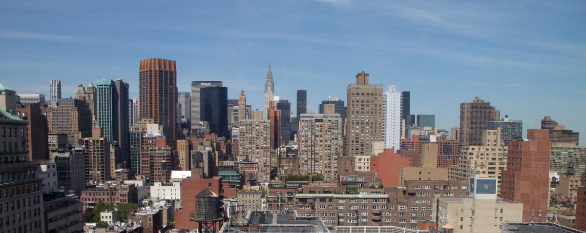
Astoria, Queens, offers a rich environment for analyzing how language appears in public spaces. I selected this area for its varied signage styles and how they communicate with different audiences. This study will explore three themes: the use of color in signage to attract attention or convey meaning, the impact of font styles on readability and identity, the presence of multiple languages and their prominence, and the type of information displayed in public texts. Examining these elements will provide insight into how visual and textual choices shape communication and promotion for business owners in Astoria. The map below (Figure 1) highlights key areas where these linguistic patterns can be observed.

Figure 1. Map of Astoria & Sub-districts “Reddit”, Google, Reddit, 2018 (https://www.reddit.com/r/astoria/comments/9pwplp/i_made_a_map_showing_the_subdistricts_of_astoria/) Accessed 27 Mar. 2025
There are three main themes in my analysis:
- Color:
Color helps signs stand out by making them easier to see and read. Complementary colors, like blue and orange or red and green, create strong contrast, so the text and symbols pop. This makes signs stand out more and easier to understand quickly.
2. Font:
Font affects how easily a sign is read. Bold, simple fonts are best for quick recognition, while decorative fonts can be harder to read. Clear fonts with strong contrast make signs more effective.
3. Language & Info:
Signs are in English and often include the business’s address and phone number. People walking by take pictures of signs to remember and visit later. This makes it easy for customers to find and contact businesses when they have time.
Before we start…. lets first address the diversity in Astoria, Queens.
Why is diversity important to linguistic landscape in an area?
Diversity in Astoria affects businesses by connecting with more people. Acknowledgement of diversity helps to promote the use of different languages and designs that appeal to various cultures. This makes customers feel welcome and more likely to engage. It also helps businesses reach a wider audience.

Figure 2: Race and Ethnicity. “DataUSA.” DataUSA, 2023, https://datausa.io/ Accessed 24 Mar. 2025.
In 2023, there were 3.01 times more White (Non-Hispanic) residents (83k people) in NYC-Queens Community District 1–Astoria & Queensbridge PUMA, NY than any other race or ethnicity.
Data from the Census Bureau ACS 5-year Estimate. And https://datausa.io/profile/geo/nyc-queens-community-district-1-astoria-queensbridge-puma-ny?pums5RacesPyramid=pums5Race4
Astoria is originally known for its Greek and Italian communities, however neighborhood has evolved into a melting pot with White, Asian, Black, and Hispanic populations. It is evident that this diversity creates a wider range of traditions and languages in the local businesses, restaurants, and cultural institutions. Addressing the diversity will let you know what the customer base looks like and who store owners are trying to cater to most.
(THEME 1) COLOR:
I walked around Astoria, Queens and snapped a few pictures of street signs and signs above stores.
Take a look, do you notice something similar about the colors on these signs?
Analyzing the photos:
- Store owner uses dark blue and neon white lighting for the letters.

Figure 3.
- The use of two complimentary colors, evokes feeling of patriotism.

Figure 4.
If you guessed that all of these signs use complimentary colors, then “ding ding!” you’d be correct. I have noticed that roughly about 75% of signs in a bustling city like New York utilize complimentary colors for the main colors on signage. Colors can help store signage stand out in bad weather conditions, at night, or evoke some type of feeling in the customer.
Store or business owners do this to optimize visibility and contrast. If you were out on a rainy or foggy evening and wanted ice cream, would you notice the ice cream store that has a pastel store sign or a bright red and blue one? You’d probably notice the one with the brighter and bolder colors first.
(THEME 2) FONT:
Next, lets head into why which font you pick is so important. Other than color, font will dictate whether or not signs are readable across all ethnicities and races.
Non-native english speakers may have issues with cursive writing or any overly complicated fonts.
Lets Analyze these pictures:
- Hand-written street sign, letters are all in lower case so it is harder for people to read. The words are not aligned and get cut off by the drawing. This would be hard to read, even for native hispanic customers.

Figure 5.
- Clearer font, written by marker and uses all capital fonts. This street sign is literally “no-nonsense” and will catch the eye of people walking by or potential customers. This is a perfect font choice and letter design. Notice how there are no words getting cut off and every letter fits perfectly.

Figure 6.
Which of these above signs would you read and understand faster?
(THEME 3) LANGUAGE & INFO:
Lastly, the final theme is language and info. The most common language that these signs are written in, is english. It is mainly written in english because it is one of the most common spoken language in America and caucasian people make up Astoria’s largest percentage in population.
In addition, the negative space of the signs are commonly filled up with additional detail, like the exact location, services, opening times, phone number, or sometimes all four at once.
Picture Analysis:
- The services are all written in english on the bottom, there is also images of teeth for non-english speakers. On the bottom right corner there is the contact information and on the bottom left there is the address.

Figure 7.
- The services are also all written in english and the store owner includes the address at the bottom left and the phone number on the top right.

Figure 8.
The use of english language and additional information is a tool of convenience to help customers find their store again easier.
Why are these themes important to New York City?
All these themes are strategies that business owners use to adapt to their surroundings and attract customers. The main goal of all these themes is to combine strategies for the most optimal and effective communication. In a busy city like New York, businesses need to adapt by making their signage stand out and easier to understand. It is very hard to hit the perfect balance of this without being too busy or too plain in your signage and store design. I hope this analysis helps with breaking down strategies that store owners could potentially use to help to restore their New York City business.

Astoria, Queens, New York City