Abdou sana:
All the pictures of signs were taken on the same street at Fordham road. Fordham road is where I live and I have gotten used to the atmosphere. Fordham itself is like a huge mall while not actually a mall. It just has tons of stores and everything a person might be looking for. Fordham tends to be overly populated during the day but more peaceful at night. Lots of people come there everyday to shop, and enjoy the company. There’s also lots of vendors during the day, people sell all types of different products on the streets. If you’re not a fan of crowded noisy places, then Fordham may not be for you. Fordham Road is also known for its diverse community mixed with different cultures. its population is mainly latinos, Caribbeans, and African Americans. Overall Fordham is like a noisy shopping mall that offers everything a person needs on a daily basis. I will be working with all types of signs and logos from around Fordham, its asthenosphere is interesting and diverse. The themes I will focus on are capital letters, the vibrant colors in most of the signs, and old school signs.
Thesis
The signs on Fordham road demonstrates how businesses use different marketing strategies to attract a diverse customer basses, showcasing economic influence within the community.
Figure 1.
Figure 2.
Capital letters:
In a lot of my signs, there’s huge capital letter wording. The reason why most of the stores do this is because they want to attract a lot of customers. Fordham itself is like a huge mall while not actually a mall. It just has tons of stores and everything a person might be looking for. Fordham tends to be overly populated during the day. Lots of people come there everyday to shop, and enjoy the company. This is the reason why I believe almost every store makes their signs in huge letter writing because it’s the most convenient way to seek attention and be noticed better compared to other stores around the area. There’s a lot of competition between these stores because a lot of the stores in the area sell the same products. So it’s a matter of attracting customers by making the font size huge and in all caps to make the presence of the store more serious and efficient.
Figure 1.
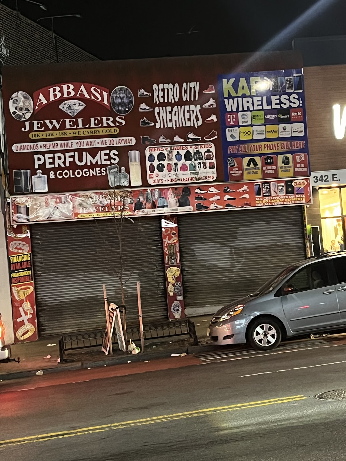
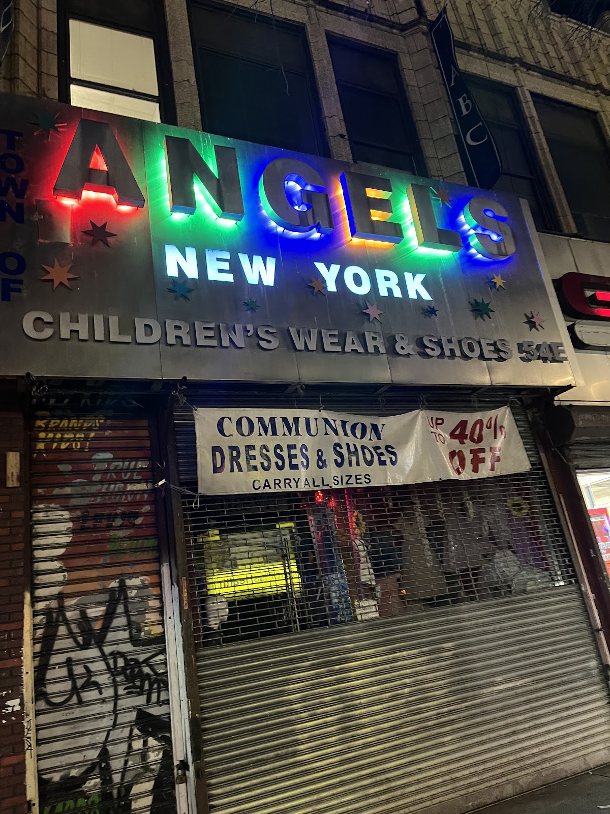
The first sign sells a lot of different types of items, it ranges from sneakers to cologne and perfumes, jewelry, phone services etc. Them making the wording in all capital letters makes customers have an attraction to the store, the fact that they sell or give so many services at once can appeal to customers because it may help them save a lot of time on their shopping.
Figure 2.
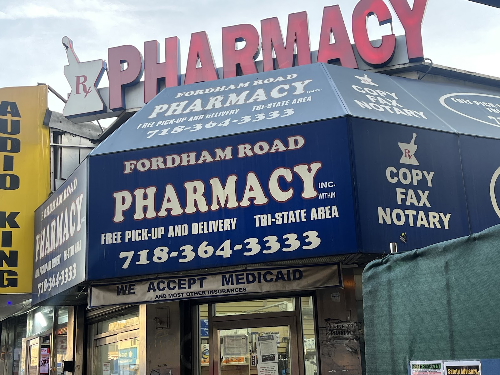
The second sign is a simple pharmacy that sells prescriptions. Them making the sign in capital letters helps to speak a simple message of “ here’s a pharmacy, we sell a lot of goods that you may need, so if you’re in need then come check us out”. Not only is this essential, but it can really set a tone different between that pharmacy and a different pharmacy.
Figure 3.
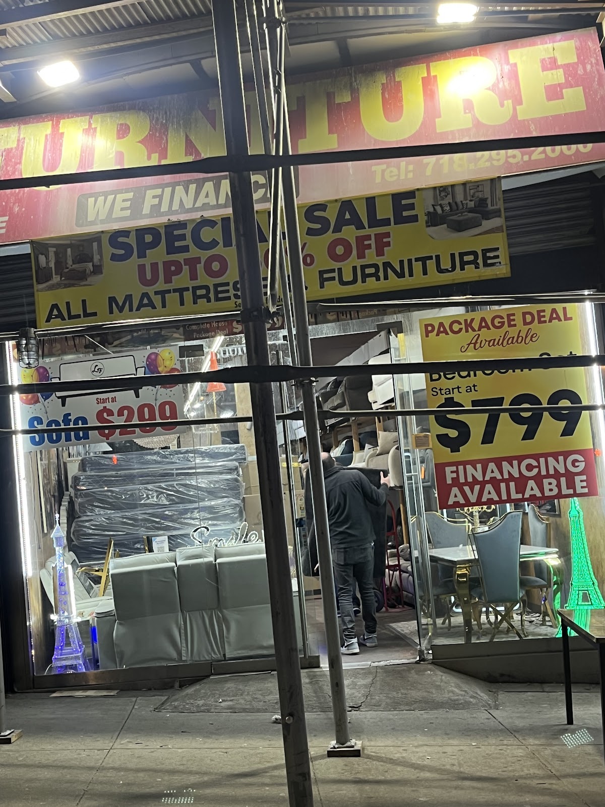
The last sign is a store that sells furniture and is having a huge sale at the moment. Making the signs in capital letters to show that they’re having a huge sale right now is just a smart way to make money. It’s easy for the eye to see and furniture is a material that everyone needs within their homes. So huge letters were just a convenient way to make money.
Old school:
The second most convenient theme that is seen in my signs are old school signs. Old school signs are signs that present a lot of information of what services the store provides without even going inside the store. I personally find old school signs are convenient to customers because it helps us save time. They don’t sugar coat anything within the signs, they just straightforwardly state the services which is very pleasant for a place like Fordham Road since it’s so crowded. Old school signs can also help reduce confusion for customers because it prevents customers from needing to ask basic questions, which will improve their shopping experience. It’s also beneficial for non-social people and introverted people. Below I have provided 3 pictures of old school signs from Fordham. One common observation I see within all three signs is that they all provide some type of contact information or website to learn more about the store. This is a very smart action from them because customers may not have time to visit the store, but they can always take a quick picture to then later call or visit the website to see if the store fully provides the services they are looking for.
Figure 4.
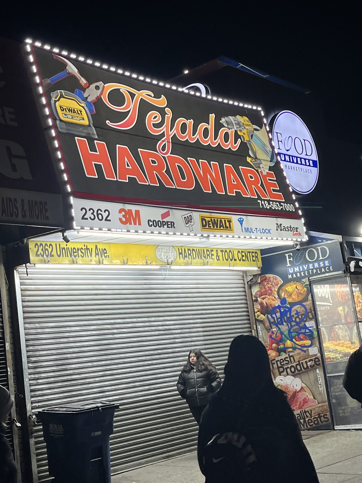
In figure 4, it’s a sign of a store that sells construction tools. The store could have just stopped with the branding name which was “ Fejada HARDWARE”, but instead they went more in depth by stating the types of brands of tools they sell within the actual sign. For a construction store, one obvious question I can see customers asking is “ which brands do y’all sell”. Them providing the brands already in their signs can help customers save time by not going into the store just to find someone that works there to ask that question.
Figure 5.
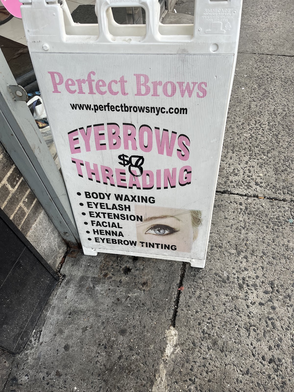
Figure 5 is a small street sign that was set in front of the store. Street signs like these don’t usually provide too much information. Usually just the brand name and maybe some deals they have. For such a small street sign, I would still consider this an old school sign. The sign provides the branding name entitled “ perfect brows”. Hearing the name alone, I would automatically assume that the only services they provide are eyebrow services. The sign states that they provide other services like Body waxing, Facials, and Hennas which I found extremely shocking. Henna is a natural dye made from the leaves of a henna plant. It’s used to create temporary body art, kind of like a tattoo. From the branding name alone, I think it would’ve been impossible for someone to predict that this store provides henna services. Them adding this detail to their sign and also provided a website has brought them a lot more customers.
Figure 6.
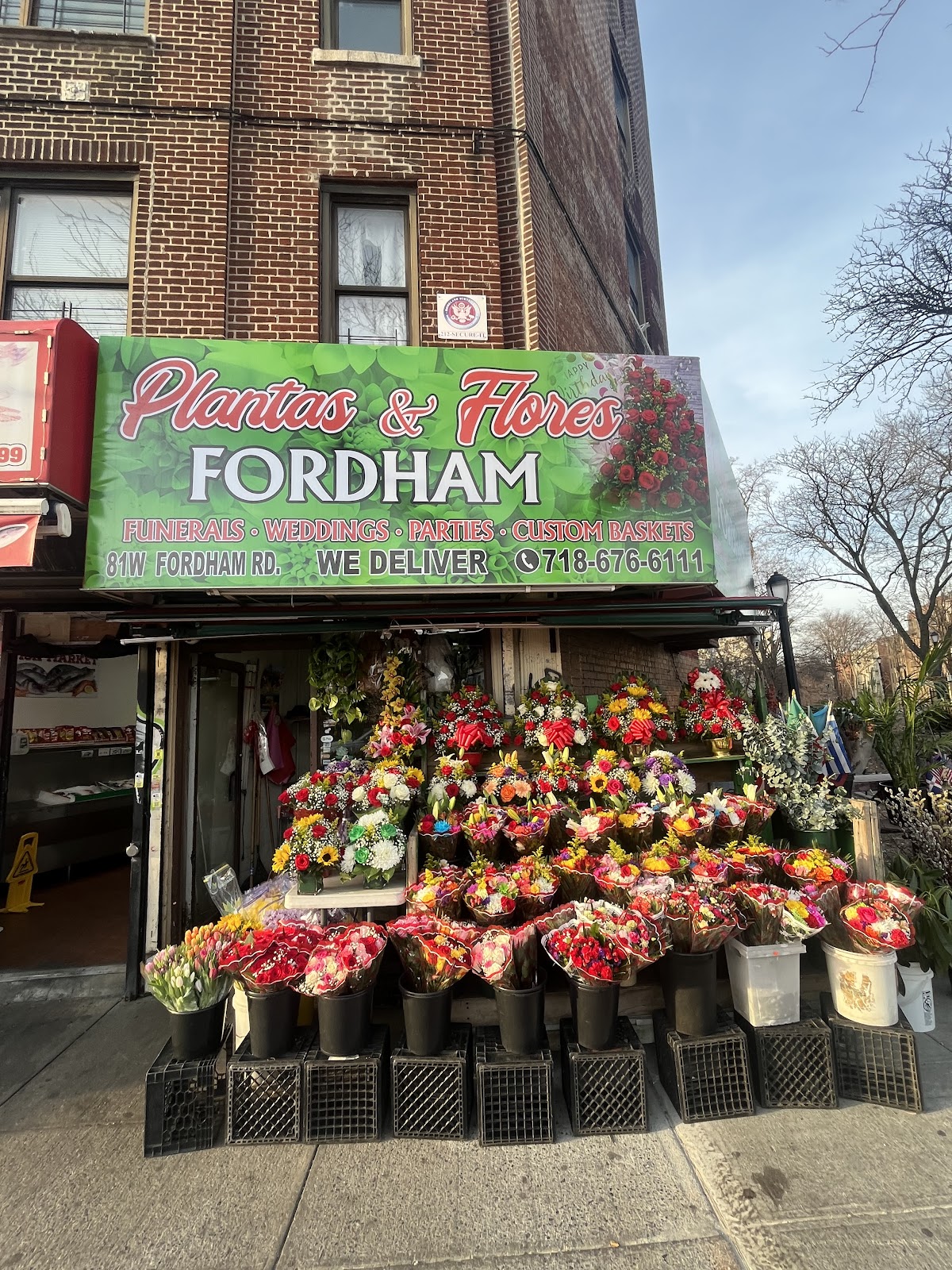
Figure 6 is a sign of a flower store called “ Plantas & Flores”. From the name it seems to be a store owned by a hispanic country. knowing this detail doesn’t provide insight of the services of the store. Below the branding name, they listed services they provide like funeral services, weddings, parties, and custom baskets. From the size of the store itself, I feel like most customers wouldn’t assume that they do services for such big events like weddings, and funerals. The store doesn’t look as professional for those kinds of services. Them adding this old school sign really helps build their credibility because I’m sure it has allowed them to cater to those big events.
Figure 7.
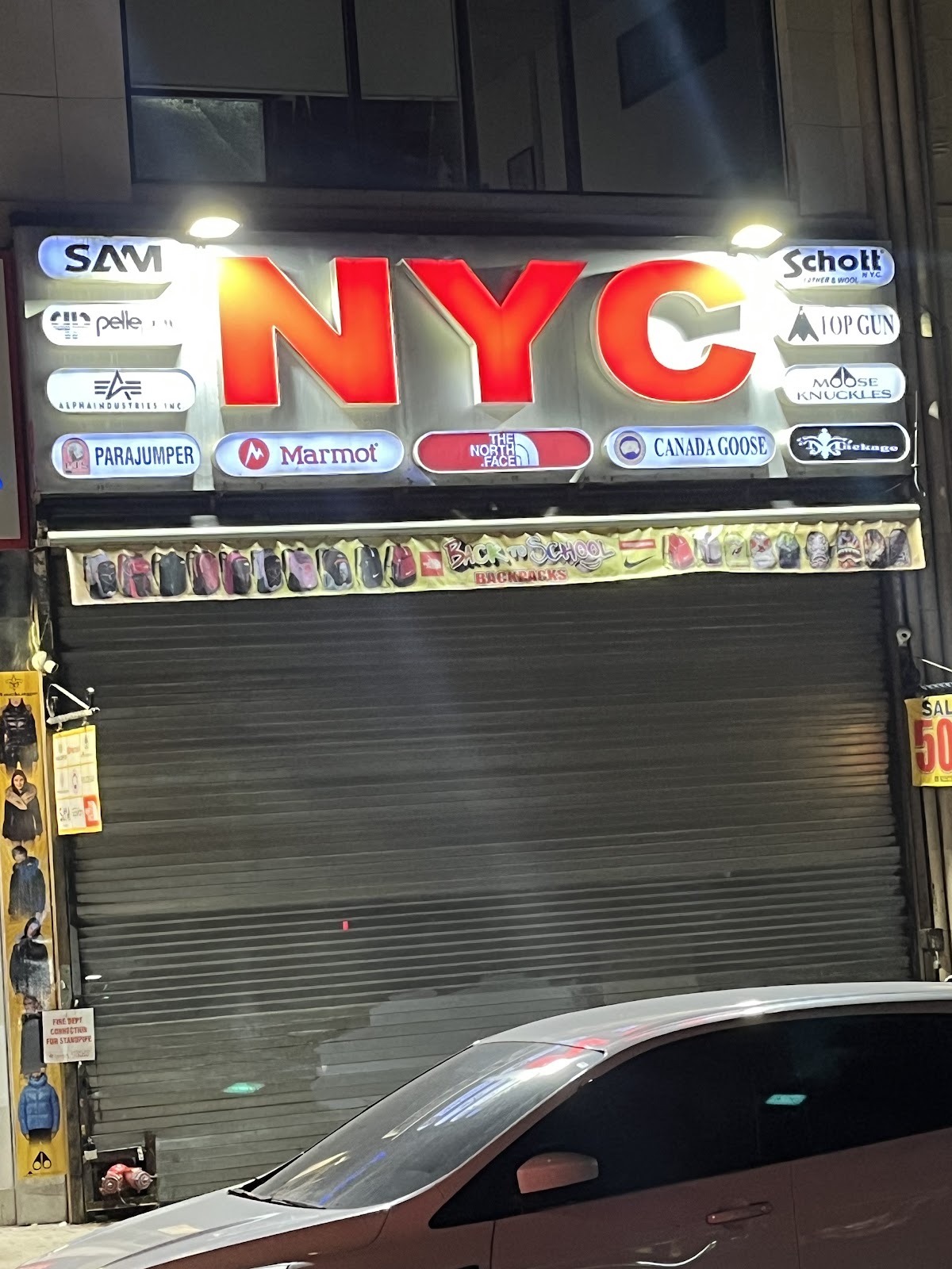
Figure 8.
Figure 9.
Figure 10.