COVID Visualisation and Analysis:
Focusing on R0
Author: Francis Yuan
Data Last Updated: 1 April 2020
Estimation of R0 for COVID-19
The R0 index for a disease in a given community is defined as the expected secondary infections generated by one case. Epidemiologists use this value to quantify the transmissibility of an infectious disease. For a given disease like COVID-19, R0 may vary across regions, due to differences in demographic and socioeconomic factors. Though R0 doesn’t necessarily indicate the spreading rate of diseases partly because lifespans of diseases vary (for example, R0 indices of AIDS and the common cold are in the same range, but their spreading patterns are vastly different), R0 indices for a given disease in different regions may be a good indicator for spreading rates.
Based on The New York Times’ COVID-19 database, I used an R toolbox to calculate R0 for each state in the US.
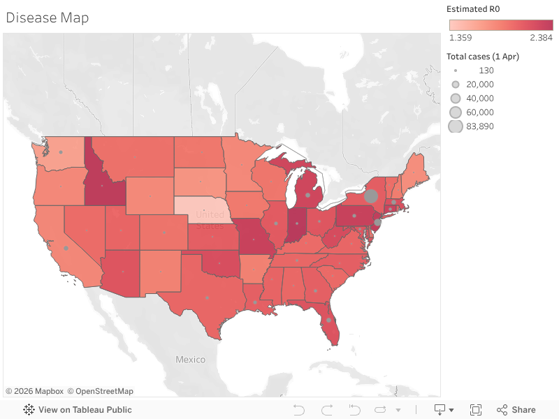
Figure 1: R0 and Total Cases of States in the US (click me to get the interactive version of this plot, same for plots below)
We can see that New Jersey and New York, which have the most cases, are among the highest in terms of R0. Interestingly, R0 is very high in Idaho and Indiana; it may be worthwhile to dig into this, which I haven’t been able to do yet.
Threat Analysis
Though almost everyone is susceptible to COVID-19, the elderly are particularly vulnerable: The fatality rate is much higher for patients above 65, and those patients are also more likely to develop severe symptoms. Moreover, a major threat this disease is posing is the pressure on the healthcare system: If the outbreak overwhelms the healthcare system, the fatality rate will sky-rocket and the social consequences will also be severe, which is happening in Italy and Spain.
To do a threat analysis, I acquired demographic data from the US Census Bureau and hospital capacity data from the National Center for Health Statistics. Combined with the R0 estimates, I was able to perform a threat analysis. The idea is: a community is at greater threat if COVID-19 is spreading faster (higher R0), if it has more elderly persons (higher percentage of persons above 65), or if its healthcare capacity is lower (fewer hospital beds per 1,000 people).
Based on the three variables, I performed a cluster analysis in Tableau. Fifty-one regions in the US (50 states plus DC) were divided into three clusters, which were manually labeled as high threat, medium threat, or moderate threat. For example, Florida has a large portion of senior population, and COVID-19 is spreading faster, so it’s classified as facing a high threat; the DC has lots of hospital beds and the spread is slower, which means the risk is relatively moderate.

Figure 2: COVID-19 Threat to States in the US
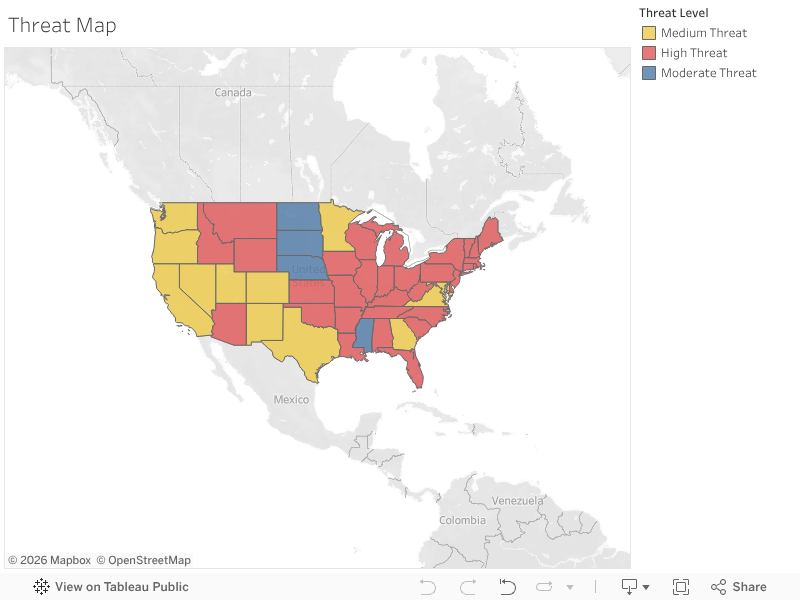
Figure 3: Map of COVID-19 Threat Level
This analysis may be able to provide some information about where medical resources are most needed and it may also be of use when state governments are evaluating their response to the disease.
Digging into the Variation of R0
It can be noticed that R0 has great variations across states, which makes it interesting to look into the causes of this variation. To do this, I did several regressions in Python (code available upon request).
A natural idea would be that R0 may be related to population density, so I did a univariate regression.
| Dependent Variable: Estimated R0 |
|
Coefficient |
P-Value |
| Const |
1.9998 |
0 |
| Population per square mile (2010) |
-0.000003 |
0.8735 |
|
|
|
| Observations |
49 |
(Note: Population density data from the US Census Bureau.)
In the regression above, the coefficient of population density is by no means significant. Statistically, there’s no relation between population density and R0, which is a surprise. At first, this result makes me wonder if my estimation of R0 is entirely wrong, but then I did another regression and it started to make sense.
| Dependent Variable: Estimated R0 |
|
Coefficient |
P-value |
| Const |
2.441 |
0 |
| Vehicles per 1000 (2017) |
-0.0005 |
0.0404 |
|
|
|
| Observations |
49 |
(Note: Vehicle ownership data from Wikipedia.)
This regression shows that the more vehicles people own, the slower COVID-19 spreads, which is significant at the 5% level. Though the coefficient is small, the measure for vehicle ownership ranges from 539 to 1140, which can translate into a considerable difference of 0.25 in R0. This result makes sense because if people have their own cars and often travel in them, they’ll get in touch with fewer others, hence slower disease transmission rate.
I also noticed response to the disease is very different across states, and it occurred to me that a part of R0’s variation might be explained by the political affiliation of states. Therefore, I added 2016 presidential election results into the regression.
| Dependent Variable: Estimated R0 |
|
Coefficient |
P-Value |
| const |
2.535042 |
0 |
| Vehicles per 1000 (2017) |
-0.0007 |
0.006 |
| GOPWon |
0.1256 |
0.031 |
|
|
|
| Observations |
49 |
(Note: GOPWon equals one if the republicans won in this state in 2016, zero otherwise. Data from GitHub.)
After adding this new variable, the coefficient for vehicle ownership became more significant, while the new variable itself is also significant at the 5% level. This suggests that in red states, COVID-19 spreads faster. Interpretation of this result should be done with care, as this result may well be driven by demographic or socioeconomic factors that are related to party support (i.e., adding those factors into the regression would make GOPWon insignificant).
Disclaimer
This passage is for information purposes only.
Analytical results in this passage are only preliminary. The validity of analytic methods used is not rigorously verified and this passage is subject to revisions. The author is by no means accountable for any conclusions drawn from this passage.


