
It’s been 2 years since I visited the Museum of Modern Art on 53rd St and I recently went to visit again. It recently underwent renovation where a new section was added to part of the Museum and where new changes took place in the original building as well.
One of the first things I noticed that was different about the reopened museum is the entrances. There is now security before you enter the building to check your bag, along with cops on standby as well. I’m not sure why or what caused this action to be in place, but I don’t have a good impression of it. Having security is normal, but having cops on standby isn’t a good look to me because I don’t usually see that happening for any museum that I have visited before. When entering, some significant things I noticed are new hanging overhead lights and a relocation of the ticket area. The overhead hanging light is a clear rectangular glass box that has dozens of sphere light bulbs inside it. It is an interesting design and choice to put in the entrance lobby area. I think the reason for the overhead light is to give visitors the feeling of the creativity behind a Museum dedicated to modern art, and also for a more welcoming feeling, since the lobby is spacious and can feel empty. As for the ticket area, I noticed it used to be somewhat in the middle of the lobby where it felt out of place. But after the renovation, the ticket area has their own section with a different color than the rest of the lobby, to distinguish itself so that visitors have an easier time finding them, and lines are more organized, which I think is one of the museum’s best improvements. A brand new addition to the museum that debuted after the renovation is the New Creativity Lab called ‘The People’s Studio”. In this room there are art and craft supplies which allow people to draw, create, and even knit. This new addition shows the renovation’s effort to make more interactive areas in the museum, that was lacking before.
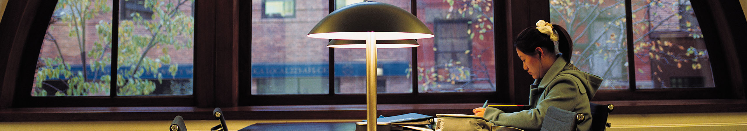
I would describe the layout of the exhibits in MoMa as “getting lost in art”. I say that because of the design of the rooms. The exhibit sections follow the same design of a large room with white walls, white ceilings, and a wooden floor. This design of identical colors makes the experience for viewers feel as if they are “lost”. Whenever I entered a new exhibit and was going from room to room, I felt like I was going in circles because how similar each room looked. I got this lost feeling where I at one point I thought, it would be impossible to navigate back to where I originally started from. But, I actually was seeing new pieces each room I went, so that reminded me I was going deeper into the exhibit and not just walking in circles. As for how the design affects the experience of the art, I feel that it allows viewers to focus more on the art and lets them know the main piece of the room. The neutral colors of the lighting, walls, ceilings, and floor is easy on the eye, where it is not a distraction or a gimmick that deflects the focus of the main intended piece in the room.
I would say that the addition of a new section in the MoMa is a success in the way that they did it and it’s purpose. One thing to point out about the way they added the new section is that they built it adjacent to the already existing building, rather than building it on top, giving it more stories and height. By building the new section adjacent, it keeps the identity of the already existing MoMa building, which isn’t too tall or too short. Also, by building it adjacent, it expands the MoMa even further on their block on 53rd St, which shows their dominance of the block that they are on. However, if the new section of the MoMa was built on top of the already existing building, it would change the identity of the MoMa building. If the newly reopened MoMa was to be more than 10 stories tall, it would change the way people see the MoMa. Commercial and business buildings are usually the tall buildings that we see in Manhattan, so if the MoMa were to add height and look similar to commercial buildings, it would certainly lose some of their identity to viewers. Another great part of the new section of the MoMa is that they stayed consistent to their exterior glass window design. The glass window stays true to the Museum’s name of being modern. Most modern museums and even buildings have transitioned to using window exteriors, which symbolize the modern standard of architecture.
If I were to describe the identity of the Museum of Modern Art, it would be a “giant cube that could be changed”. This museum is always adapting and the exhibits in there are not permanent. Exhibits in the MoMa from what I noticed, lasts for a specific number of months before a new one replaces it. Even inside the exhibits, the walls in the room are not permanent either. They can moved or removed to cater to a new exhibit that is going to be on display. The MoMa is constantly being changed with different exhibits being shown, but it will always remain true to its identity of displaying modern art. It shows me that art is always evolving and new forms of art can be discovered or emerge at any time.


