Bayside is a neighborhood in the northeast side of Queens. Bayside stretches from Bay Terrace to the edge of Oakland Gardens in Queens. The small town contains multiple schools, many restaurants, and is the melting pot of many cultures who immigrated here in the 1900s. Bayside has always fostered a diverse community and amplified its multiple cultures through its linguistic landscape using the language of the culture, store front design, and colors.
Bayside consists of many ethnic neighborhoods but are blended in a way that there is no distinct culture in a neighborhood. Most neighborhoods contain Chinese, Korean, European, Hispanic, and African American cultures. Much of the schools in the area make up a diverse population that it’s hard to find a ethnic identity in Bayside. Everywhere you go, there is something unique about the different signs you would see on restaurants and food markets.
The intersection of Springfield Boulevard and Horace Harding Expressway reveals the setting of many diverse restaurants. In the street of Springfield, many of the signs show English words but also some show their ethnic language. For example, Rolly Kimbab, a Korean restaurant, shows the Korean characters on their banner and . They also show a portion of their menu on a banner to try to attract both Korea and non-Korean customers to their restaurant. Much of the restaurant workers speak Korean and little English which is the basis of most non-American restaurants in Bayside. In addition, many restaurants in Bayside use colors to represent ideas of the restaurant or symbols. The green in Rolly Kimbab explains that they use fresh ingredients and the youth of Korean culture. The store mainly attracts young people to the fresh ingredients available at the restaurant with its green accents.

Image 1: Rolly Kimbab on Springfield Boulevard.
Across the street, you would see a bunch of Chinese restaurants such as Supreme Dumpling. Supreme Dumpling, as shown below behind the tree, a Chinese character and also the same character is implemented in the entrance of the doorway. Many Chinese restaurants in Bayside and other towns put symbols on their restaurants to symbolize wealth and prosperity. Like the color green that Rolly Kimbab used, Supreme Dumpling used a gold color to symbolize their good fortune and wealth in the future.

Image 2: Supreme Dumpling in Bayside.
On the corner of Springfield and Horace Harding, is a little Empanada spot known for their empanadas. The restaurant shows a combination of colors from the Spanish flag, which is red and yellow, combining to make orange. Orange represents uniqueness and fascination in the town because it is the only bright colored restaurant on the block. The restaurant also uses the Spanish language which says the name of their restaurant, “El Punto de Las Empanadas”. This attracts the Spanish population who can’t read English as well as the non-Spanish speakers using English words. However, the workers in the restaurant speak both Spanish and English fluently so communication to get food is simple.

Image 3: The Empanada Spot on Springfield Boulevard.
Nearby, Gino’s is a long standing Italian restaurant serving Bayside since 1977. It doesn’t not cater to the Italian community by showing the Italian langauge on its storefront. Rather, it uses English words and the colors of the Italian flag to show that the restaurant itself is Italian cuisine. To show its authenticity, Gino’s opens its windows to the public to show that they create everything fresh and authentic. The windows in Gino’s are relatively clear which differ to the restaurants before. The restaurants before had a commonality which was that they had some sort of version of their menu posted on their window space. For example, The Empanada Spot has pictures of its food like Rolly Kimbab does and Supreme Dumpling has their menu on the storefront. On the other hand, Gino’s is relatively open like the restaurants you would see next.

Image 4: The Italian flag colors are represented in the store front.
Across the town, there’s a high concentration of high quality restaurants in the upper part of Bayside. In this condensed streets, these restaurants have similar diversity to other parts of Bayside. There are many more restaurants including cafes, food markets, and even unique restaurants serving a specific item of food.
One of these restaurants include Momo Ashi. Momo Ashi is a Taiwanese based restaurant. They are a cat and dog styled cafe where they serve bubble tea as well as their unique desserts such as their Monigiri and their Wamochi. These items are a play on Asian snacks using animals names and designs. As shown in the first picture below, the sign shows the deals they have with their drinks and snacks. The sign appeals to the younger generation of people in the community as the cat and dogs are the basis of their designs. Momo Ashi presents itself as an charming cafe unique to the landscape considering the next few restaurants are all more professional looking rather than adorable. Their windows are relavtively clear like Gino’s but the store front of Momo Ashi uses the color pink, shown in the second picture below, to emphasize the friendly and inviting feeling that people would feel when they entered the store. This Taiwanese styled cafe doesn’t use their own language, rather the store recreates a similar feel to that of stores in Taiwan. The store sells popular Taiwanese styled snacks and tea. For example, they sell their “Momo Toast” which comes from a Taiwanese recipe that combines pieces of bread and custard together.
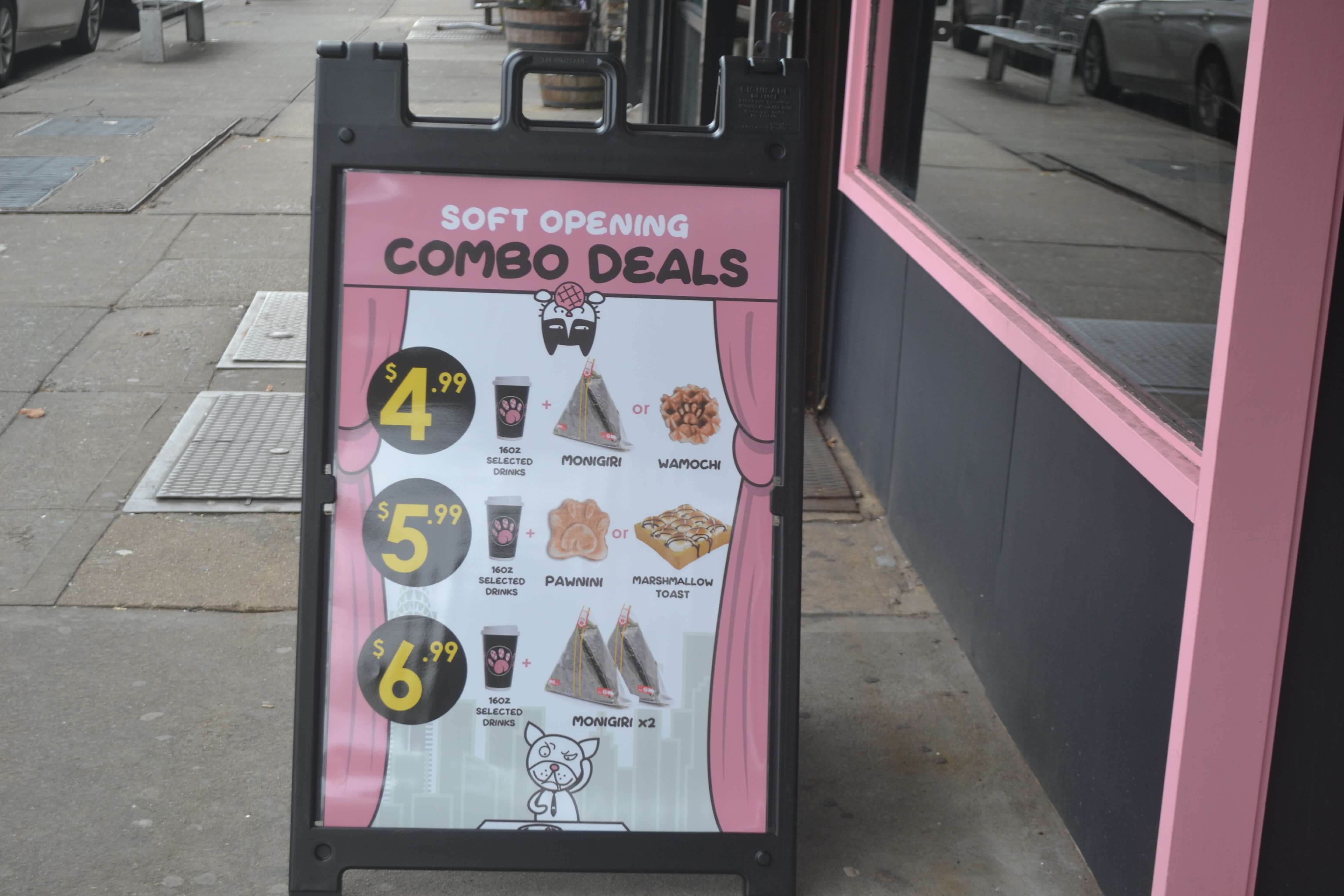
Image 5: Momo Ashi shows a series of deals regarding the unique snacks they have.
Momo Ashi had recently begun operations as cafe shop in December 2018. It took over a once nail spa, that hadn’t received much business in past years. This new shop resembles much of the newer restaurants that have started on the block. The next few restaurants are relatively new and have overtaken previous restaurants and stores.
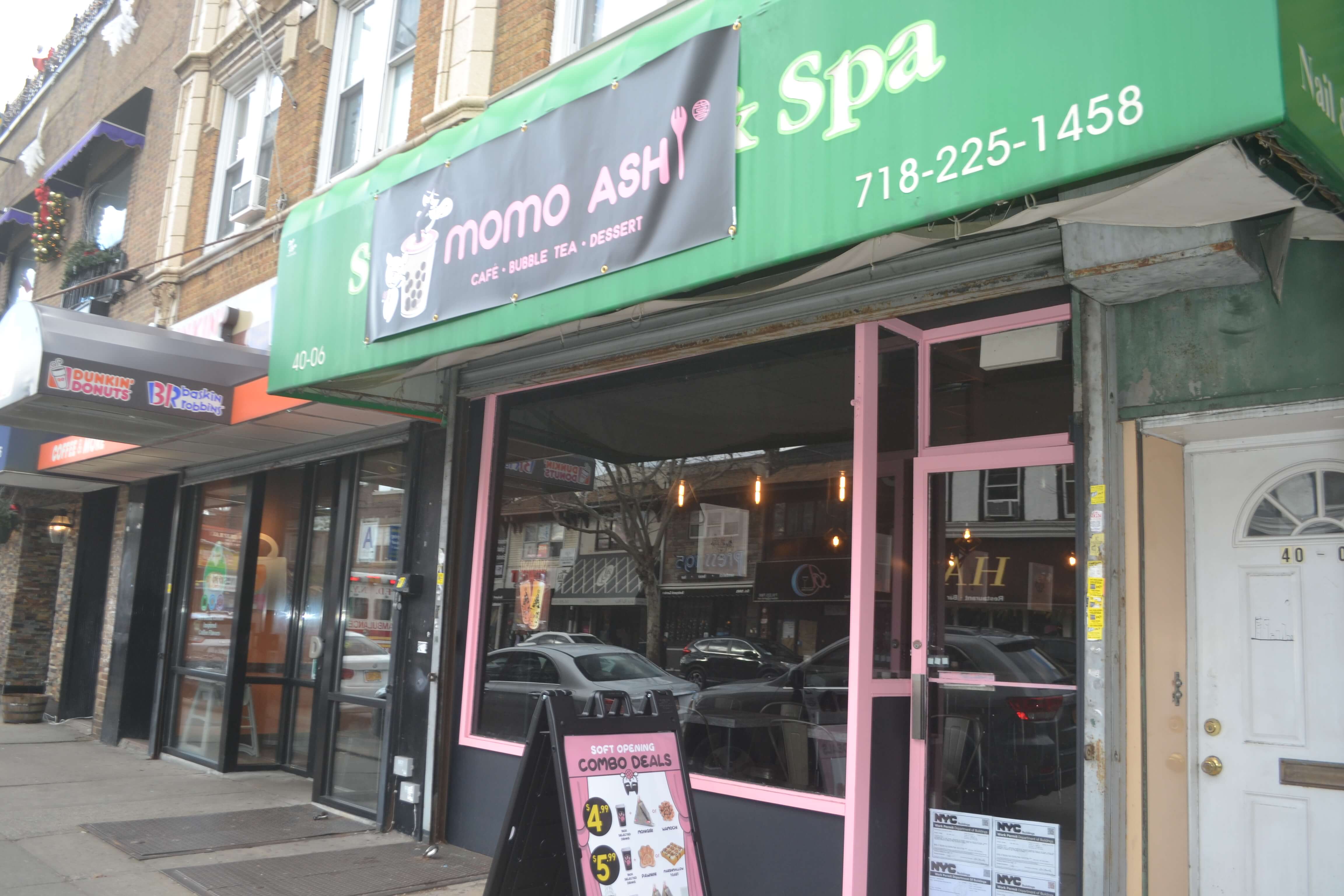
Image 6: Momo Ashi has a soft opening but still has its main colors of pink on its store front.
Similar to Momo Ashi, there is a Japanese restaurant that promotes its culture through the use of signs and colors. The restaurant is called Nippon Cha; where Nippon means the sun and cha means tea. Nippon Cha is notably known as a Japanese restaurant. As you can see, there are Japanese symbols on the bottom right of the store front and its little celebration ritual near the entrance. Furthermore, the store front of this restaurant is unique that it has a wood design board to show their name and logo which is relatively rare compared to the other restaurants with just a banner or an awning. The store front makes the restaurant recognizable in the busy streets of Bayside. The color of the restaurant does as well. The teal color represents a clarity or rejuvenating feeling and that correlates to the tea they sell. Tea in Japanese culture means purity and re-innovation and it matches the store front. The store front is very empty and simple like Momo Ashi and Gino’s and there is a sophistication seen on these restaurants for not bombarding their windows with their menu and pictures of their food.
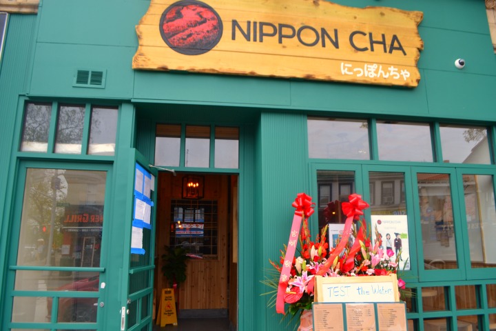
Image 7: Nippon Cha represents the essence of Japanese culture through its colors and appearance.
Other than a restaurant, Bayside offers many places to eat delicious pastries and desserts; this one in particular is called the French Workshop. The French Workshop shows a sophistication France is known for. The store front is presented as a simple yet modern exterior to enter a cafe with delicate food. The basic font of the restaurant is simple and not distracting to the rest of the building. The color of the restaurant is uncomplicated using brown and black to make the shop seem strong and elegant. With its glass doors, the restaurant makes it easy to show what they are doing and the minimalistic view of their storefront.

Image 8: The French Workshop sells pastries and cafe style food.
Up the road, a long standing traditional diner pertaining to the signs and appearance of the 1900s. The Jackson Hole, shown below, is a family owned restaurant and started business in 1972. Jackson Hole has a unique diner feel unlike the other restaurants in the community. The restaurant has neon lights and steel accents on the outside of the restaurant giving it a diner feel. The lights also signify excitement and entertainment, making the restaurant an inviting feeling. The Jackson Hole continues to look like a 80s restaurant despite its competitors changing to a modern look. Jackson Hole remains true to its identity in the past as an American diner.

Image 9: Jackson Hole glows in the night.
One of the other traditional American restaurants is Uncle Jack’s Steakhouse. Uncle Jack’s Steakhouse was established in 1996 and are known for their steaks. They maintain their festive, circus appearance to show inviting feelings. The outlook of the restaurant seems more expensive than the neighboring restaurants. The restaurant mentions foods that are not cheap and the restaurant itself has an awning that protrudes outward With the color maroon on their store front, it presents a warming to the outlook of the restaurant. Uncle Jack’s Steakhouse has kept its past identity as a steakhouse without changing itself in a community with new restaurants.
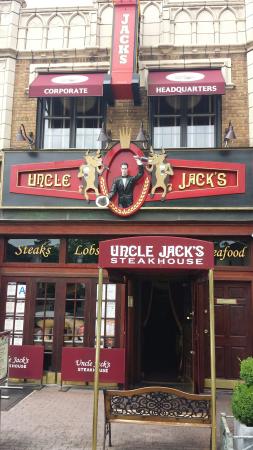
Image 10: Uncle Jack’s Steakhouse in Bayside.
Bayside has a diverse community and it is seen within the restaurants and food markets that pop up. Much of the restaurants show signs of their culture using either colors or their own language to show authenticity in their cuisine. On the other hand, many restaurants have reared toward a minimalist viewpoint rather that bombarding their store front with pictures. These restaurants use colors and a simple design on their store front to display their type of restaurant. Moreover, there are the traditional restaurants that have been here since the 1900s. They have more of a old fashioned store front and their colors match the period in which they originate from. These restaurants show that Bayside has become more modern and cultural while preserving traditional restaurants. But all the restaurants have a given similarity which is that they cater to English speaking people. With their ethnic language, they use English as a commonality to appeal to the majority of the community and these patterns keep Bayside unique and diverse.
Hi, this is a comment.
To get started with moderating, editing, and deleting comments, please visit the Comments screen in the dashboard.
Commenter avatars come from Gravatar.