
Welcome to my first blog here at Baruch!
We will be exploiting the importance of the Chinese culture in New York City,
Here we will be focusing on the food and the history that falls behind this Chinatown neighborhood. Chinatown on the lower east side has been around since the 1870s. Therefore, it has been through a hand full of hand violence and the food industry has slowly begun to transform into what it is today. Chinatown today is about 2km big with a population of 100,000 residents at the moment. Chinatown here has many tourist attractions, such as our yearly lion dance, and our food. Authentic food is hard to find around the city. That is why people come from all over the city to Chinatown in Manhattan. Although, there is a Chinatown in every Burroughs what makes the one in lower Manhattan so unique is because of the five-point here. The five point was made up of 5 hidden spots in New York City where gang members use to attack each other back in the early 1900’s. 5 points is really the main reason why chinatown in Manhattan the way it is today because of the famous history behind it. Another reason why we attract so many tourists is because of the price of the food here. The food is good and the portion of the food is a lot so overall it is a win-win for everyone that comes here for breakfast lunch and dinner. So I suggest you guys come on the journey with me to learn more!
These next five pictures are mostly similar but also a little different at the same time. As you can see I picked up a few neon signs just like the previous ones. But one of them has only Chinese characters and one of them only has English letters. This pattern, it has allowed me to come up with an educated guess. I saw a pattern. These two signs both belong to a Chinese restaurant. But one of them targets mostly Asians and one of them targets mostly Americans. Chinese take-out restaurants are mostly a fusion of American and Chinese food. That’s why they would get a lot of customers that typically are not Chinese. So they would want their customers to have the ability to read the sign whereas the Chinese neon signs it’s all in Chinese because they get mostly Chinese customers. This could also be a problem in the long run because most of these Chinese signs get a lot of tourists. Whereas the other signs have both English and Chinese characters. Overall, I feel like these signs could be placed in a better location. Not only a better location but also target the people that are usually in the neighborhood.
Lastly, with these pictures, you can easily see that the patterns of the sign look pretty similar. Some are mostly rectangles, have the address of the place on the bottom of the sign, and most importantly the neon signs. Some can be eyecatching and placed inside of the store. You will never find a neon sign hanging off the wall like in figure 6. That is mainly because neon signs need to be plugged into a power source and most of them are not waterproof. We can also say that most of these signs have both English and Chinese characters on them. While some do depend on who the business is targeting. For example, If the business is targeted more towards tourists then the English characters on signs would be displayed in a bigger font than the Chinese characters. Whereas if the business is targeted more towards the Chinese then the Chinese characters would be in a bigger font while the English characters would be a little bit smaller. Just like in figure 4 and figure 8. Therefore, we can all say that the culture in Chinatown has significantly changed over time and still staying true to the Chinese culture as all these figures have proven to remain the same.
MOTT St:
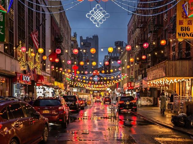
Figure 1 NAM WAH TEA PARLOR: 13 Doyer St
If we look closely at this sign we can clearly tell that it has been through a lot. The sign itself is slowly decaying as time goes by. Our educated guess would be Nam Wah has been here for a long time. They also have both English and Chinese letters displayed on their signs. Their updated signs are the neons ones below the original sign.
/cdn.vox-cdn.com/uploads/chorus_image/image/39151524/2011_11_oldmap.0.jpg)
Figure 2 Golden Florist: 353 Grand St
This neon sign is a little different from the others. Because this is a take-out spot their targeted consumers are predominantly not Chinese. People who open Chinese takes outs are the ones that like to get out of their comfort zone and open a Chinese takeout in neighborhoods that contain mostly people of color and whites. That’s why this neon sign has only English letters. Also if you notice they also do not have the name of their store as part of their sign. They did that because most Chinese takeout have generic names or they come with Chinese vowels which makes it harder for their consumers to understand.
/cdn.vox-cdn.com/uploads/chorus_image/image/47134122/chinamerNeonSign.0.0.jpg)
Figure 3 Great New York Noodletown: 28 Bowery
This sign is a little different, you see a symbol, English letters, and most importantly you see Chinese characters both simplified and traditional. That is because this restaurant is right in the middle of Chinatown. They want everyone whos Chinese to have the ability to read it and potentially grab dinner with them. As well as the tourist that can only read English they can also grab dinner with them.

Figure 4 Pharmacy: 187 Centre Street
This sign is similar to the previous one. Shape in a rectangle has a symbol and has English as well as Chinese characters. As you can see this sign is very eye-catching. They are in yellow and the size of the characters also matters. Because this is also in the middle Chinatown. Most of the signs here in Chinatown have their address on the corner of their signs and it is mostly displayed in a small font.

Figure 5 Famous Pecking Duck house: 79 Chrystie St
This sign is a little different. As you can see this only contains Chinese characters and pictures. Which is also accessible to customers that arent Chinese they can look at the picture and you will have a better understanding of what the characters are saying. This is also in the middle of Chinatown the signs are still very eye-catchy. Looking at the patterns of neon signs around Chinatown This one has a good amount of different colors. I also noticed that this sign is very detailed with the smoke coming out of the noodle dish and the duck swimming in the water symbolizes freshness.

Figure 6 Chinatown Lumber: 127 Divison St
This sign reminds me of figure 1. They are both slowly decaying and look old. The characters are also leaning towards the Chinese side. The Chinese characters are much bigger and the English ones. Something I found a little different is the address and their phone numbers. Not many places in Chinatown display phone numbers and addresses. Also, this sign is hanging off the wall in the street. And with the color of the fonts, it can be more eye-catching.
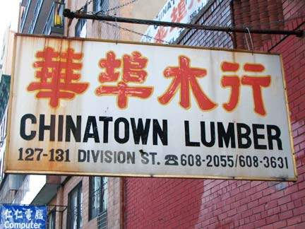
Figure 7 Deluxe Green bo: 56 Bayard St
This sign is also rectangular has a fixed color and has both English and Chinese characters. But once again the Chinese characters are bigger than the English ones. You also see that the address is located on the bottom of this sign. Which was something we found common in all of these figures.

Figure 8 Chinatown Ice Cream Factory: 65 Bayard St
This Sign reminds me of figure 10. As you can see here the ice cream factory also has three different signs on all three different levels but still share the same purpose. the address of this ice cream location is also located on the bottom corner of the sign. There is a symbol of a dragon on the sign which shows loyalty because in china dragons do mean loyalty. You also see that the English characters are bigger than the Chinese ones as well. But in the middle sign, you see the opposite, you see that the Chinese characters are bigger than the English ones. Which ultimately shows they get customers from both sides.

Figure 9 Peaking Duck: 42 Mott St
This sign is a little different the figure 5 because it has fewer colors which make it focuses on one thing in this case we can already tell this place is known for pecking ducks. Unlike figure 5 they symbolized the duck in a different way. We also see how this sign has both characters to widen their customers. They also added the word “BBQ”. Which draws people’s attention especially if they like BBQ.
 Figure 10 Meat Market: 57 Bayard
This sign is also in a rectangular form. Has a cow to symbolize the meat market. As you can see in this sign the address of this place is located on the bottom of the sign. One thing that is pretty interesting in this picture is that this meat market has three different signs. They are all also being displayed on all three different levels. They all share the same purpose and meaning but three different levels can really grab people’s attention. /cdn.vox-cdn.com/uploads/chorus_asset/file/19886288/CTown1.jpg)
Hi, this is a comment.
To get started with moderating, editing, and deleting comments, please visit the Comments screen in the dashboard.
Commenter avatars come from Gravatar.