Paul Voler – Designer Otl Aicher
Reply

By: Ben Nahmani
Massimo Vignelli
Massimo Vignelli has a unique style in his design. Especially for considering his career began in the early 1960’s. it is hard to generalize his style into simple terms or even describe it because he has done so much. Moreover, all of his work vary in categories. From brands/logos to furniture and even architecture. Massimo has done it all! But for now I’ll focus on his branding.
Massimo was able to work with some of today’s biggest companies while they were still just discovering themselves. These companies needed an image. Something that people would recognize, a logo worthy of their brand name. Massimo Vignelli was the perfect candidate for the job.
Vignelli designed the bloomingdale’s typography used as its brand/logo as well as on its signature “size” bags. Shown below:


The double o’s looped together and the unique curvy and smooth typography have remained the company’s typeface for over 4 decades! Talk about timeless.
Another brand that used Vignelli’s talent was American Airlines. Logo shown below:

A funny story about this design is that Massimo was always quick to say that the company forced him to add the eagle. I think it worked out well. Contrary to the previous example of his work, here Vignelli used straight lines with sharp angles that transition easily into the finer details of the eagle’s features, creating the feathers on the wings, the talons and its beak.
Finally the last piece I just had to write about was the 1970’s NYC subway map:

Here we can see that Vignelli combined aspects from both of his logo designs, using sharp angles and straight lines with smooth rounded edges that are easy on the eye but still flow very seamlessly. Just try following any of the subwaylines… the typography used in the map also show well thought out hierarchy between borough names, bodies of water and the names of subway stations. Additionally the negative space used represents actual land masses without subway lines running through them, truly a representative map of the city’s transportation infrastructure.

Juan Romero
ART 4900
Professor Klein
Paula Scher has been at the forefront of graphic design for four decades. She has worked on everything from album and magazine covers to corporate and brand identities. She has also taught classes and written books on graphic design and has won countless awards, including a 2001 AIGA Medal. It is an illustrious career that continues to this day. During her time as a graphic designer, Paula has approached her work with the populist viewpoint meaning her designs would mix in popular culture as a way to draw in people. She does not have a specific style though. Her work has ranged from extremely clean-cut to very in your face designs, all depending on what it’s for.
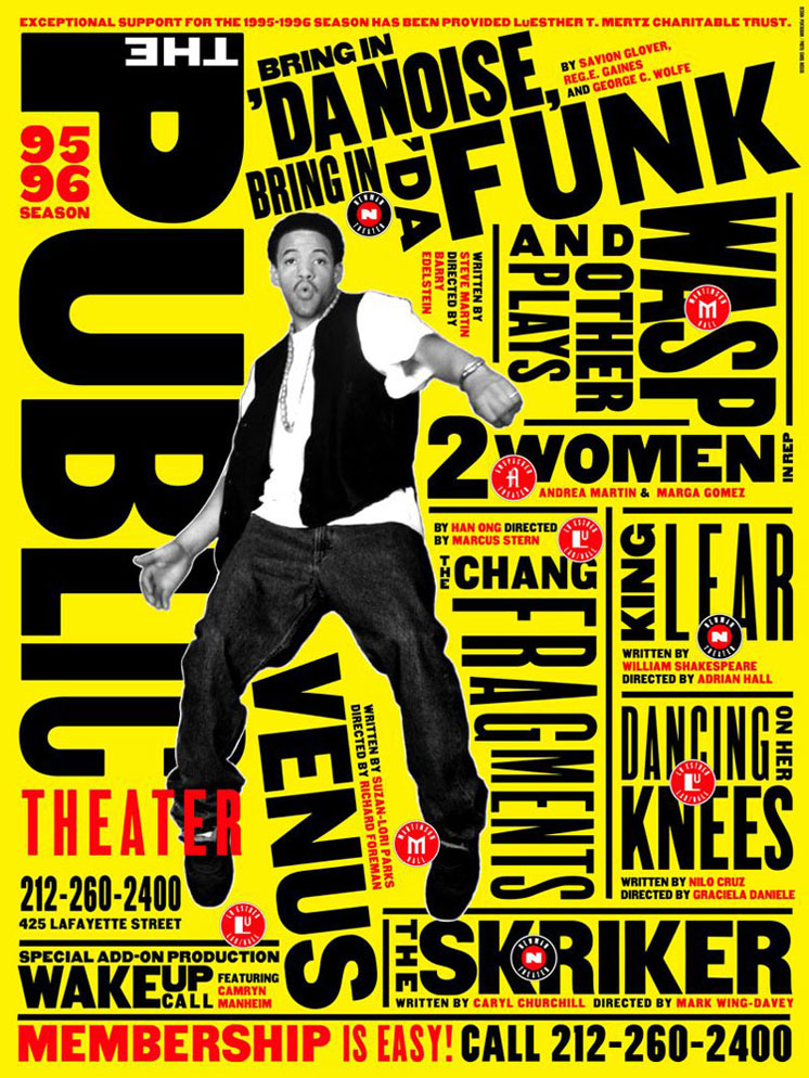
Some of her most famous designs were the designs she made for The Public Theater’s production of Bring in ‘da Noise, Bring in ‘da Funk. This particular design incorporates the musical’s main actor surrounded by blocks of words. All the words are going in various directions to mimic motion, which is meant to represent the dancing from the production. The title of the production, along with the names of other productions at The Public Theater, are presented in a large, bold san serif font. The name of the authors of the productions, and other information, is presented in a very small, red san serif font. All of this is presented against a yellow background, thus making everything on the poster stand out.

This second Paula Scher design is one of her most recognizable. Designed back in 1976, this design has stood the test of time. The design incorporates bright colors over a black backdrop. She used guitars and made them look like spaceships (something I had never noticed until just now) and created contrast between the different elements of the design by using bright reds and blues. She also displays Boston, both the band’s and the album’s name, in a bright yellow stylized font on the center of the top of the cover. At the time, album covers mostly featured a picture of the band so this was a good change of pace and add some mystic to who could be behind the album. Though Scher believes the design to be “mediocre”, it is one of the most iconic album covers ever created.
Ultimately, Paula Scher has done and continues to do a great job of embodying and representing her subjects in her work. She continues to create identities the stand the test of time.
Post you designer paper in the category Designer.

